StockCharts Insider: The Sector Intelligence Stack
Before We Dive In…
Sectors show the market’s inner rumblings. Money flows in. Money pulls out. Pressure builds beneath the surface. Sectors, and the opportunities they present, are never static. Some opportunities are obvious. Others stay buried in the noise. Following sectors can give you an advantage; if you know where to look, you get a glimpse of a market’s dynamics before its structure fully takes shape.
There are tools to help you analyze sector breadth and movement from multiple angles. Most traders use one, maybe two. The advantage comes from stacking several together.
The Core Stack: StockCharts Tools for Sector Analysis
There are many ways to view sector dynamics. Each tool is designed to penetrate a particular, specific aspect of movement, giving you something of a 360-degree view of the market’s inner workings on a sector level.
1 - Sector Drill-Down
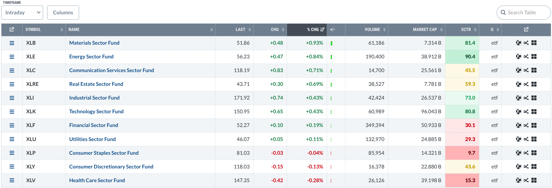
You can start here. It is essentially a built-in workflow for top-down analysis. The Drill-Down ranks all 11 S&P sectors by actual and relative performance (via StockCharts Technical Rank). You can toggle from intraday to one-year view to see which sectors are leading and lagging.
Click a sector, and you can drill down fast, from sector to industry to stock. Rank them by SCTR, and you see the technical leaders rise to the top.
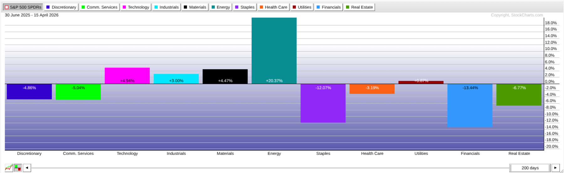
2 - Market Summary US Sectors
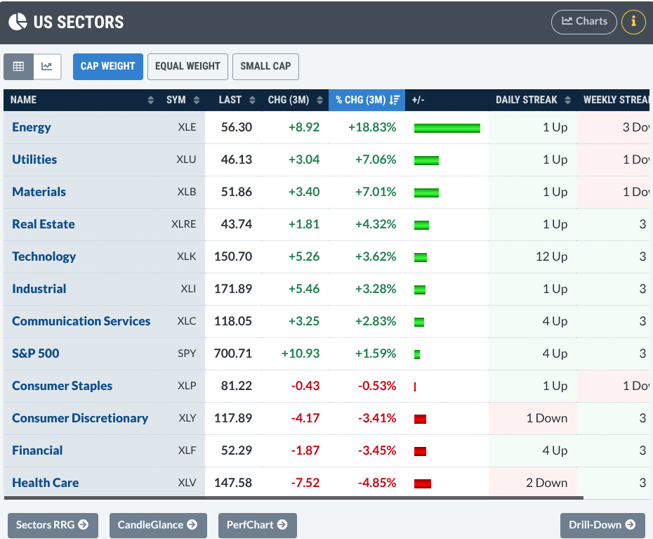
Found in the Market Summary page, this presents a similar ranked hierarchy, but with a few differences. You can compare different weightings and view the sectors as Relative Rotation Graphs (RRGs), or from a PerfCharts and CandleGlance view (we’ll touch upon these later). Just know it’s there and there’s a lot you can do with it.
3 - Relative Rotation Graphs (RRG)
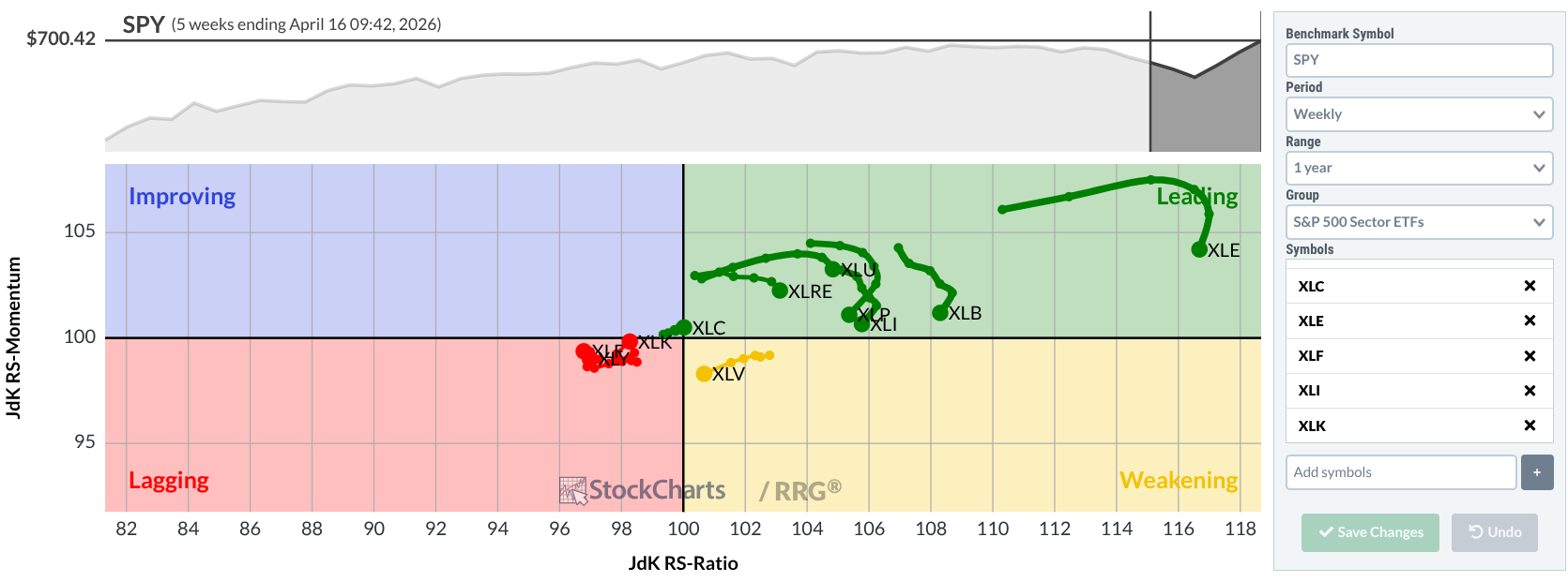
Have you used this before? This is all about motion. Sure, it maps relative strength and momentum against the S&P 500, but its highlight is that it shows movement.
Sectors aren’t just strong or weak, they’re traveling: leading, weakening, lagging, improving. In other words, you get not a snapshot, but a trajectory, which is important when you’re making decisions based on anticipated rotations.
4 - PerfCharts
PerfCharts distills everything into a single glance. Who’s outperforming what and by how much? Comparing each sector ETF side-by-side, as lines or bars, you get a quick, clean read on sector performance. Pretty simple.
5 - MarketCarpets
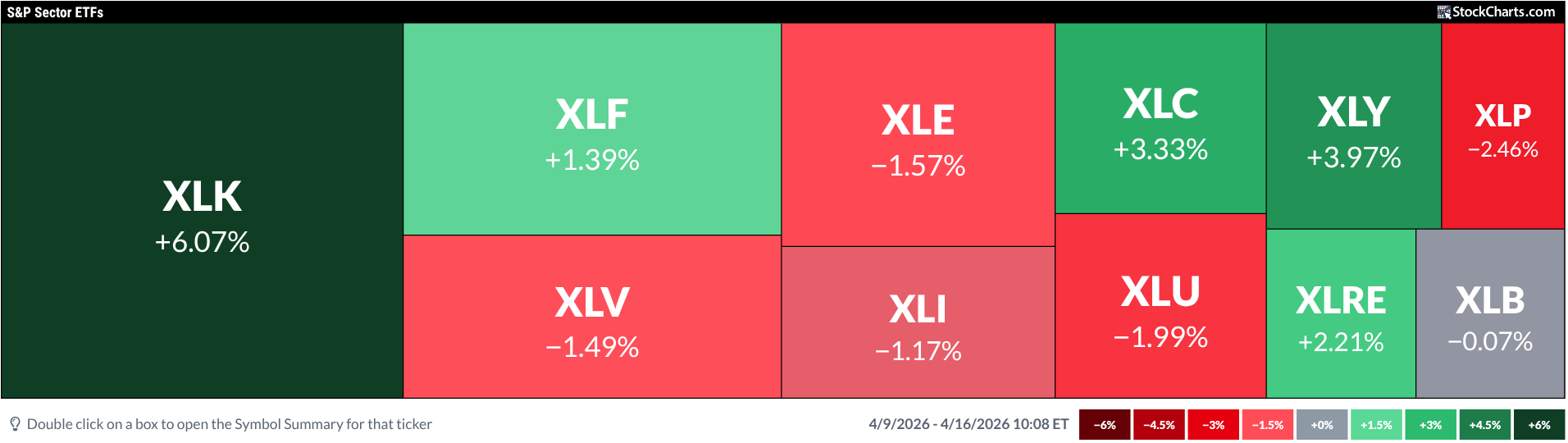
MarketCarpets is a heatmap, laying out sectors as a dynamic, color-coded field. Whether by price, indicator, or varying time frames, you can toggle through several angles to get a nuanced snapshot of sector action in seconds.
6 - CandleGlance
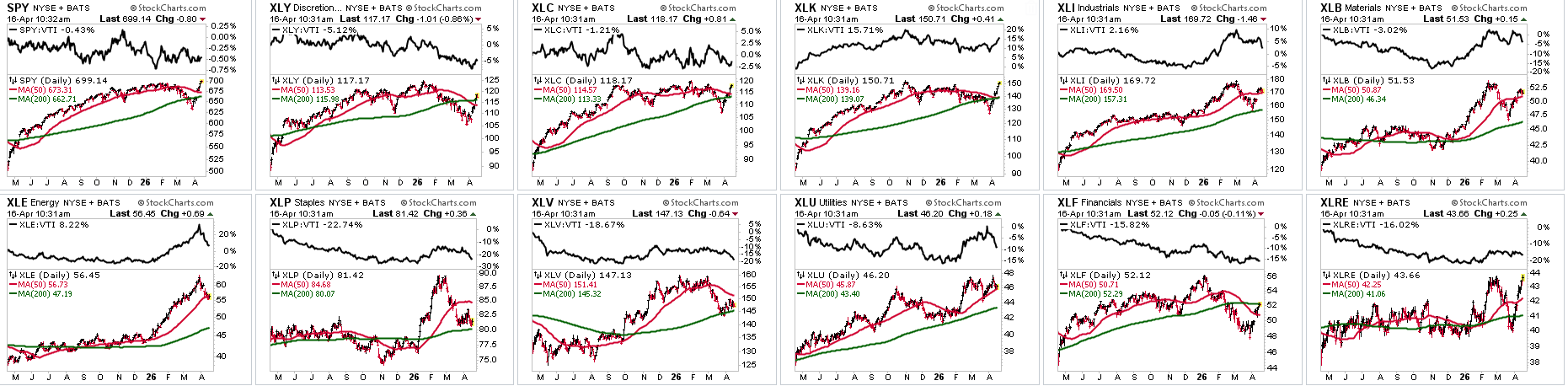
This is all about getting a fast scan structure with price, moving averages, and relative strength against the Vanguard Total Stock Market ETF (VTI) as a benchmark. No deep analysis, no overthinking, just a quick view to see if a sector is actually trending. You can use it as a confirmation layer, or to filter out noise before you go deeper.
7 - Symbol Summary
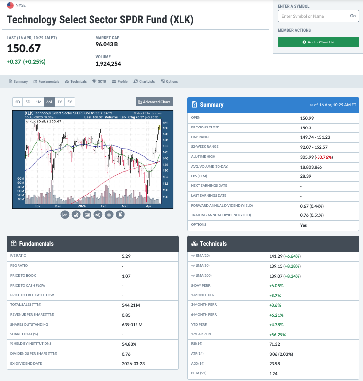
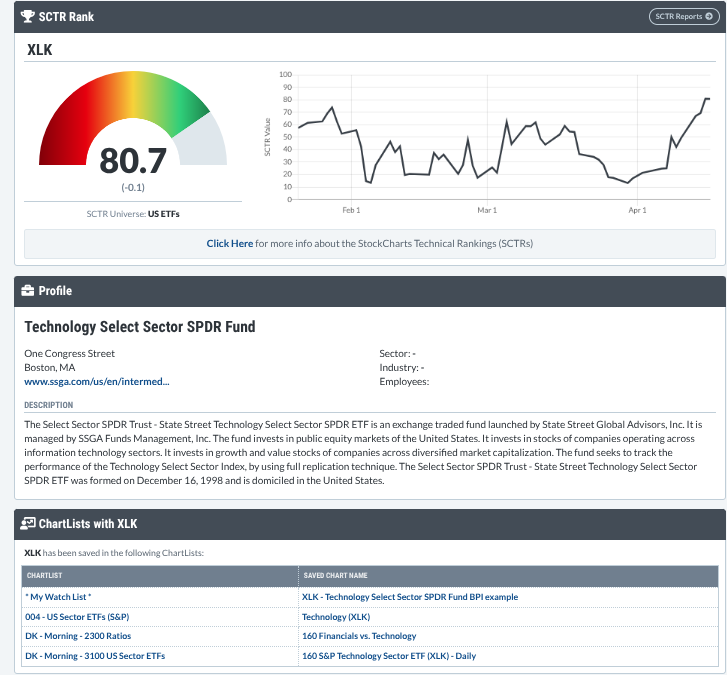
Want to go deeper into technicals and especially fundamentals? Don’t overlook the Symbol Summary, which brings a lot of important data into one place, like technicals, fundamentals, earnings (for stocks), SCTR rankings, and more. It may not be the place where ideas are born (unless you’re more of a fundamentalist), but it’s where you can put your bias in check. If the numbers don’t hold up here, don’t move forward.
8 - Ratio Charts
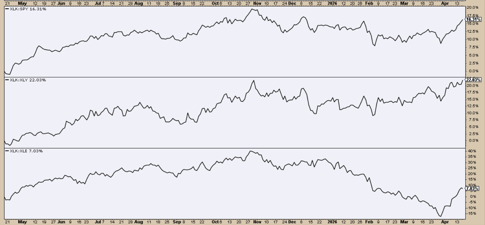
Highly underrated by almost everybody but pros, ratio charts (like XLK:SPY, XLF:XLY, and XLK:XLE above) strip away everything except relative performance.
It provides direct answers to the questions:
- Is this sector outperforming or underperforming X, and
- By how much, percentagewise, is it leading or lagging X?
Compare one sector to another sector, the broader market, or another asset class. Pros generally think in this way. Nothing’s in isolation, it’s all in comparison. While it’s not beating this, it’s probably beating that. So, what’s worth paying attention to?
9 - Sector Bullish Percent Index
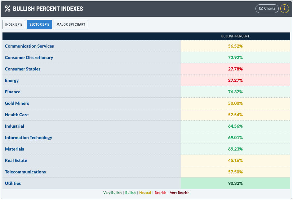
What kind of maneuvers are going on behind the scenes that “price” isn’t telling you? There could be a wave of buying or selling. You just can’t see it unless you look deeper into market breadth. What kind of “participation” is going on? Am I about to get stampeded by bulls or mauled by bears? The Bullish Percent Index (BPI) exposes that. It tells you the percentage of Point & Figure (P&F) buying signals that have been triggered in the stocks that make up a sector. If you spot it, it’s an early signal; if you don’t, it’s a hidden opportunity you might have missed.
10 - Seasonality Charts
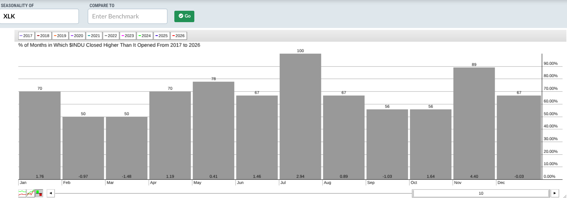
Here’s where you shift gears from market timing to calendar planning. Now, to be clear, this is not about prediction. It’s about context. In seasonality, you’re looking at calendar patterns that repeat. You might wonder if a given sector, based on its seasonal tendency, will rise or fall in a given month by a certain percentage. There’s no guarantee it’ll happen. But it’s happened enough times to warrant your attention. Whatever the case may be, if the stats are significant enough, why not anticipate and exploit the opportunity when the time comes?
Here’s Your Insider Sector Stack
In a nutshell, here’s your multi-angle intelligence pipeline for analyzing sectors.
- Sector Drill-Down -> This is where you analyze sector leadership.
- Market Summary (US Sectors) -> Gives you several ways to “slice and dice” sector action.
- Relative Rotation Graphs (RRG) -> Shows you where money is rotating.
- PerfCharts -> A clear picture of who’s outperforming who.
- MarketCarpets -> Sector action at a glance from different angles.
- CandleGlance -> See the trends (or not).
- Symbol Summary -> Plenty of data to support or debunk your bias.
- Ratio Charts -> A more flexible and surgical way to look at relative performance.
- Sector Bullish Percent Index (BPI) -> Shows the participation stirring beneath the surface.
- Seasonality Charts -> Tells you when the big moves tend to occur throughout the year.
And That’s a Wrap
By now, you can see how sectors can make up a big part of your analysis workflow. Given the tools I laid out, you don’t have to limit your sector view by performance, but you can dig much deeper into the data from several angles. Each individual tool shows you something different, and the insights provided can be incredibly useful. But when you start linking them together, the picture sharpens even faster. You stop reacting to headlines and start reading structure, and that’s the advantage you gain by taking a little more time to see what’s really stirring underneath the broader market.