Want to Buy Bonds? Take a Closer Look at This Indicator
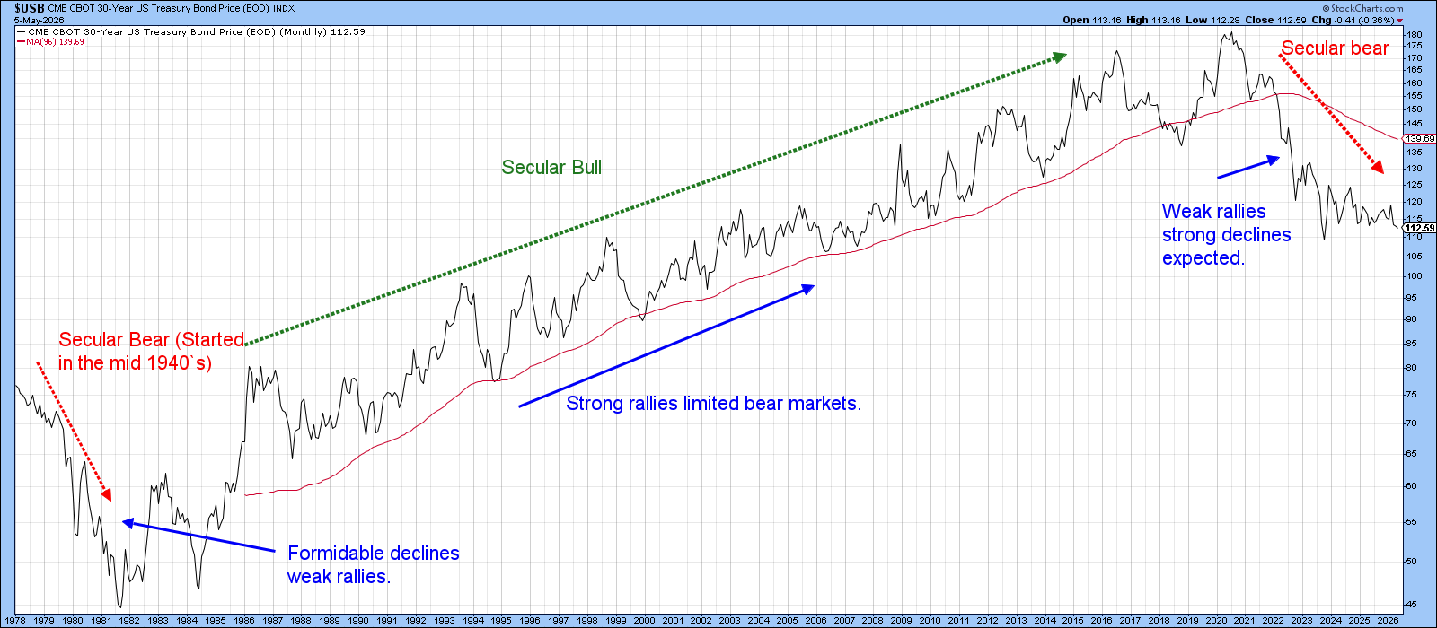
Bond prices were in a secular bear market between the 1940s and 1981 and a secular bull market between 1981 and 2020. My technical work strongly suggests that a new secular bear market in prices (and therefore a secular bull in yields) began at that point.
In most cases, counter-secular primary trend moves tend to be smaller in magnitude and duration than their pro‑trend counterparts. If the 2020 reversal marks the start of a new secular uptrend in yields, the implication is for a lengthy period in which the rising sequence of cyclical peaks and troughs that characterized the 1981–2020 era transitions into one defined by limited bond bull markets, both in amplitude and longevity. It is in that context that any bullish outcome for bonds in the period ahead should be viewed.
The natural question, then, is which indicator deserves close monitoring in the weeks ahead for a potential bond‑buying opportunity. Gold provides a compelling answer, as its principal function is its ability to discount future inflation. By contrast, the highest‑quality, virtually risk‑free bonds dislike inflation because it erodes their purchasing power; they thrive during periods of disinflation or outright deflation. That makes the relationship between them a powerful inflation/deflation barometer.
Chart 2 plots the ratio between spot gold and the 30‑year Treasury bond ($USB), together with its long‑term KST. The vertical lines approximate periods when the KST has triggered a sell signal. These signals have historically aligned with important junctures in the inflation/deflation battle.
There are moments when gold’s momentum leadership over bonds begins to crest, implying that inflationary forces are losing strength, which is positive for deflation-sensitive credit instruments. In a secular environment where bond bull markets are expected to be brief and constrained, such KST peaks are still significant, but far less so. They still help identify those rare windows when the inflation discounting mechanism eases enough to permit a tactical rally in long‑duration bonds, but, as the 2021 signal indicates, sometimes less so.
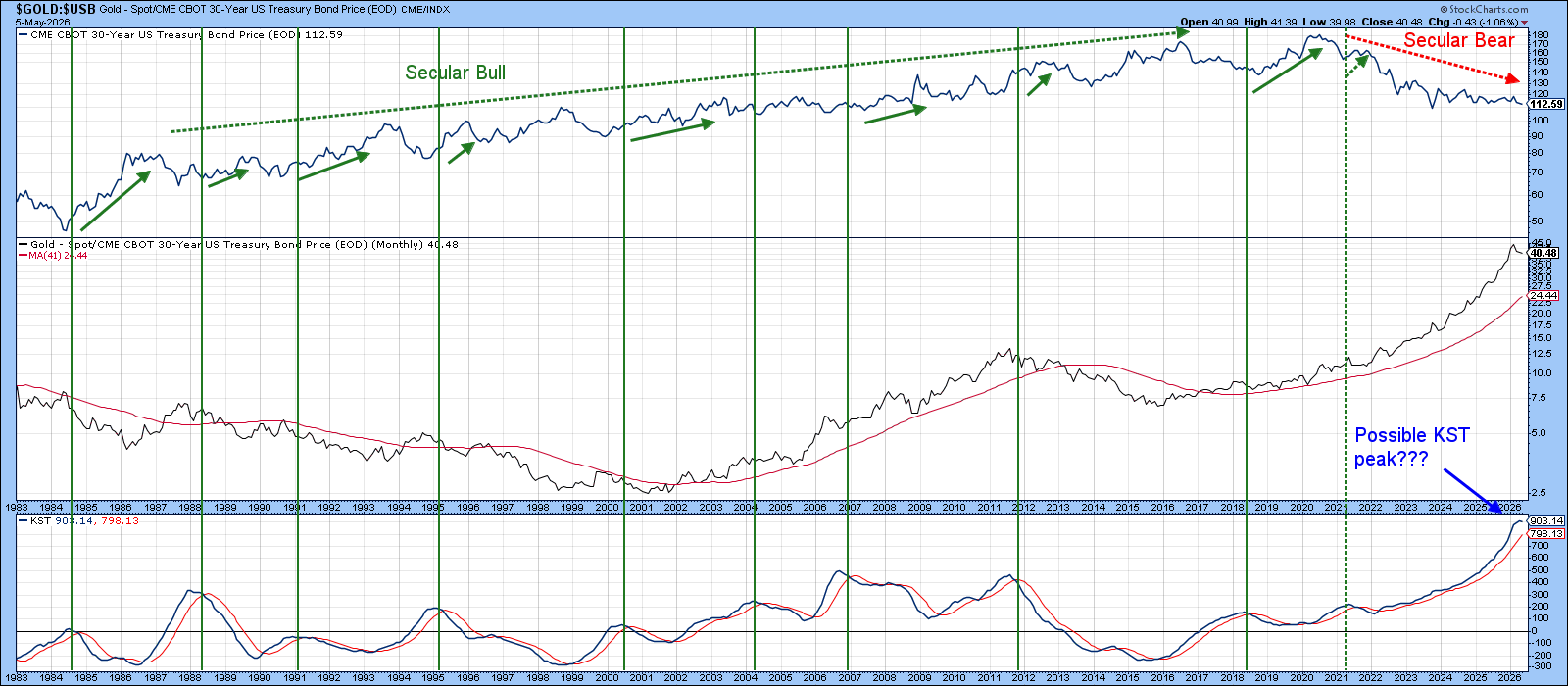
At present, the ratio remains comfortably above its 96‑month MA, keeping its secular trend positive. The long‑term KST is also still in a rising mode and holding above its signal line, but the indicator has begun to stall. That loss of momentum is not surprising given that the KST is operating from a record overstretched level, making it increasingly difficult to maintain its uptrend without some form of consolidation.
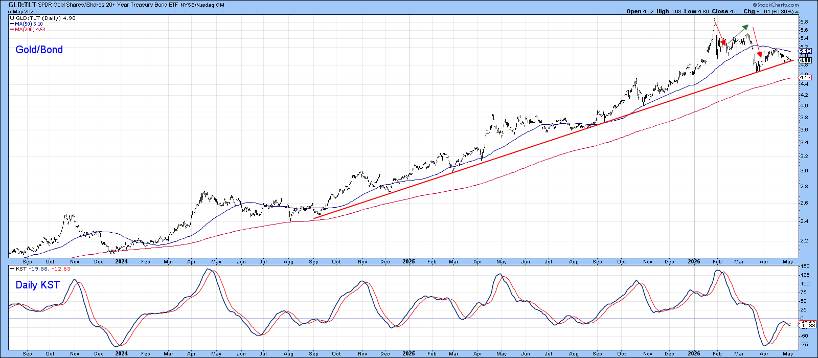
Even so, Chart 3 shows that the ratio, this time using the iShares 20‑Year Treasury (TLT), has declined to a major up trendline. The line carries considerable weight, not only because of its length but because it has acted as dynamic support on at least seven previous occasions. The red and green arrows on the chart highlight that the ratio has already begun tracing out a pattern of declining peaks and troughs, which would add credibility to a bearish interpretation should the trendline be decisively violated. For now, though, that support remains intact, and the burden of proof still lies with the bears.
Gold/Bond Versus Transports
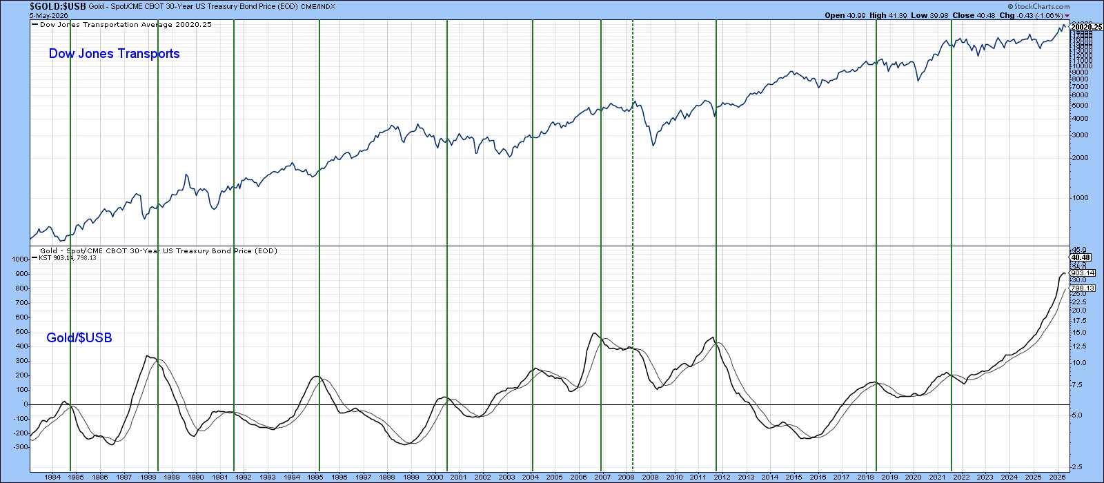
Because the Gold/bond relationship is a cyclical one revolving around the business cycle, it reflects the dissipation of inflationary forces that could provide a favorable environment for some industry groups. One example is the Dow Jones Transportation Index ($TRAN). While KST peaks in the gold/bond ratio don’t provide mechanical buy signals for it, Chart 4 shows they frequently occur near points where inflation momentum is cresting. This is because easing inflation pressure improves cost dynamics for transport companies and often coincides with early‑cycle recoveries in economically sensitive equities.
That said, the relationship is not precise enough for exact timing, as the index is influenced by a myriad of factors. It does, though, reinforce the broader message: when gold’s inflation‑discounting function begins to lose momentum, cyclical industry groups and sectors often find a more hospitable environment.
Bottom Line
The gold/bond relationship is starting to look tired, and its long-term KST has begun to stall. However, there is insufficient proof at this point to call a primary trend reversal. If the evidence tips over to the bearish (deflationary) side, any such rally should be viewed through a secular lens.
If 2020 did indeed mark the start of a new secular bear market in bond prices, then any counter‑secular advance is likely to be weaker and shorter‑lived than the powerful rallies that characterized the 1981–2020 secular bull. In other words, a KST reversal would still offer a tactical opportunity, but not the kind of durable, multi‑year bull market that investors grew accustomed to in the prior era.
Good luck and good charting,
Martin J. Pring
The views expressed in this article are those of the author and do not necessarily reflect the position or opinion of Pring Turner Capital Group of Walnut Creek or its affiliates. The Six Stages of the Business Cycle are followed each month in Martin Pring’s Intermarket Review.