StockCharts Insider: What Rising Bond Yields Mean for Your Stocks
Before We Dive In…
If you're confused about how bond yields are affecting the stock market, this one’s for you. As I’m writing this, there’s been lots of news coverage on rising bond yields and Treasury Secretary Scott Bessent’s attempt to bring those yields down (which didn’t really work all that well).
If you already know how this entire mechanism works, feel free to skip this article. But if you don’t quite get why rising bond yields are such a big deal and how it affects the market, this Insider article is for you.
We'll start with two quick notes:
1 - You’ve heard about different yields on financial news (like the 2-year, 30-year, and so on). In this piece, we will zero in on just one: the 10-year Treasury yield, or $TNX. Why? Because of its direct impact on stocks.
2 - StockCharts shows $TNX as yield times 10. So a reading of 48.00 means a 4.80% yield, and NOT 48%.
Bond Yields Are Rising - So What?
For decades, US Treasury bonds were considered the safest sovereign debt investments around the world. This might still be true, but perceptions are shifting. Foreign central banks, global sovereign wealth funds, and institutional investors domestic and foreign have been reducing their exposure to US treasuries.
Why? For many reasons fundamental and geopolitical (and the $40 trillion US national debt is an overarching theme here too). Also, it’s not only US bond yields that are rising, as many sovereign bond yields are also rising across the globe. So, you’re probably wondering, how might this pressure the economy and markets?
Here’s How the Bond Yield Ripple Effect Works
1 - Rising yields drive up borrowing costs: Take the 10-year Treasury yield. It’s the global baseline for credit. When that rises, so do mortgage rates, auto loans, and corporate borrowing costs. (If you can imagine the Fed Funds rate as a “dog owner,” the 10-year is the “dog” on a long leash).
2 - This can drag down the stock market (with a caveat): High yields present investors with a potentially higher and virtually risk-free return. So what do many investors do? They pull money out of the stock market and other riskier assets to invest in bonds.
Caveat: Yields and stock prices don’t always move inversely. If yields are climbing because the economy is booming (people dumping bonds to put into stocks and riskier assets), stocks can hold up or even rise alongside yields for some time.
3 - High yields can create a spiraling burden for the government: Higher yields mean Washington pays more to service its debt. It’s a big deal now that the national debt has exceeded $40 trillion. If investors lose confidence and start pulling out of Treasurys, yields can climb even higher. This means the government has to issue even more bonds (debt) just to cover its interest on current debt. This keeps yields elevated and rising. And this can pressure stock valuations in a not-so-good manner.
As you can see, yields are an important factor in deciding what a stock’s price might or should be, given the current circumstances. They’re definitely not a side plot.
So Why Watch Yield Charts Yourself?
Because when the dynamic I just explained above kicks in, yields tend to move first. There’s often some lag time before stocks react.
Just remember that yields can rise out of fear as well as optimistic sentiment. The point here is not to predict direction but, rather, anticipate movement. In other words, don’t let the “tide” catch you off guard.
I am writing this on September 9, 2026. Sure, it’s an evergreen article, but if you’re reading this in the future, you’ll have the opportunity to see what actually transpired.
As of writing, yields have been climbing for weeks. Yet stocks appear to be holding steady. Eventually something has to happen. Again, the point here is to anticipate the outcome, whatever opportunities or risks that may bring.
Put This Symbol in Your ChartList: $TNX
There are lots of bond yields out there. If you’re going to track just one, track $TNX., the CBOE 10-Year US Treasury Yield.
I mentioned this earlier in the piece. You know…the 10-year, the global credit baseline, mortgage rates, etc. Well, here it is.
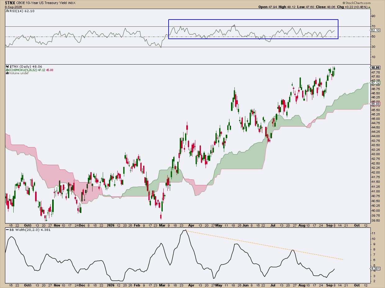
What you want to look for: Is the line trending up or down or moving sideways and for how long? That’s pretty much it.
From there, you take a look at the broader market. See how it correlates (or not) with what you’re seeing. Check out the news and see if anyone’s clamoring about it. What scenarios are different analysts forecasting? Most importantly, what potential outcomes might you anticipate?
In the chart above, I see the following:
- The $TNX has been trending up since late March. I’m using the Ichimoku Cloud to gauge this particular instance. The yield is way above it, the cloud itself is rising, and its 26-period projection is not rising but thickening. In short, that says “solid uptrend.”
- The Relative Strength Index (RSI) is in its bullish range. It’s settling more or less between 50 and 70, but it's not hitting or exceeding 70, which is what you’d see if an asset were trending strongly.
- The Bollinger BandWidth indicator is falling while the yield is rising. This means that the 10-year is rising by way of a slow grind, not a panicked scramble. But it also means that volatility is starting to narrow. If it continues, you may see a squeeze forming. Volatility can’t remain squeezed for too long, and there’s bound to be a sharper move. And that’s what you want to keep your eye out for, as it may be telling you something important about the economy. And that’s when you have to figure out what that means for the stocks you hold.
Here’s What Everyone’s Watching Right Now
Set aside yield direction and trend for a moment. There’s a much simpler way to view this: psychological levels. These are like checkpoints that many people seem to agree on.
The rough map looks like this:
- 4.50%: This level used to be considered a “ceiling". When yields got above it, stocks started looking expensive next to low-risk bonds.
- 4.80% - 4.82%: The chart above shows that the battle is taking place at these levels (again, I’d say current, but you may be reading this article way in the future). The chart shows that the 10-year yield is treating this range as resistance.
- 5.00%: This is the traditional “line in the sand.” If the 10-year gets past this level, it’ll make headlines, as it typically signals a major risk event. Some say that, on Wall Street, a break above this level can result in automatic algo selling among institutions; a capital flight from stocks to either cash or bonds. It really depends. But it’s worth keeping an eye on it.
Again, these aren’t predictions, but merely these are rules-of-thumb. Nobody knows what’s going to happen. But at least you know which numbers people are watching and why.
So What Do I Do With All of This?
No big deal. Just consider taking on a few simple habits that may help. Here are some tips.
Insider Tip #1: Check the $TNX once or a few times a week. What’s it doing? Just get a baseline context of what’s happening in the bond market.
Insider Tip #2: If the yield keeps rising while stocks are not responding or staying calm, just keep watching it. It’s a clue to pay closer attention.
Insider Tip #3: Watch those psychological levels and listen to what financial news pundits and financial experts are saying about them.
Insider Tip #4: Watch for catalysts. This can be anything big on the economic calendar, like Fed meetings, inflation reports (you know, CPI, PPI, and PCE), jobs data, etc. These and others can force the market to finally react to what the yields have been hinting at all along.
And that’s all. No crystal ball here. Just keen observation, and patience.
And That’s a Wrap
Bond-speak may seem like a foreign language if you’re not used to the lingo. Now you get it. Wall Street watches bonds because they’re a leading indicator. Still, stocks can sometimes shrug them off. But now you know how to chart the 10-year and you can make sense of all the talk. Should something big happen, you know what scenarios to anticipate. From that point on, you can build a game plan.