Three Non-Tech Stocks Showing Bullish Potential

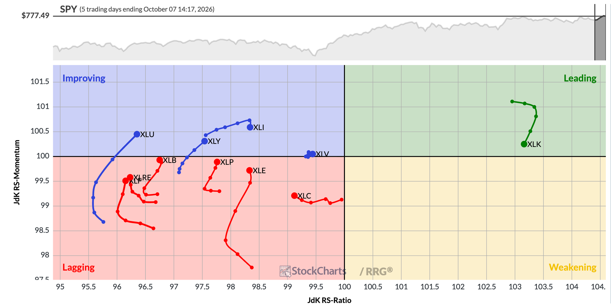
There’s no denying that the Technology sector has been the one area demonstrating consistent outperformance. And while other sectors, including Energy and Health Care, have experienced brief periods of relative strength, one glance at the daily Relative Rotation Graph shows that tech stands alone in the Leading quadrant.
The Technology sector has plenty of compelling charts but, in my view, several names in the other 10 sectors have impressive technical configurations. It’s easy to find a great chart in Technology, but for the other sectors, you have to make sure you have a consistent process for idea generation.
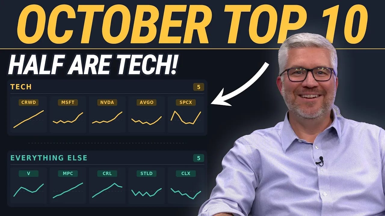
As I was preparing my list of the top ten charts to watch for October, I challenged myself to make sure at least half of the ideas came from other S&P 500 sectors. And, by using fantastic tools like the StockCharts screener, I was able to do just that. Here are three of the non-tech charts that could end up becoming leadership names in Q4.
Visa (V)
While much of the Financial sector has followed a weak September with further weakness in October, shares of Visa have popped higher this week to confirm a bull flag pattern. After reaching a peak around $385 in late August, the price declined in a parallel downtrend channel to an eventual low around $357.
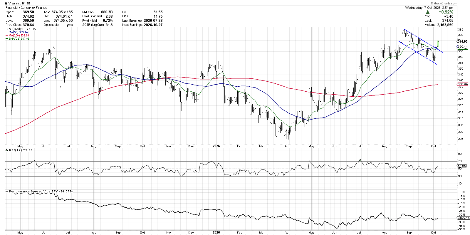
Once V confirmed a move above the upper trendline channel, the bull flag pattern was confirmed to suggest much further upside potential. On top of that, the price also popped back above the 50-day moving average, clearing another key short-term resistance level. I’d still like to see the Relative Strength Index (RSI) improve above the 60 level, which would confirm a bullish momentum configuration, but this chart appears to be in a position of strength.
Steel Dynamics (STLD)
I would argue that the chart of STLD is more neutral than anything here, as it remains in “moving average limbo” between the 50-day and 200-day moving averages. So what’s the reason to be optimistic here? Basically, price has established and respected a support level around $218 that has been confirmed four times over the last six months.
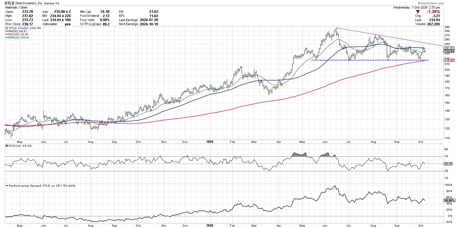
Between the clear price support and the 200-day moving average right around $218, it seems like we have a pretty straightforward structure to use when forming a potential trade. If the price breaks below $218, it would indicate a breakdown of major support and suggest a new distribution phase. But if the price can rotate above the 50-day moving average, and the RSI can push above 60 to confirm strong upside momentum, then STLD could be on course for much further gains.
We can also draw a simple trendline from the major highs from June and August, indicating a potential short-term resistance level around $250. A break above that level, and the stronger momentum readings suggested above, could provide a good confirmation of a new accumulation phase.
Clorox (CLX)
If you’ve followed my work, you know I’m generally a trend follower. As a result, I’m mainly looking for stocks showing strong price action and improving relative strength. But I’ve also found that broadening my approach to other price patterns and setups can help diversify my portfolio and make sure I’m not overreliant on a singular approach.
The chart of Clorox stands out in that it’s one of the few I’m finding recently that features a bullish momentum divergence. While the stock trended lower through September, the RSI started to slope higher. The improving momentum suggests that the distribution phase may be in its final moments.
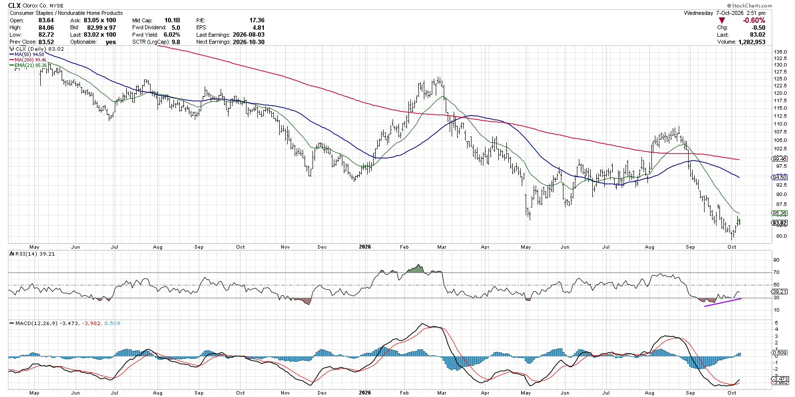
With beaten-down names like CLX, I usually bring up the MACD or PPO indicator to identify actionable turning points. Over the last week, the MACD line crossed up through the red signal line, indicating an upside reversal. Also note that the MACD histogram was trending higher in recent weeks, similar to the uptrend we noted in the RSI.
With a contrarian play like Clorox, you’d want to see an initial move higher followed by a higher low. A brief upswing could be just a “dead cat bounce” before a continuation of the downtrend. But a higher low would suggest that dip buyers are coming in to provide the next upward leg in price. So, for now, I’m watching for improved momentum and a higher low to validate a bottoming pattern in this Consumer Staples play.
While investors remain enamored with the impressive charts in the Technology sector, we have to remember that good charts can pop up anywhere. And by using a consistent set of routines to identify new ideas and manage risk, we can navigate challenging market periods with confidence.
RR#6,
Dave
P.S. Ready to upgrade your investment process? Check out my free behavioral investing course!
David Keller, CMT
President and Chief Strategist
Sierra Alpha Research LLC
marketmisbehavior.com
https://www.youtube.com/@DKellerCMT
Disclaimer: This blog is for educational purposes only and should not be construed as financial advice. The ideas and strategies should never be used without first assessing your own personal and financial situation, or without consulting a financial professional.
The author does not have a position in mentioned securities at the time of publication. Any opinions expressed herein are solely those of the author and do not in any way represent the views or opinions of any other person or entity.