The Bull Market Has Legs, But Is Risk Appetite Really Back?
This week, the S&P 500 ($SPX) and Dow Jones Industrials ($INDU) notched new closing highs, the Nasdaq Composite ($COMPQ) had its best week since April, gold moved higher, and volatility subsided. The bull market still has legs!
This week’s update:
- Sentiment measures
- Where’s Crypto?
Stocks popped on news of a potential peace treaty between the U.S. and Iran, pulled back when a deal failed to materialize, then rallied again following the weak jobs report. Investors now seem less concerned about an interest rate hike in September.
A Sentimental Journey
Besides the Cboe Volatility Index ($VIX), another sentiment indicator I watch closely is the Cboe Options Equity Put/Call Ratio ($CPCE). It’s another useful way to gauge investor sentiment and identify extreme levels of fear and greed.
My “go-to” chart is the one from the Market Summary page.
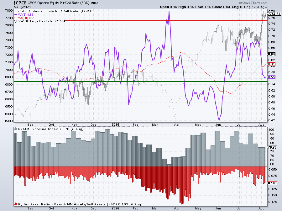
The purple line shows the five-period moving average of the $CPCE. The ratio isn’t visible on this chart, and there’s a good reason for that. Pull up a chart of $CPCE and you’ll see plenty of sharp moves in both directions, which can make the data difficult to interpret. The moving average smooths out that noise and makes the peaks and troughs much easier to spot.
Notice how closely the peaks and troughs line up with the tops and bottoms in the S&P 500. Right now, the moving average of $CPCE is nowhere near an extreme, although it is a lot closer to the lower threshold than the higher one. Compare today’s reading with early June, the last time the ratio reached an extremely low level. If this holds, there's a chance the S&P 500 could keep moving higher. But if the purple line starts to move higher and inch toward the upper threshold, consider it a red flag.
The put/call ratio isn’t a buy or sell signal. Think of it instead as a snapshot of investor sentiment. And the two panels below it add some useful context. The NAAIM Exposure Index shows whether institutional investors are leaning bullish or bearish, and the Rydex Asset Ratio gives you a sense of whether investors are generally bullish or bearish.
The first week of August ended on a positive note. Equities performed well, precious metals prices moved higher, bond yields pulled back, and oil prices remain in a holding pattern.
What About Crypto?
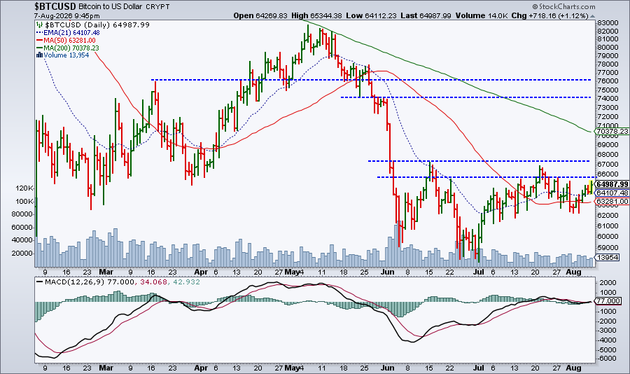
One asset group that still needs to show some momentum is cryptocurrencies. A strong comeback would add another piece of evidence that risk appetite is back in full swing.
It’s the weekend, and you’re probably itching to analyze some charts, so I’ll leave you with this daily chart of Bitcoin to US dollar ($BTCUSD). Bitcoin has bounced off its July lows, but it still has plenty of work to do. Click the image to open the live chart, fiddle with it, and see what you come up with. And try the Screener to find cryptocurrencies that are quietly moving higher.
Enjoy your weekend!