Gap Patterns in Focus: What GOOGL, AAPL, and the S&P 500 Are Telling Us

The S&P 500 ($SPX) index gapped higher to finish the week at yet another new all-time high. This latest gap, while bullish on the surface, would need to be validated by some sort of follow-through next week. Otherwise, we could be faced with the dreaded gap and fail or “jump and dump” pattern.
Today, I'm going to break down how price gaps can be valuable for gauging investor sentiment, particularly the action in the days immediately following the price gap. I’ll share examples of bullish and bearish gap behavior, and then outline three charts with recent gaps that need to be validated next week.
“Gap and Run” or “Gap and Fail”?
On the daily chart of Oracle (ORCL), there are several price gaps on the upside and downside. Focusing on the upside gaps, I’ve highlighted two where the price continued to drift higher after the price gap. We’ll label these as “gap and run” patterns.
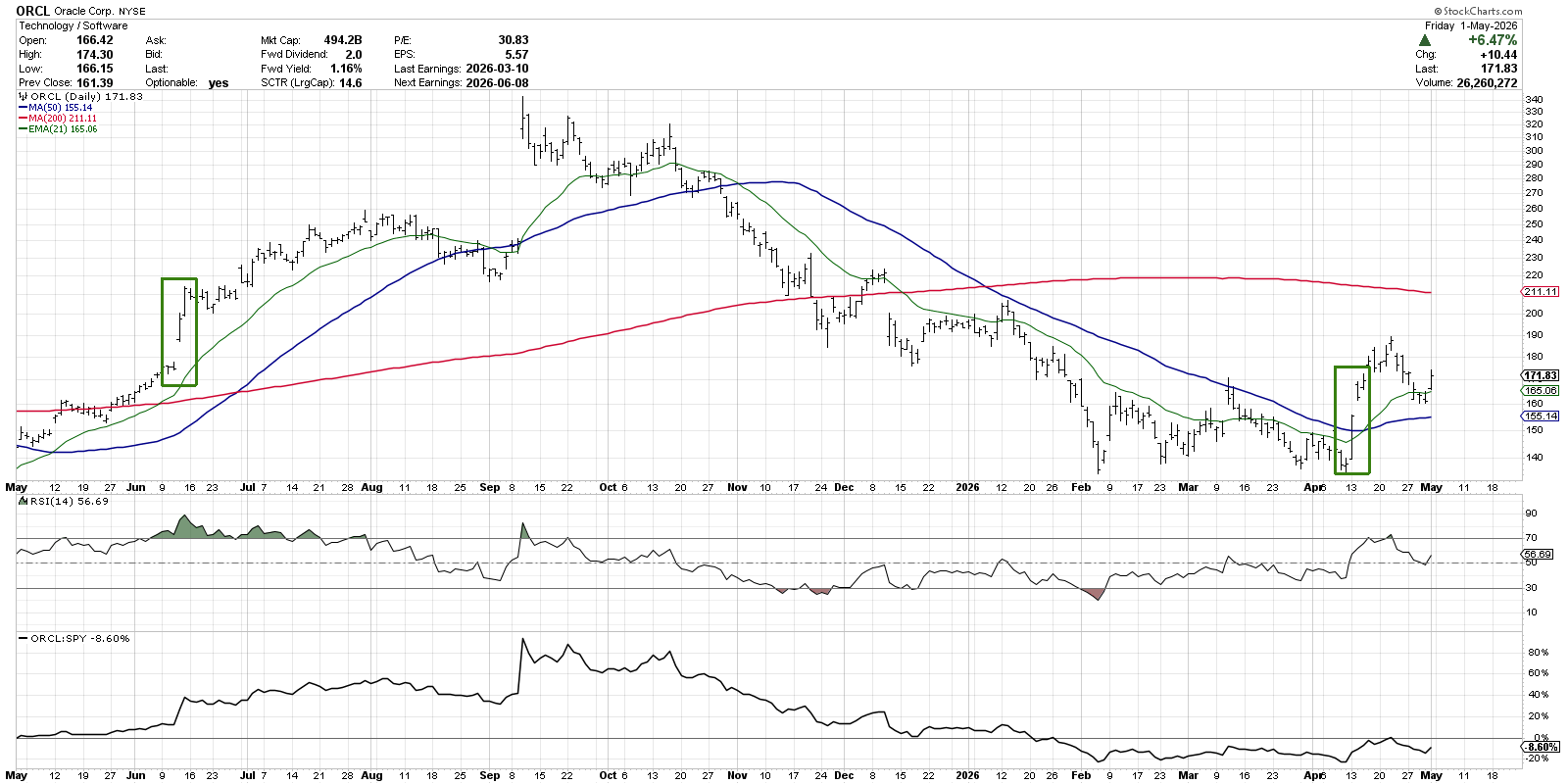
Just a couple of weeks ago, ORCL bounced higher after several tests of support just below the $140 level. After that final pop higher, Oracle closed above the 50-day moving average before gapping higher on April 14th. In the days after that gap, we saw additional upside as willing buyers continued to bid the price higher.
This “gap and run” pattern represents investor optimism, as additional buyers come in after the initial gap higher. Instead of being scared away by the higher ticket price, investors are willing to pay more for exposure to this particular stock. As a result, the price pushes higher.
We can see a similar gap and run pattern in June 2025, when an upside price gap during a primary uptrend was followed by additional buying power. While the stock consolidated a few days after the continuation gap, the uptrend eventually resumed, which led into the eventual peak in September 2025.
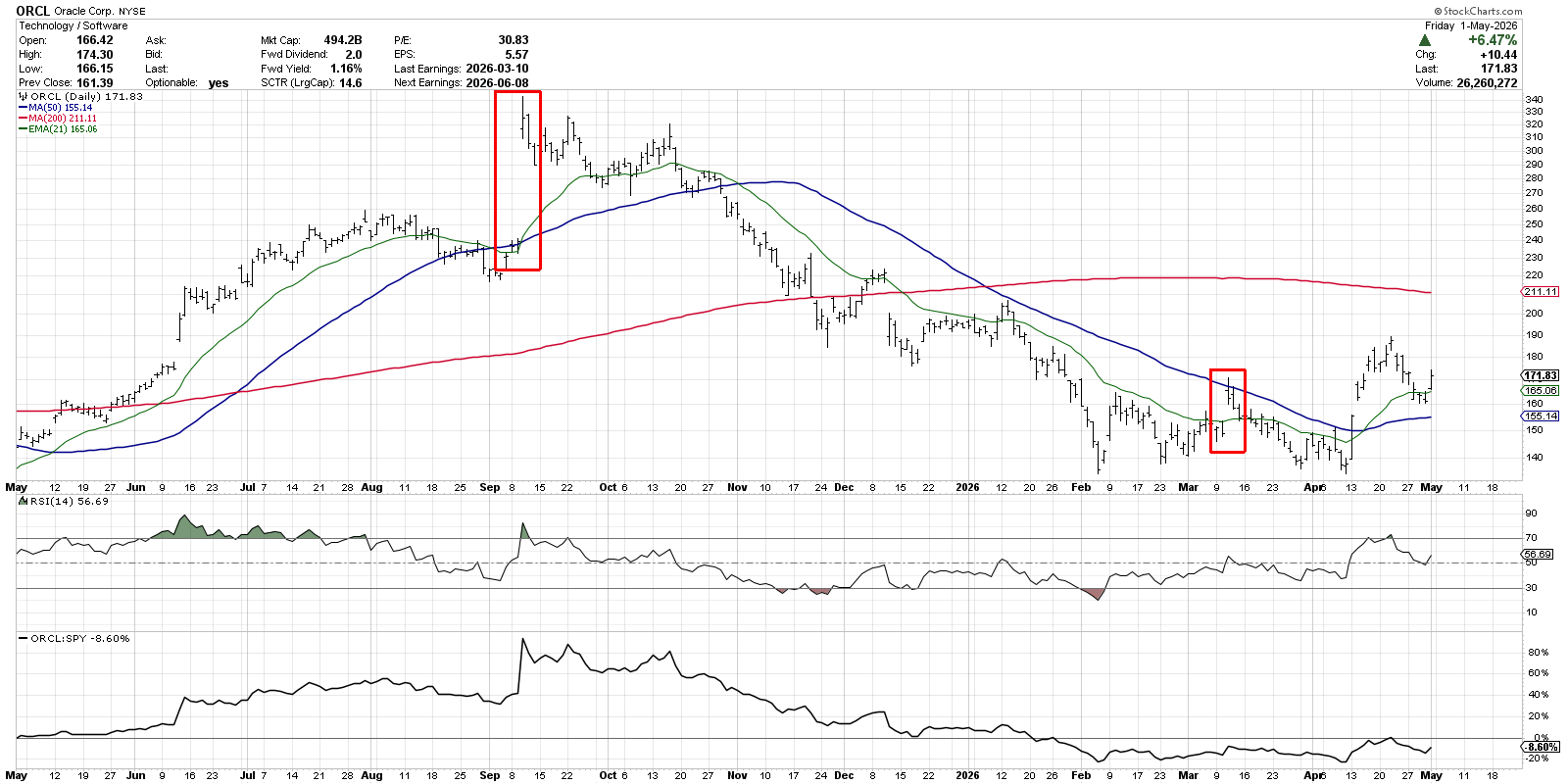
We can see another price gap going into the September 2025 peak, and the gap higher was followed immediately by a short-term distribution phase. Instead of optimism after the price gap, as we noted in June 2025, in this case, we see a lack of buying power as investors are selling the gap higher.
With an absence of optimism and a lack of willing buyers to push the price higher, the “gap and fail” pattern implies a bearish thesis, as there isn’t enough demand for the stock. So it’s not the price gap itself that tells the whole story, but rather the price action after the gap that helps us understand the dynamics of the market.
Two Magnificent 7 Names Featured Gaps This Week
Alphabet (GOOGL) flashed a price gap after announcing earnings this week, bringing the stock to close to a new all-time high above $380. Going into Friday’s session, the question was whether additional upside could confirm a gap and run pattern for this leading AI play.
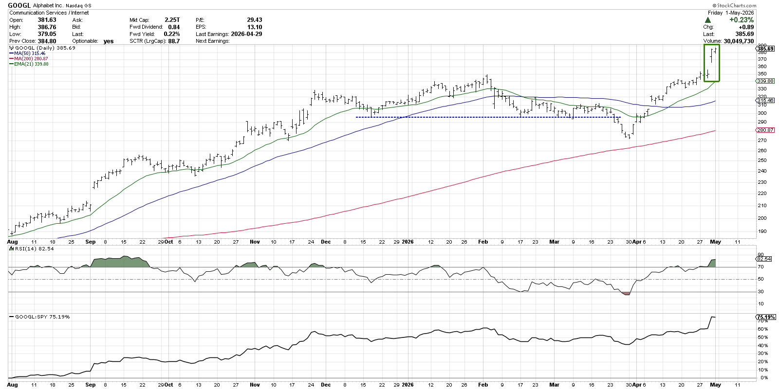
Friday saw a higher high and higher close for Alphabet, indicating that buying power is alive and well. If there is any price failure early next week, we’d consider the price gap as an area of potential support. That would imply a short-term support level around $165.
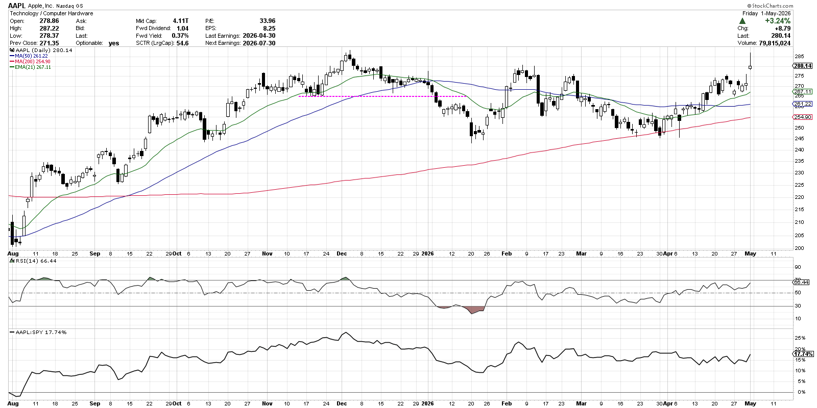
Following a strong earnings report after the close on Thursday, Apple (AAPL) gapped higher in Friday's session. But with a close back near the lows of the day, the candle chart features a “shooting star” candle that often indicates short-term bearish sentiment.
With a retest of new all-time highs and a gap higher into major resistance, the shooting star candle could not come at a less opportune time. This bearish reversal pattern suggests a “gap and fail” pattern into next week, but we’ll be watching the gap range closely to see if it holds as initial support.
Will the S&P 500 Confirm a Gap and Fail Pattern?
We can also observe a clear shooting star candle pattern on the chart of the S&P 500, with the open and close near the low of Friday’s trading session. The gap on the S&P 500 is not a significant gap, such as the ones we described on the chart of ORCL, but the price action after this small gap could end up serving as an important piece of evidence going into the first full trading week of May.
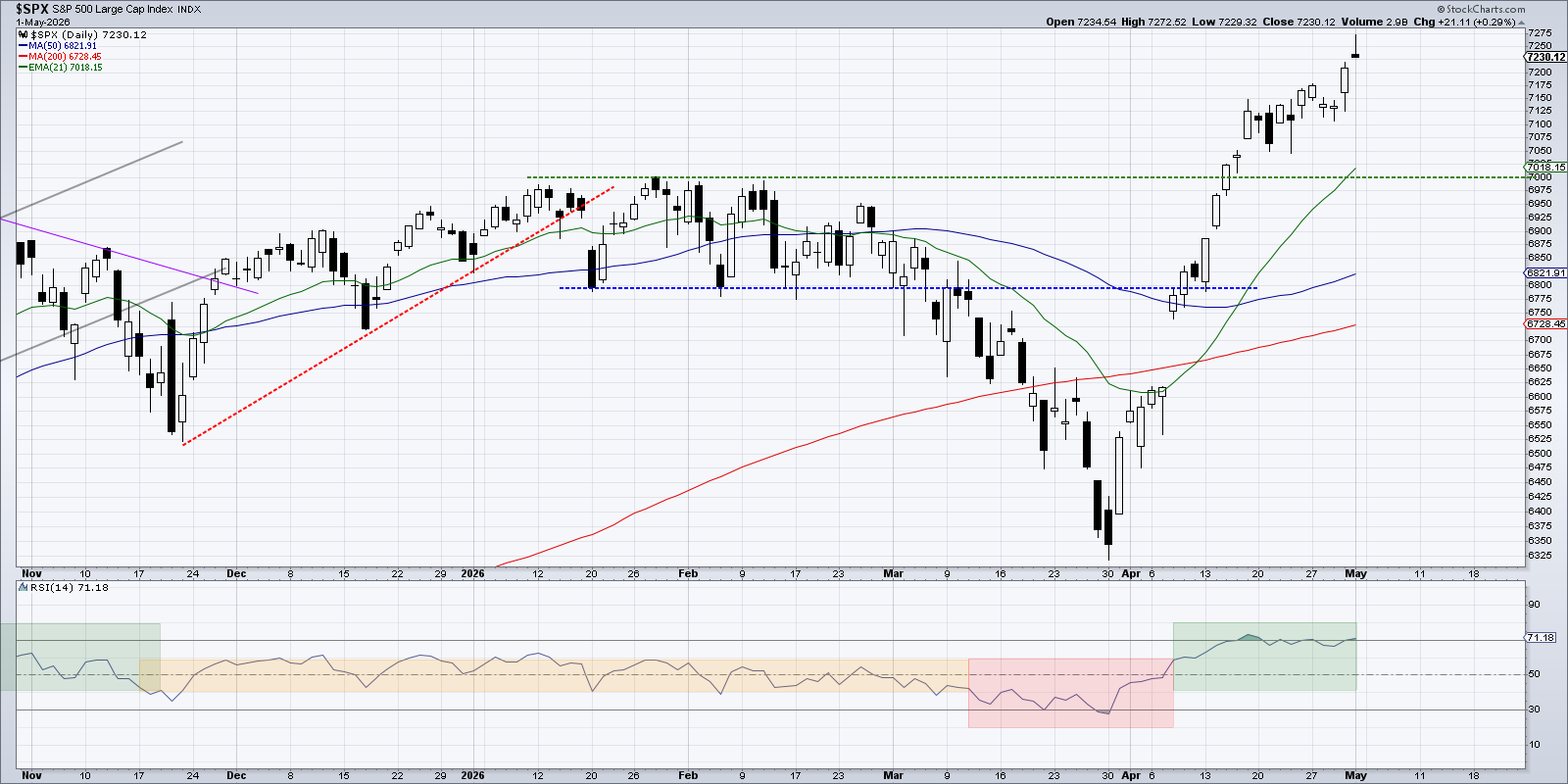
The 21-day exponential moving average is rising just above the 7000 level going into this weekend. If we see a short-term drop early next week, we’d be looking at the recent swing lows around 7050. This would most likely line up fairly well with the 21-day exponential moving average.
I was taught that “the most bullish thing the market can do is go up.” So while we’re always prepared for a potential pullback, a gap and run pattern confirmed in Monday's session would signal an “all clear” for the S&P 500 index. There’s no denying that equities have been boosted recently by rampant optimism. And a gap and run pattern could indicate even further optimism following a gap to new all-time highs.
This article was adapted from a viewer question we addressed on our Friday mailbag episode of CHART THIS with Dave Keller. For other great questions and thoughtful answers, head over to our YouTube channel!
RR#6,
Dave
P.S. Ready to upgrade your investment process? Check out my free behavioral investing course!
David Keller, CMT
President and Chief Strategist
Sierra Alpha Research LLC
marketmisbehavior.com
https://www.youtube.com/c/MarketMisbehavior
Disclaimer: This blog is for educational purposes only and should not be construed as financial advice. The ideas and strategies should never be used without first assessing your own personal and financial situation, or without consulting a financial professional.
The author does not have a position in the mentioned securities at the time of publication. Any opinions expressed herein are solely those of the author and do not in any way represent the views or opinions of any other person or entity.