Breakout or Breakdown? Why Last Week’s Rally Raises Red Flags
As a long-time technician, I have always been drawn to breakouts, especially those that are decisive and supported by strong volume. Last week, the Dow Jones Industrial Average ($INDU) and the Value Line Geometric Average ($XVG) staged upside breakouts, only for them to swiftly reverse and fall back below their respective resistance levels.
False Breakouts and Their Implications
When a breakout fails, price action typically resolves in one of two ways. In a bullish scenario, the index quickly regroups and surges back above resistance, logging significant new highs. Alternatively, if the failure is genuine, it usually triggers a meaningful market decline.
The mechanics behind this second outcome are rooted in market psychology. A sudden reversal traps late-stage buyers at the highs. As the price drops, these investors are forced to liquidate their positions. This wave of forced selling rapidly fuels downward momentum, which is further amplified by aggressive new short sellers entering the market.
A false breakout should never be viewed in isolation. It represents just one piece of evidence pointing toward a potential trend reversal. Before shifting to an aggressively bearish bias, confirmation remains critical, specifically through a decisive trendline break or reliable moving average crossover.
The Dow and Value Line Geometric Average
Chart 1 offers a classic example of this failure pattern. In early February, the SPDR Dow Jones Industrial Average ETF (DIA) pushed above a key resistance trendline but failed to sustain the move. Bearish confirmation quickly followed as price violated the red uptrend line and its 50-day moving average, triggering an uncomfortable short-term decline.
Bringing the analysis up to date, DIA staged another failed breakout last week, this time above a secondary, dashed resistance line. This latest rejection is reinforced by an additional negative signal: a bearish outside bar that formed last Wednesday. Adding to the technical weakness, the Relative Strength Index (RSI) peaked in early June and failed to confirm the Dow's subsequent higher high later in the month, locking in a clear bearish divergence.
Nonetheless, confirmation remains incomplete. The key uptrend line, currently slightly north of $505, has yet to be broken. Until that occurs, the false breakout should be treated more as a warning signal than definitive proof of a reversal, especially as there are no apparent divergences between the NYSE Composite and its NYSE A/D Line.
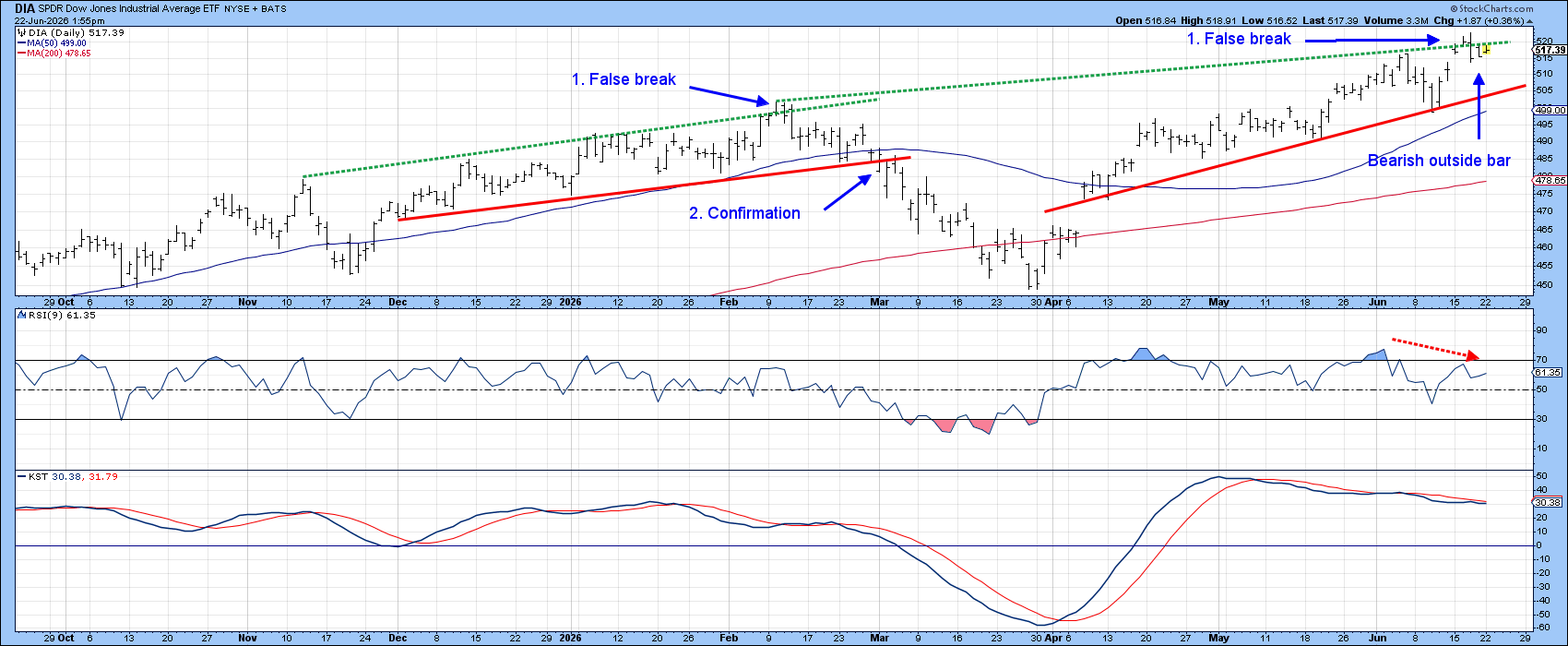
Chart 2 features the Value Line Geometric Average, which serves as a broad proxy for the "average stock." Its recent breakout is arguably more significant than the Dow's, because its resistance trendline has been tested far more frequently.
Key support rests just below 658, where both the red uptrend line and the 50-day moving average converge. This zone represents the critical level to watch for trend confirmation. Meanwhile, a bearish divergence is forming: the RSI is making a series of lower peaks even as the index posts higher highs.
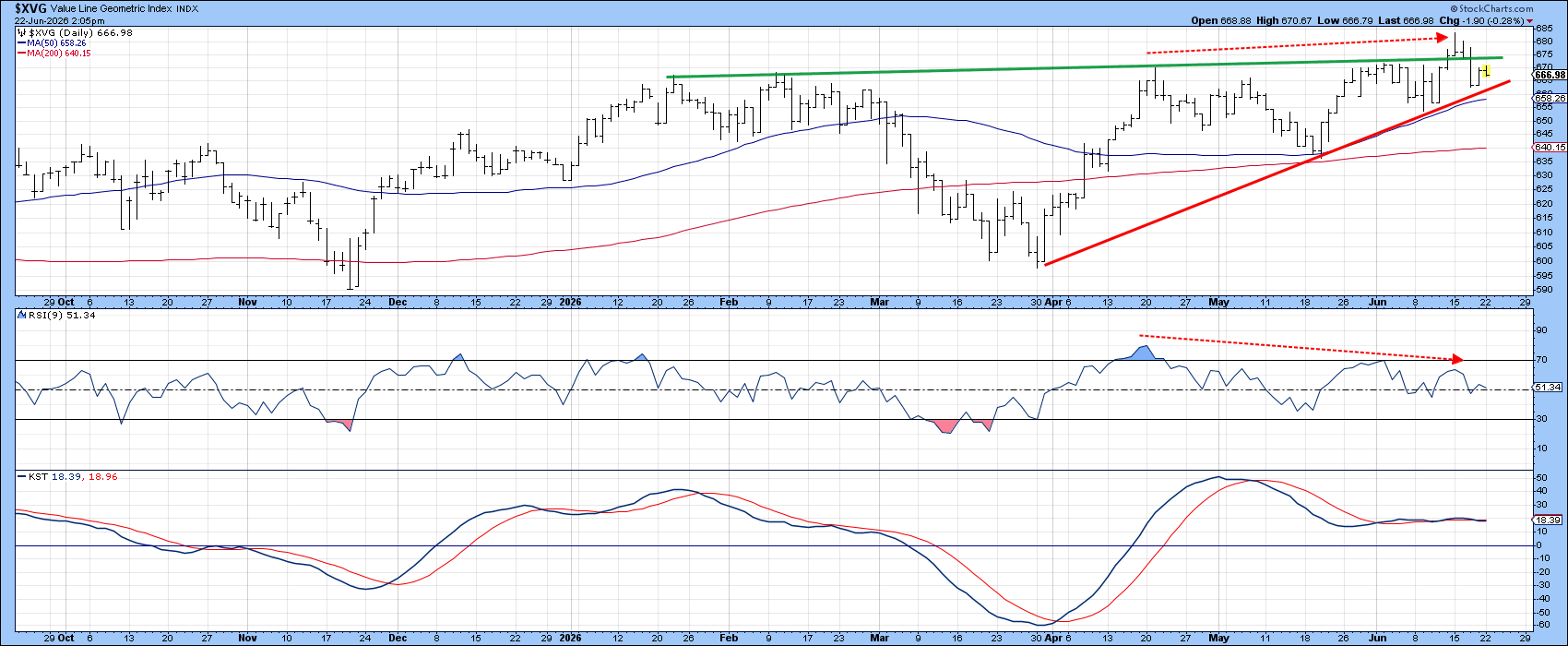
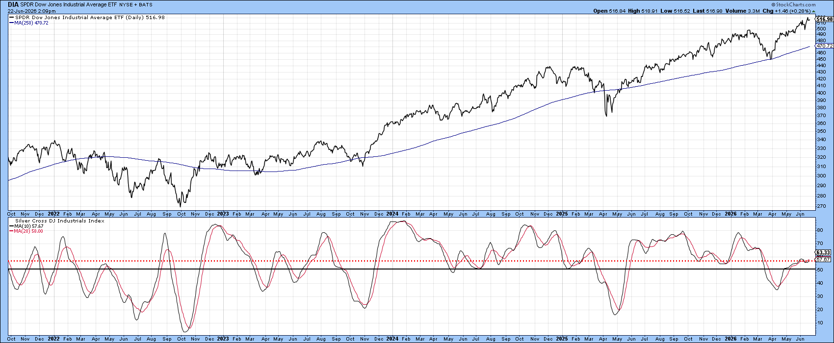
Chart 3 tracks market breadth by measuring the percentage of Dow Jones stocks with a positive "silver cross" (the 20-day EMA crossing above the 50-day EMA). To smooth out jagged raw data, the chart plots a 10-day moving average of this metric.
While the Dow recently hit a new all-time high, this breadth indicator barely climbed above its 50% equilibrium level. This weak participation is concerning; it reveals that the index's advance lacks broad support from its underlying stocks. The red horizontal line emphasizes that no recent market rally touching a new high has stalled with such low participation.
Though a continued market advance could eventually lift this indicator, the current reading flags a fragile foundation. If the potential false breakout from Chart 1 is confirmed, the lack of broad support increases the probability of a sharp market decline.
Good luck and good charting,
Martin J. Pring
The views expressed in this article are those of the author and do not necessarily reflect the position or opinion of Pring Turner Capital Group of Walnut Creek or its affiliates. The Six Stages of the Business Cycle are followed each month in Martin Pring’s Intermarket Review.