Will Crude Oil Fall Back to Where It Began?
If you believe the recent oil spike was driven solely by the Iran conflict and the subsequent closure of the Strait of Hormuz, you would likely conclude that prices are destined to fall back to where they stood in late February.
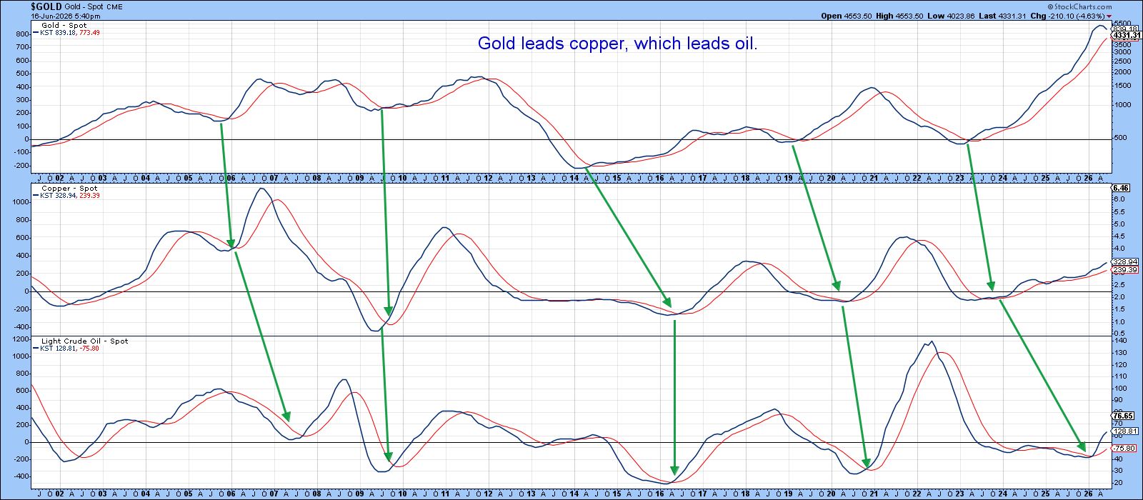
However, historical intermarket relationships suggest a different outcome. People may say “follow the money,” but, in this case, it’s more instructive to follow the sequence — a recurring progression between gold, copper, and crude oil that unfolds, in one form or another, during virtually every business cycle.
Gold tends to lead copper, and copper in turn leads crude oil, because each reflects a different stage of the economic cycle unfolding over time. Gold moves first as central banks ease policy and liquidity improves, making real interest rates fall and driving demand for a monetary hedge even before growth returns.
From there, copper follows, as expectations shift toward recovery and anticipation of industrial activity. Copper is sensitive to manufacturing and construction demand.
Crude oil lags because it depends on actual, realized economic activity— transportation, production, and consumption—which only increases once the expansion is firmly underway. In essence, the sequence progresses from policy response (gold) to growth expectations (copper) to tangible economic demand (oil).
The sequencing shown in Chart 1, where gold momentum turns first followed by copper and then oil, fits the typical business cycle progression, where monetary conditions lead expectations and expectations lead real demand. Just before the war, oil was already beginning to catch up to copper, indicating that a rally was fundamentally justified even without the supply shock; the war mainly amplified the magnitude, not the direction.
Looking at the current setup through the same lens in Chart 2, gold now appears to be entering an early topping process, while copper, the key leading indicator for crude, continues to advance strongly. If this sequential relationship remains intact, it suggests that the cycle is not yet mature from oil’s perspective, and crude likely still has further upside before reaching its own peak.
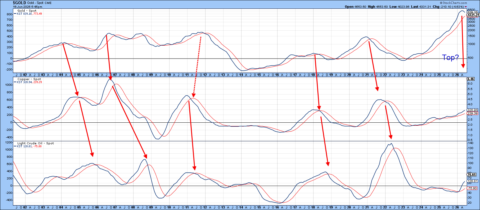
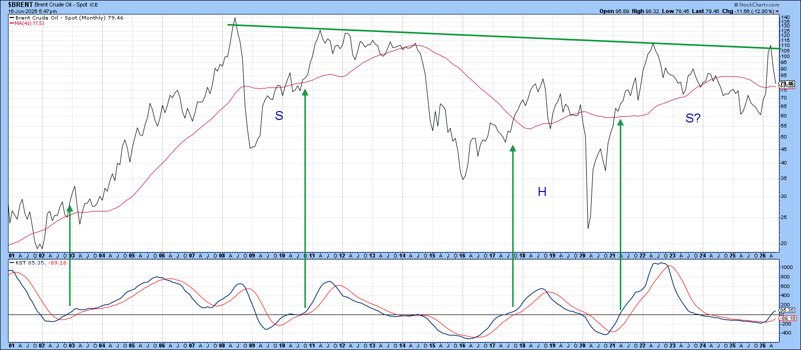
Chart 3 reinforces this outlook from a long‑term technical perspective. Price action appears to be in the terminal stage of forming a multi‑year reverse head‑and‑shoulders pattern. For full confirmation, the price would need to decisively break above the green neckline near the recent highs. I am not forecasting such a development, but a worthwhile attempt is certainly in the cards.
The long‑term KST in the lower panel supports this view as it has only recently turned bullish. The historical evidence, highlighted by the green arrows, shows that when it has previously reached a similar level just above zero, substantial rallies have typically followed.
That said, this doesn’t mean the path higher will be without obstacles. There are clear signs of near‑term strain. For instance, a related breadth indicator, the percentage of energy stocks in positive trends, has already reached historically overstretched, overbought levels that have acted as barriers in the past. While this doesn’t rule out further gains, it does create a definite headwind. Offsetting this concern, however, is that price remains above its 24‑month moving average, a key marker of longer‑term trend direction.
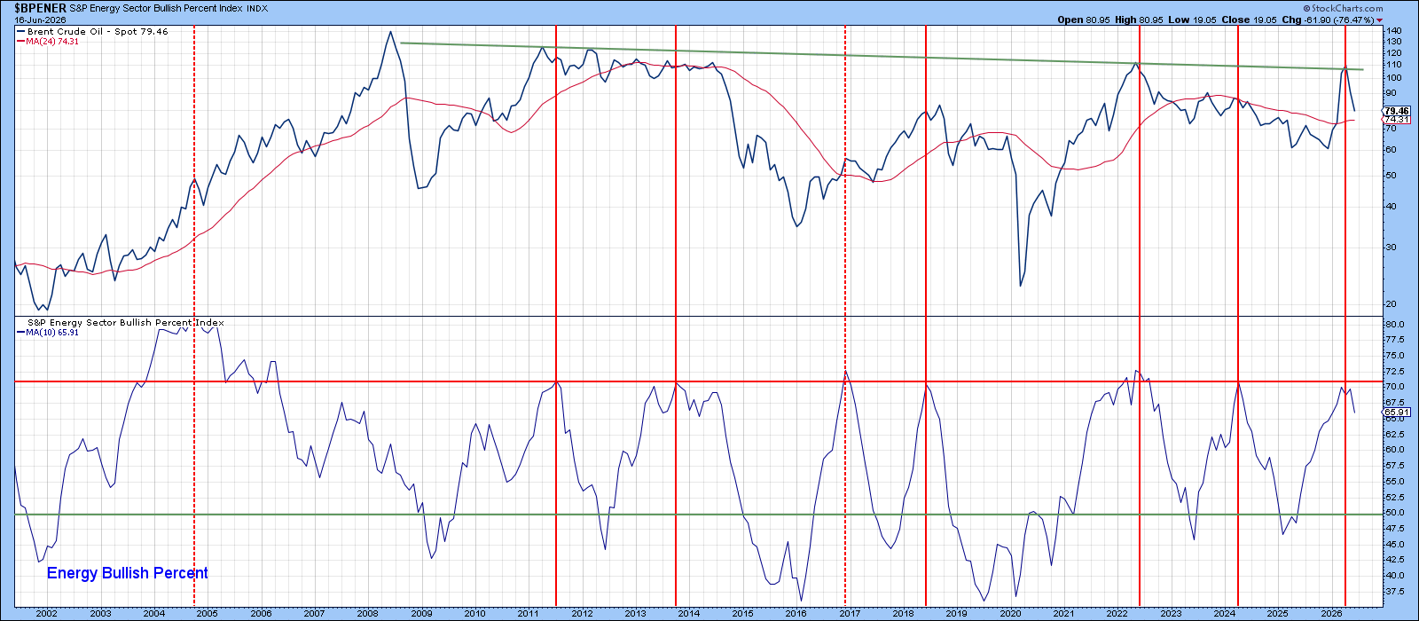
Chart 5 provides a partial counterbalance through the 12‑day Rate of Change (ROC). Readings that reach or exceed the blue “mega overbought” threshold always warrant attention, but their interpretation depends on context.
When such extremes occur after a prolonged advance (red dashed arrow), they typically signal exhaustion and carry bearish implications. In contrast, when a thrust emerges following an extended decline, as highlighted by the dashed-green arrows, it tends to mark a powerful bullish reversal, often signaling the early stages of a sustained and substantial rally.
Given that the 2026 thrust developed in the wake of a protracted downturn, the latter interpretation appears more applicable, implying that the recent strength is not a culmination but rather the beginning of a larger move, and that higher oil prices are likely.
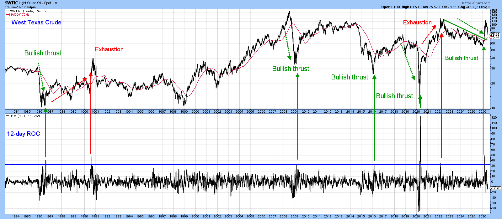
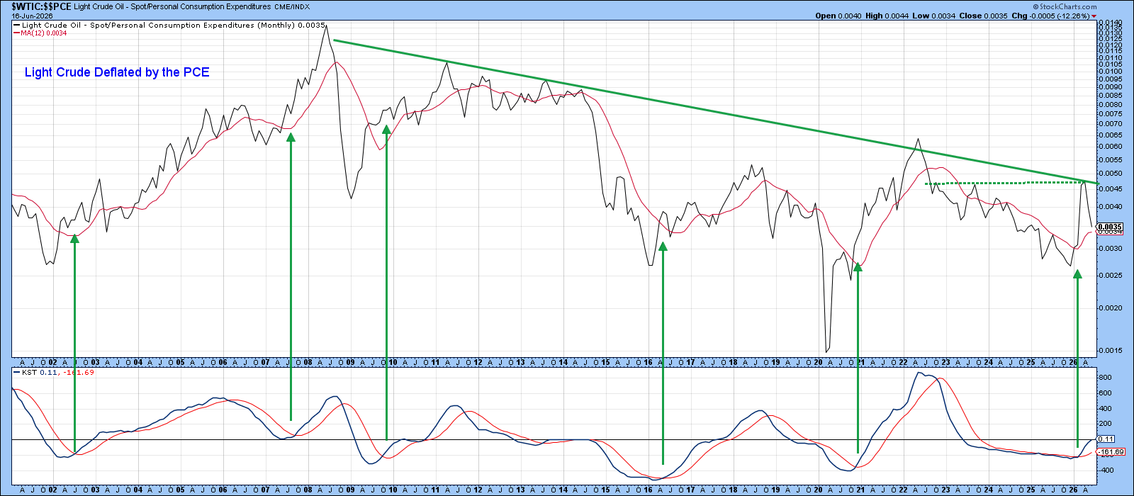
Chart 6 adds an important inflation‑adjusted perspective by deflating crude prices using the Fed’s preferred PCE measure. From this angle, the recent rally, while impressive in nominal terms, has so far failed to break above its post‑2008 downtrend line, underscoring that the longer‑term secular resistance remains intact. That said, price is now pressing into a crucial junction, where that downtrend intersects with what could become the neckline of a developing inverse head‑and‑shoulders pattern centered on this year’s highs. This makes the current level especially pivotal.
Adding to the constructive case, the KST indicator sits at a relatively low level, suggesting there is still ample room for upside momentum to build. Rather than making a firm forecast, the prudent approach is to watch whether price can sustain a breakout here and, more importantly, whether such a move evolves into something strong enough to pose a broader, economy‑threatening signal.
Good luck and good charting,
Martin J. Pring
The views expressed in this article are those of the author and do not necessarily reflect the position or opinion of Pring Turner Capital Group of Walnut Creek or its affiliates. The Six Stages of the Business Cycle are followed each month in Martin Pring’s Intermarket Review.