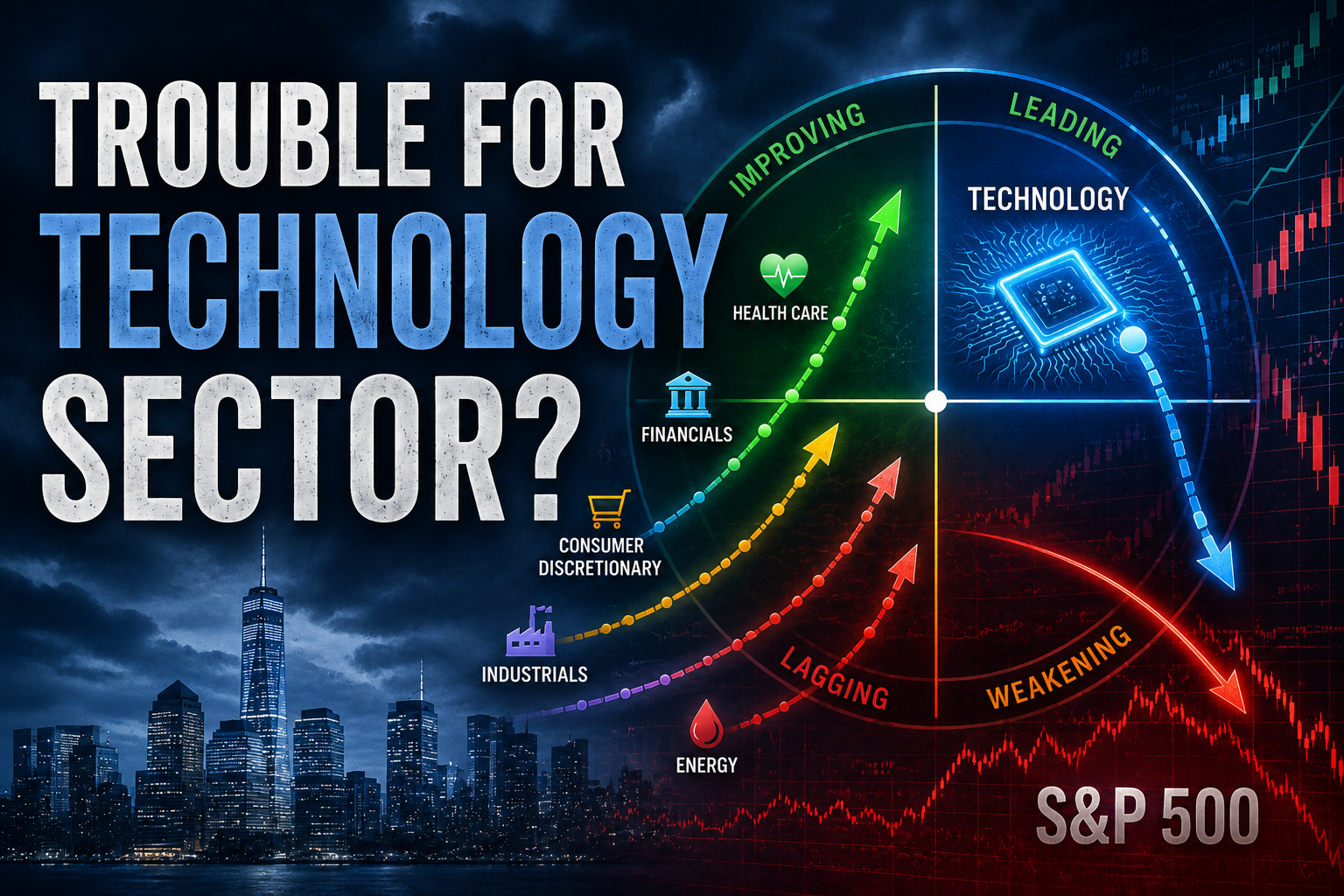
StockCharts Insider: Swing Charting and the Hidden Architecture of Trends
Before We Dive In…
Swing charting is one of the models featured in ChartSchool’s Trading Strategies & Models page. It’s a simple concept. But its simplicity is comparable to the bare foundations of an elaborate building. No matter how detailed and ornate a structure, if the foundation is faulty, that structure will collapse. So, that’s what swing charting aims to show. The core architecture of a trend. It’s so fundamental to analysis that sometimes it’s all you need.
We’re not going to cover the bare bones basics here. It’s easy enough to understand. You can also read the main article in ChartSchool. But I will elaborate on the logic behind this model and suggest a few ways to complement or extend its use.
The Market Generates More Information Than You Need
If you don’t have enough market information, you risk operating blind. But too much information can blind you as well.
The market produces thousands of tiny price fluctuations. Financial news often amplifies the noise with competing explanations. Market noise. The challenge is parceling out significance.
Like our analogy above, a house can be complex and ornate, even to the point of becoming a labyrinth. But the foundation is much simpler. This applies to market noise. You have to get to the foundation.
A swing charting perspective doesn’t care about the small fluctuations. It doesn’t pay too much attention to time, either. What it does look for are the significant beams holding the movements together.
Swing Charting Is a Simple Filtering System
In swing charting, there are really two main things to identify: key swing highs and lows.
Why focus only on these two points? Because an uptrend = higher swing highs and lows; and a downtrend = lower swing lows and highs. Conditions that don’t meet either fall into the “non-trending” category.
You’re probably wondering when a swing point (high or low) is a key swing point? That depends on the timeframe that’s important to you. It’s a matter of interpretation. But once you’ve identified these two things, the noise tends to dissipate.
Look at the chart below and you’ll see what I mean.
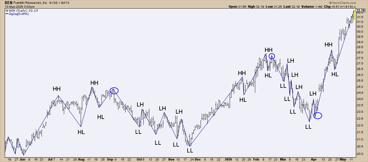
FIGURE 1. DAILY CHART OF Franklin Resources, Inc. (BEN).
To help me identify the key swing points, I used a Zig Zag line set to 5%, meaning it only draws swing points that exceed a 5% move. Here you can see the higher highs (HH), higher lows (HL), lower lows (LL) and lower highs (LH).
So what does this mean trend-wise? The green section is an uptrend. Yellow is a transitional non-trending condition. Red is a downtrend.
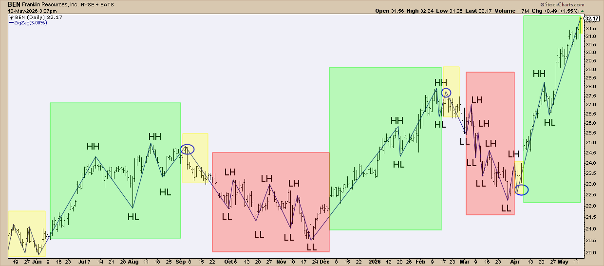
FIGURE 2. DAILY CHART OF BEN.
Do you see the “trends”? Now, there are many different ways to identify trends, and not all agree. Maybe you’re used to moving averages. Maybe you look at Keltner Channels, Bollinger Bands, or the Ichimoku Cloud. This method is a bit more basic. I find it helpful. Hopefully, you see the logic behind it.
So, how might you use it? This first one makes sense.
Breakouts Above the Swing Highs or Below the Swing Lows
Swing highs can often pose resistance. Swing lows can serve as support. So, when price breaks above a swing high and follows through, it often signals conviction. Same for the opposite.
Insider Tip #1: Use Swing Highs to Anticipate Bullish Breakouts and Swing Lows to Place Stop-Losses
Maybe a stock is in an uptrend and pulling back. Or maybe it’s in a downtrend. Either way, a few points above the swing high makes for a good entry point.
Remember: if an uptrend requires higher highs, then that’s what you’ll typically get during a strong trend or a reversal. If it’s a false breakout, that’s what stop-losses are for. Here’s the same stock again.
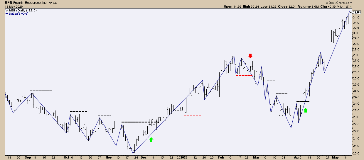
FIGURE 3. DAILY CHART OF BEN.
See the thin dotted black lines? Those were buy stop orders that were never triggered. The thick one accentuated by the green arrow is where the buy was triggered. Now take a look at the thin dotted red lines. These were trailing stop-losses that weren’t triggered. The thick red line, emphasized by the arrow, was where the position was stopped out.
As a side note, there are tricks to getting in earlier before the breakout, but that will have to be covered in another article, as it’s a detailed (yet simple-to-understand) tactic.
Insider Tip #2: Stack Swing Points with Momentum and Money Flow Indicators
You can see the swing points clearly. But is there momentum behind it? Is there capital flowing into the asset? Together, these three factors can help you assess the move.
Take a look at this chart of SPDR Gold Shares (GLD).
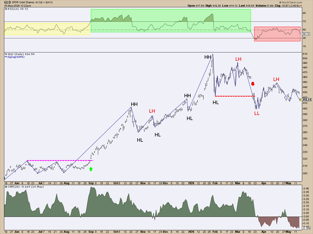
FIGURE 4. DAILY CHART OF GLD.
What Do the Swing Points Say?
The magenta line and green arrow show where the upper level of consolidation was violated to the upside. This kicked off the subsequent uptrend. Note the consecutive higher highs and lows (HH and HL). There was one lower high (LH) in November. It formed a symmetrical triangle that broke out to the upside.
Based on the swing points alone, the uptrend remained intact until the HL was violated in March. The red line and arrow show you the point where this happened.
Was There Momentum Behind It?
If looking at the swing points alone lacked certainty, the Relative Strength Index (RSI) could’ve given you a clue. Prior to the initial breakout, the RSI was in a neutral position (shaded yellow). Post-breakout, it was in its bullish range (shaded green). And once the HL was violated, the RSI fell into a bearish range (shaded red).
Was There Enough Capital Inflow Backing the Move?
The Chaikin Money Flow (CMF) is designed to measure the amount of money flowing into or out of an asset. Notice how it was well above the zero line even before the uptrend? The levels varied, but buying pressure prevailed. Once the HL was taken out in March—coinciding with the RSI “oversold” level and bearish range—the CMF fell below the zero level. At that point, selling pressure was dominant.
And That’s a Wrap…
Swing charting is both a model and a strategy. True, it slows you down a bit. But that’s an advantage. It increases your accuracy. It makes you think about every turn in the market. Yet it's simple enough to keep you from overthinking the noise. It strips the trend down to its foundation. And once you begin seeing trends that way, charts look simpler. You stop getting lost in the fog of market noise. Instead, you stick close to the architecture holding the trend together.