StockCharts Insider: The Insider Guide to Stacking Performance Spreads
Before We Dive In…
The Performance Spread is a new indicator on StockCharts. It may not look like much at first. Compare a stock to a benchmark; line's up means it’s outperforming, line's down means it’s lagging. Too clean? Many people stop right there, as if a single line does the job. If that’s how you use it, you’re missing at least 75% of what it can do.
The real value’s in the stack. Stacking performance spreads falls somewhere between a technical and fundamental read; really, it’s more intermarket analysis. In my opinion, that’s the true power behind this indicator.
The Basics (Fast)
The Performance Spread is a relative strength indicator that looks at the difference in percentage change between a primary security and a baseline symbol. An example would be comparing a stock to the S&P 500 (SPY). What the indicator shows is whether your primary security is leading or lagging your chosen benchmark, with the zero line demarcating outperformance and underperformance. But that’s just one comparison.
One Benchmark’s Usually Not Enough
So, a stock is leading the S&P 500. You found a winner, right? Pause. What about its competitors? What about its sector and industry, or anything else that’ll give your read more nuance?
The idea of “beating the market” is a bit overrated, if by “market” you mean the S&P 500. In a hot sector, half the stocks can beat the S&P without really doing anything; many can simply ride the tide. But stack it against a few more stocks or indexes and you’ll start seeing differences. Maybe you’ll see the why behind the move. Maybe you’ll discover there’s nothing substantial driving it.
How you choose your comparisons will vary. The important thing is the logic behind each combination. Here are a few I came up with. I’ll explain why I chose each one. In the end, you’ll come up with your own, and it’ll probably differ from mine.
The Bitcoin Stack
Instead of just checking whether Bitcoin is up or down against the dollar, this combination aims to measure its strength against another major cryptocurrency, a safe-haven hedge, a tech-heavy index, and a crypto-adjacent business.
- $BTCUSD vs. $ETHUSD: What's the risk appetite within the crypto market?
- $BTCUSD vs. $GOLD: How does it compare to a competing "hard asset" story?
- $BTCUSD vs. $NDX: Is it trading like tech growth, or something else?
- $BTCUSD vs. Coinbase (COIN): Is the crypto business amplifying or lagging the underlying asset?
Let’s take a look.
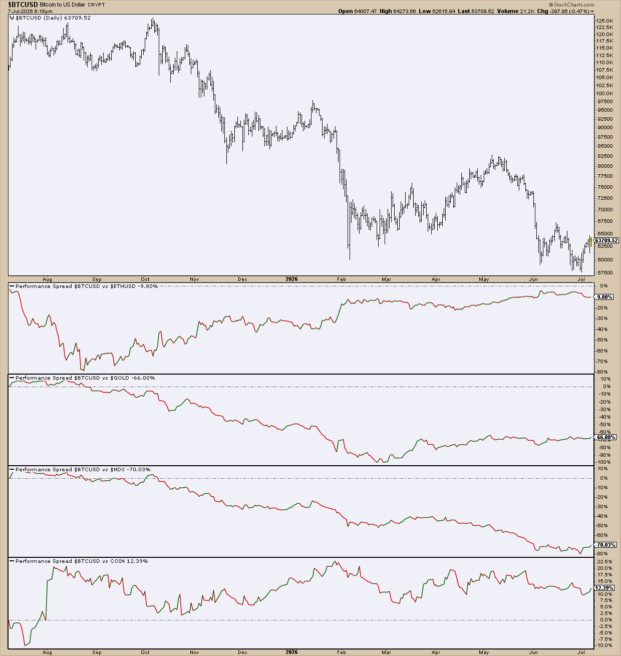
Bitcoin’s rising against $ETHUSD, but it’s still underperforming the crypto by -9.81%. The safe-haven hedge is starker, as it’s down flat by -66% against spot gold. Against hi-beta growth stocks, it has fallen -70%. The only good news is that it’s outperforming Coinbase +12% and holding sideways.
Put together, it kills the “digital gold” thesis. As a speculative hi-growth asset, the story is equally dismal. It’s basically lagging on every front except its own exchange. That’s an incredibly weak place to be.
The Energy Sector Stack
Energy has been a big story in 2026, particularly since the US - Iran conflict began in February. Suppose you wanted to evaluate Energy Select Sector SPDR Fund (XLE) as an asset. Here’s how you might compare it.
- XLE vs. $WTIC: Is the sector capturing WTI crude oil gains, or lagging behind it?
- XLE vs. $SPX: Are we seeing a sector rotation signal?
- XLE vs. JETS: This is an inverse cost-pass-through check; are airlines absorbing energy's move?
- XLE vs. $USD: How much of energy's move is real sector strength versus the dollar simply weakening or strengthening against other currencies?
Take a look.
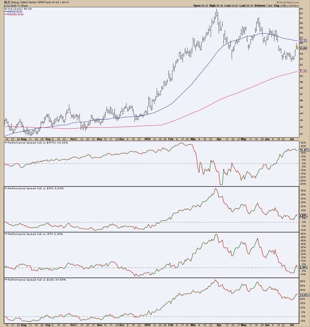
Looking at the stack, it makes you wonder whether XLE got a little ahead of itself. The spreads suggest that perhaps a little bit of air is coming out. XLE has been rising against WTI crude, meaning that it’s capturing more gains than the commodity itself. Besides this one, the other spreads are losing steam. XLE’s lead against the broader market has all but evaporated. XLE vs. JETS tells you that airlines have gone from getting crushed by energy’s performance to keeping pace. And while XLE’s performance against the dollar remains positive, it shows that its dollar-adjusted strength is starting to cool as well.
These are just two examples, but there are plenty more. Here are eight more to consider:
Apple (AAPL) - Classic Tech
- AAPL vs. $SPX: Is it beating the broader market?
- AAPL vs. $NDX: Riding the tech wave, or leading it?
- AAPL vs. XLK: How is it leading or lagging among mega-cap tech stocks?
- AAPL vs. MSFT: Winning or losing ground to its closest rival?
Gold ($GOLD) - Safe Haven and Dollar Devaluation
- $GOLD vs. $USD: The classic currency debasement narrative check.
- $GOLD vs. GDX: Are miners confident about gold’s rally, or is bullion going it alone?
- $GOLD vs. $TNX: Is the move being driven by real-rate expectations?
- $GOLD vs. $SILVER: Is it time to buy more gold or more silver?
Nvidia (NVDA) - The AI Trade
- NVDA vs. SMH: Is Nvidia leading the AI trade, or is the whole semiconductor sector getting pulled along with it?
- NVDA vs. TSM: Is AI value shifting toward foundries or staying with the company designing them?
- NVDA vs. AMD: Is one of Nvidia’s closest rivals closing the gap?
- NVDA vs. $NDX: Is this an Nvidia-specific story, or is broader tech lifting or pushing down everything at once?
Regional Banks (KRE) - Credit Quality
- KRE vs. $TNX: Are regionals moving with rates or is something else driving them?
- KRE vs. XLF: Against larger banks, does regional bank performance reflect a credit-quality flag, or just a size effect?
- KRE vs. HYG: Is credit risk appetite pricing in some trouble that regional banks haven't confirmed yet?
- KRE vs. $SPX: How are regionals doing against the broader market?
Small Caps (IWM) - Risk Appetite Barometer
- IWM vs. SPY: The classic small caps vs. broad market read.
- IWM vs. HYG: Is credit risk appetite backing up or going against small-cap strength?
- IWM vs. $TNX: Are small caps trading like the rate-sensitive group they actually are?
- IWM vs. $VIX (inverse): Is small-cap weakness showing up before volatility spikes, or after?
Walmart (WMT) - Grocery Staple Trade
- WMT vs. XLP: Leading or lagging its own sector?
- WMT vs. COST: How’s it performing against its closest bulk-retail rival?
- WMT vs. TGT: Winning or losing ground in general-merchandise share?
- WMT vs. $SPX: How is Walmart doing against the broader market?
Healthcare/Biotech (XLV/IBB) - Defensive vs. Highly Speculative
- XLV vs. $SPX: Are we seeing signs of defensive rotation?
- XLV vs. IBB: Is it risk-off or risk-on in the healthcare sector?
- XLV vs LLY: How’s it doing specifically against a top big pharma name?
- XLV vs. XLP: Which defensive flavor are investors choosing, health or consumer caution?
Homebuilders (XHB/ITB) - Rate-Cuts and Rentals
- XHB vs. $TNX (inverse): Are falling mortgage rates showing up as strength in homebuilder stocks?
- XHB vs. $SPX: Is housing leading or lagging the broader market?
- XHB vs. HD: New construction story, or broader renovation and moving demand?
- XHB vs. AVB: Is housing demand shifting from renting to buying, or moving together with rentals?
This is a personalized list of spreads I would do. You probably have your own ideas. So, go ahead and experiment with it.
Insider Tip #1: A Stock Can Be Winning and Losing at the Same Time.
What seems like a contradiction is actually an insight. That’s the point of stacking these spreads. A single spread may give you a verdict (like, is it beating the S&P). But a stack gives you a better “diagnosis” of what’s going on.
Insider Tip #2: Pay Attention to When Every Spread Starts Moving in Agreement.
Synchronized movement across different benchmarks is a stronger signal than a single spread. It’s also your early warning system that something bullish or bearish is likely to happen.
Insider Tip #3 - Pair a "Boring" Spread With a More "Exotic" One.
An exotic comparison (a rival or related asset) analyzes an asset’s movement from (sometimes) a more unusual angle. On their own, they can overstate what’s happening. The boring comparison (broad market or sector ETF) is like a control group. It tells you whether the asset is earning its keep from a larger perspective. Pairing gives you a lens zoom to better diagnose an asset’s performance.
And That’s a Wrap
Performance Spread is a one-panel tool. You can use it that way, but it’s best if you stack them. Choose the right spreads and the panels become a diagnosis tool. The stacks I provided are a starting point; they’re not rules, they’re suggestions. The point is to ask the right questions before you build your own. What would confirm or kill the stock’s narrative? What would lend support or skepticism toward it? Once you get those together, you can start building a real case.