StockCharts Insider: Tracking MTUM's Rotations Before the Next Rebalance
Before We Dive In...
Momentum stocks have been yielding outsized returns over the last few years. Recently, however, they started to unwind. The chip industry was one of its biggest drivers, according to Axios. When the Fed’s June rate decision was announced, investors got spooked. That’s a clean explanation as to what happened, but it's not much of help to anyone after the fact.
Axios used iShares MSCI USA Momentum Factor ETF's (MTUM) as its proxy. That’s because many investors who wanted exposure to momentum trade likely bought shares of the ETF. MTUM holds 125 stocks, but just ten make up 43.28% of the holdings. Full reconstitutions happen semi-annually in May and November, with lighter, quarterly rebalances in between to keep weights within limits. This gives you plenty of time to assess what’s going on with the fund.
Now here’s what I want to draw attention to: what could you have done to anticipate the rebalance before it became official? Maybe you’d prefer to create your own MTUM-adjacent portfolio. We’ll cover that in a separate article. For now, let’s look at how you might have monitored the momentum narrative before the official rebalance took place.
The Fundamental Story Doesn’t Give You the Whole Picture
Momentum stocks are those that have been outperforming for the past six-to-twelve months. Yes, it’s backward-looking, and the definition applies to both fundamental and technical approaches. But the way both are monitored differ.
MTUM re-scores every stock's risk-adjusted momentum at each reconstitution with minor interim adjustments each quarter. What we’re interested in here is the technical footprint and whether its movements can be seen on a chart before the fund’s official rebalance date.
Start With the Top Holdings (unless you want to tackle all 125)
MTUM weights its fund by momentum score and market cap. Each stock’s weight tops off at around 5%. This means the top ten holdings drive most of the fund’s return. So, for now, let’s focus on the top holdings.
Take a look at my ChartList below:
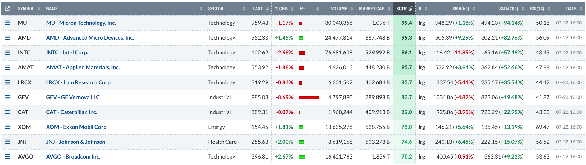
I took the top 10 holdings info from Yahoo Finance. It represents the fund’s main exposure (or nearly half of it). If you look toward the right of the list, you’ll see that I included EMA 50 and EMA 200 to show what percentage a stock is above or below either. Comparing this to the StockCharts Technical Rank (SCTR) reading, it helps me better gauge a stock’s movement at a glance, whether it’s a pullback or a reversal. I also included the Relative Strength Index (RSI) to tell me where its reading currently stands.
Use RRG to See Relative Performance Against the S&P 500
Relative Rotation Graphs (RRGs) are designed to analyze and track rotations across four quadrants: Leading, Weakening, Lagging, and Improving.
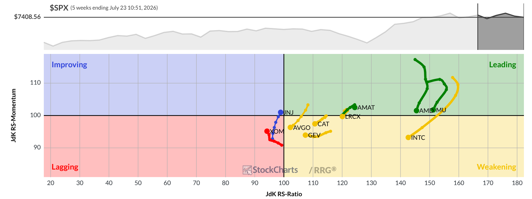
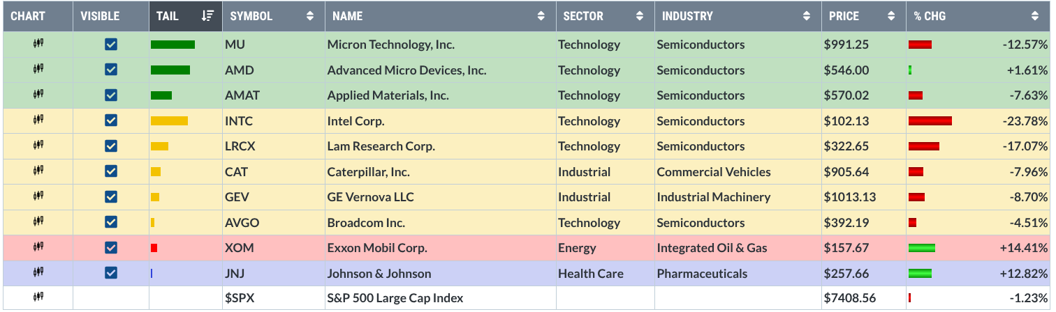
So what’s the point of viewing an RRG? If all you’re looking at is a price chart of MTUM, you can’t see what’s happening internally. Here, you get to see the fund’s biggest drivers, the state they’re in, whether a rotation is taking place (and for how long), and the sectors they represent, which might entail more research on a sector level.
You’re not trying to anticipate fund rebalance. But you are looking at internal relative strength to better understand where the fund is heading. Many of the rebalances might occur among the smaller holdings; you can look at those as well if you have the time. As for me, I just want to see what’s happening with the top holdings which, again, make up nearly half of the fund’s exposure. Also, remember that you can change time frames to get an even larger or more granular picture.
Look at the Individual Components
Now that you see the big picture from several angles, it’s probably a good idea to zoom in. You’ll want to do all ten but, for this article, I’ll focus only on two for brevity.
Take a look at Advanced Micro Devices, Inc. (AMD), which shows a relatively large rotational tail in the Leading quadrant.
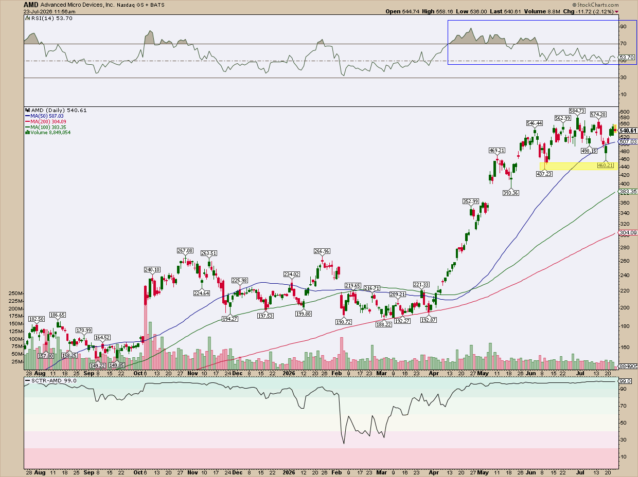
Before we start, keep in mind there’s a myriad of ways to do this. What I’m demonstrating is just one of the ways I might approach it. So here’s what I’m looking at:
The RRG chart shows AMD trailing downward toward the Weakening quadrant. Yet the Relative Strength Index (RSI) has been occupying a bullish range since April and continues to hold. This corresponds with the SCTR reading, which also began occupying the bullish range in April. Also note how the 50-day, 100-day, and 200-day EMA are in perfect order and spread out in full sail.
Now the question is whether AMD is topping or merely pulling back. The stock recently dipped below its 50-day EMA but bounced back above it just as quickly, which is a good sign for the bulls, for now at least. The $440 area is the level to watch on the downside: as long as AMD holds above it, the broader uptrend stays intact, which the EMA alignment continues to support.
A break below $440, however, would point to a deeper correction. On the upside, $600 is the level AMD needs to clear to confirm the advance is continuing rather than stalling out. Watching how AMD behaves around these two levels, $440 support and $600 resistance, is one of several ways to gauge whether this pullback is healthy or the start of something more bearish. And again, this is just one of ten holdings worth this kind of look if you're tracking MTUM's internals.
Now let’s take a look at Exxon Mobil Corp. (XOM); the name occupying the Laggard quadrant but exhibiting improvement.
Among MTUM’s top holdings, XOM is the laggard, but one that recently trailed into the Improving quadrant. What does that improvement look like on a chart?
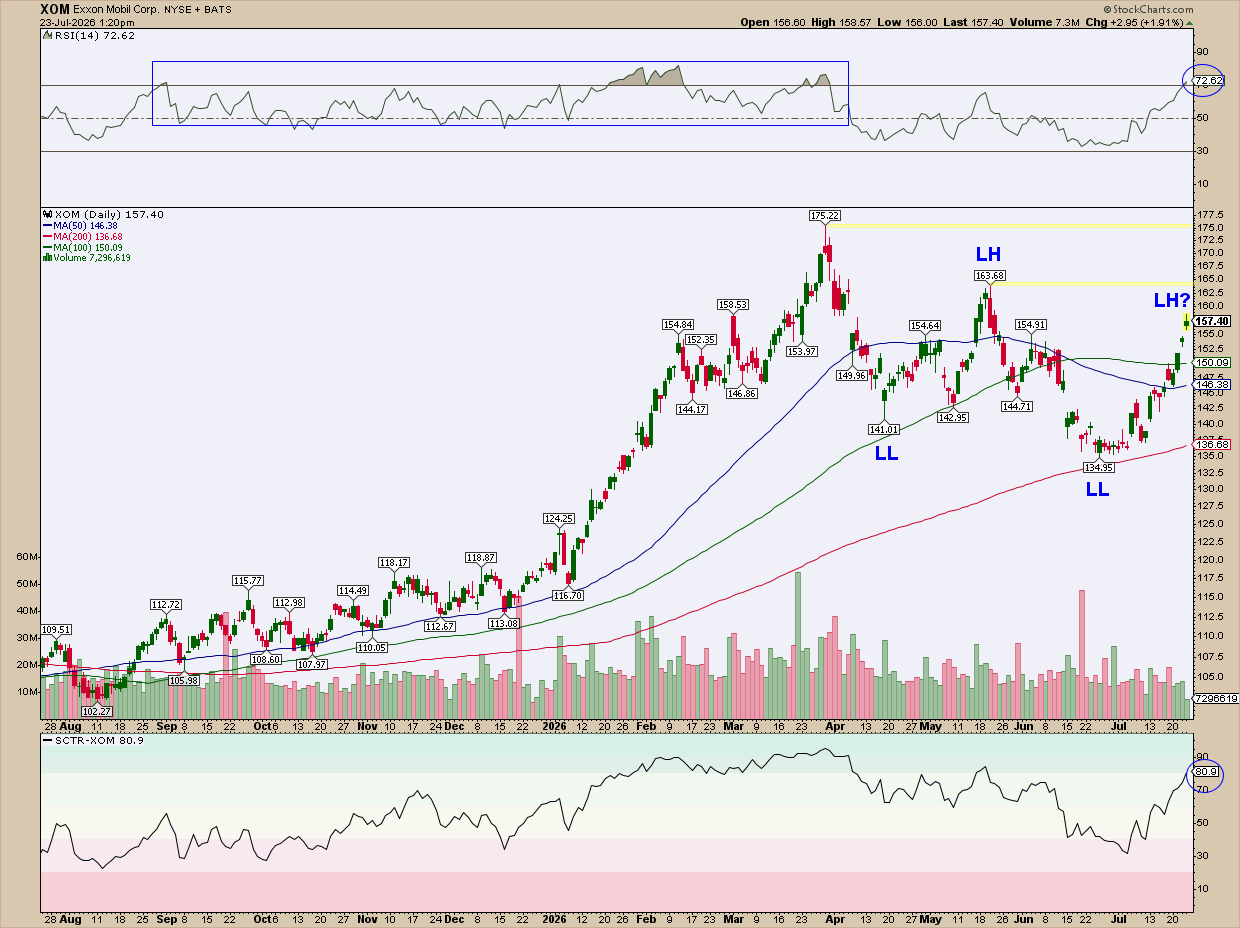
You can see where the RSI broke down from its bullish range (see rectangle). It recently moved above 70, and it coincides with a bullish reading that pierced the 80 line in the SCTR line. Does that signal a top, or the potential beginning of a new bullish range? The answer to that is to be found in the price action.
The 50-day EMA crossed under the 100-day EMA, which, if anything, illustrates the weakening of the trend. More importantly, however, note the series of lower lows (LLs) and lower highs (LHs) which signal an intermediate-term downtrend. Whether XOM continues down this path or breaks it depends on whether it breaks above the previous LH or establishes a new one. Those ranges are marked by the yellow shading and are likely to serve as resistance.
A Few Insider Tips to Consider
You’ve probably guessed that we’ve barely scratched the surface, and you’re right. There’s so much more you can do. I’ll let you take it from here. Here are a few additional tips to consider.
Insider Tip #1: Check the Sector Concentration.
Check MTUM’s sector breakdown. A fund that’s this concentrated is highly exposed to single macro shocks, especially if it impacts semiconductors and tech. If your RRG shows several top holdings from the same sector rotating together, you might treat that as one signal, not several.
Insider Tip #2: Timing Should be Rate-Sensitive.
As the Axios article I referred to earlier points out, momentum tends to cluster around interest rate decisions. You might want to keep a chart of the 10-Year Treasury Yield ($TNX) next to your RRG. A change in interest rates alongside rotations out of the Leading quadrant may be a stronger signal than either on their own.
Insider Tip #3: Don't Wait for the Reconstitution Date to Figure Out What’s Happening.
That’s the whole point of this exercise. No surprises. MTUM's reconstitution happens semi-annually (and rebalances take place quarterly). If your top-holdings ChartList already show broad rotation into Weakening, you might anticipate some changes, at least on the technical front. If you have an MTUM adjacent portfolio, now might be the time to start rebalancing your own similar momentum portfolio. Again, MTUM has a fundamental side to its scoring, so keep that in mind.
Insider Tip #4: When Momentum and Trend Disagree, You’ll Have to Decide What’s More Reliable.
A stock can flash a high SCTR score while its trend structure is breaking down. The reverse can also happen. The stock can soar to record highs while momentum is breaking down. This is where you’ll have to look at levels objectively, assess the broader sector/market/economic scenario, and determine the opportune points of entry and exit.
And That's a Wrap
I started with the Axios article breaking down momentum stocks using MTUM as its proxy. Many investors follow similar articles to understand what’s happening. Such articles are informative. But they’re often too late, and they don’t say enough. More importantly, most are missing the technical component. Sadly, that’s one component that can show you what’s happening well before the news breaks.
We broke down MTUM to its top holdings and covered just a few ways to observe the fund’s internals. This is just the tip of the iceberg. But it illustrates a point: technicals are often the missing half of the story. And it helps to follow them along with everything else that most mainstream investors follow. Maybe you’ll want to build your own MTUM-adjacent momentum portfolio. That’ll be next up. Stay tuned.