Tech Stocks Take a Hit. Is the Market Sending a Different Signal?

Key Takeaways
- Tech stocks stumble, but the broader bullish trend remains intact.
- Rising Treasury yields and oil prices pose risks.
- Learn how to spot shifts in stock market leadership and identify potential warning signs.
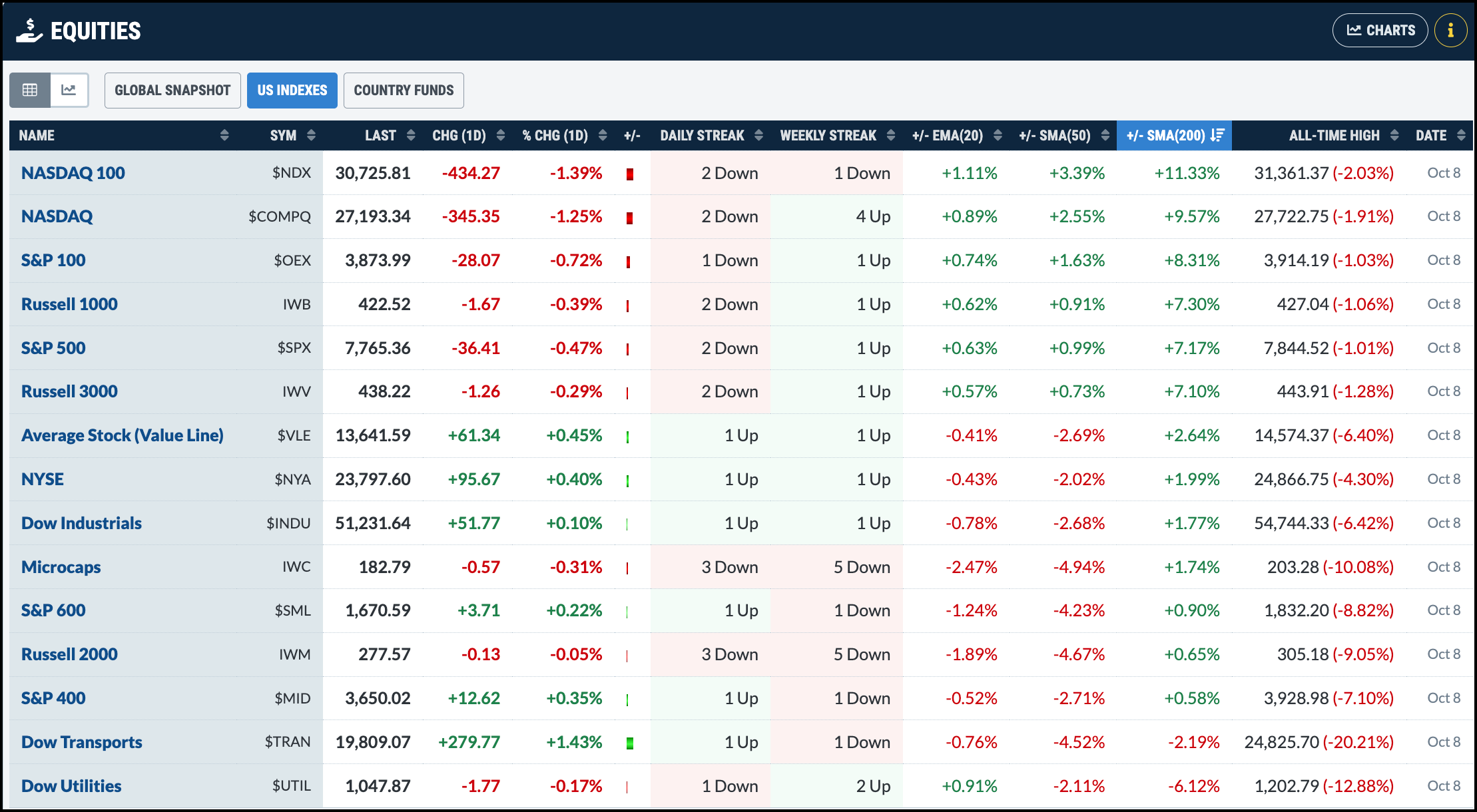
Earlier this week, it was all about tech stocks, with semiconductors leading the charge and pushing the broader market higher. Thursday, however, brought a change of pace. The S&P 500 ($SPX) and the Nasdaq Composite ($COMPQ) closed lower, while the Dow Jones Industrial Average ($INDU), S&P 400 Mid Cap Index ($MID), S&P 600 Small Cap Index ($SML), and the Dow Transports ($TRAN) all closed higher.
Is this a sign that investors are rotating out of Technology and into other areas of the market? It’s possible, but one day’s price action isn’t enough to call it a trend reversal. You’ll need to look at the charts to see what’s really happening.
Analyze the Stock Market Objectively
One of the best places to start is the StockCharts Market Summary page. In the Equities panel, sort the indexes by the +/- SMA(200) column. The Nasdaq 100 ($NDX) and Nasdaq Composite are trading well above their 200-day simple moving average (SMA). Despite Thursday’s selloff, the longer-term trend for tech-heavy indexes is still bullish.
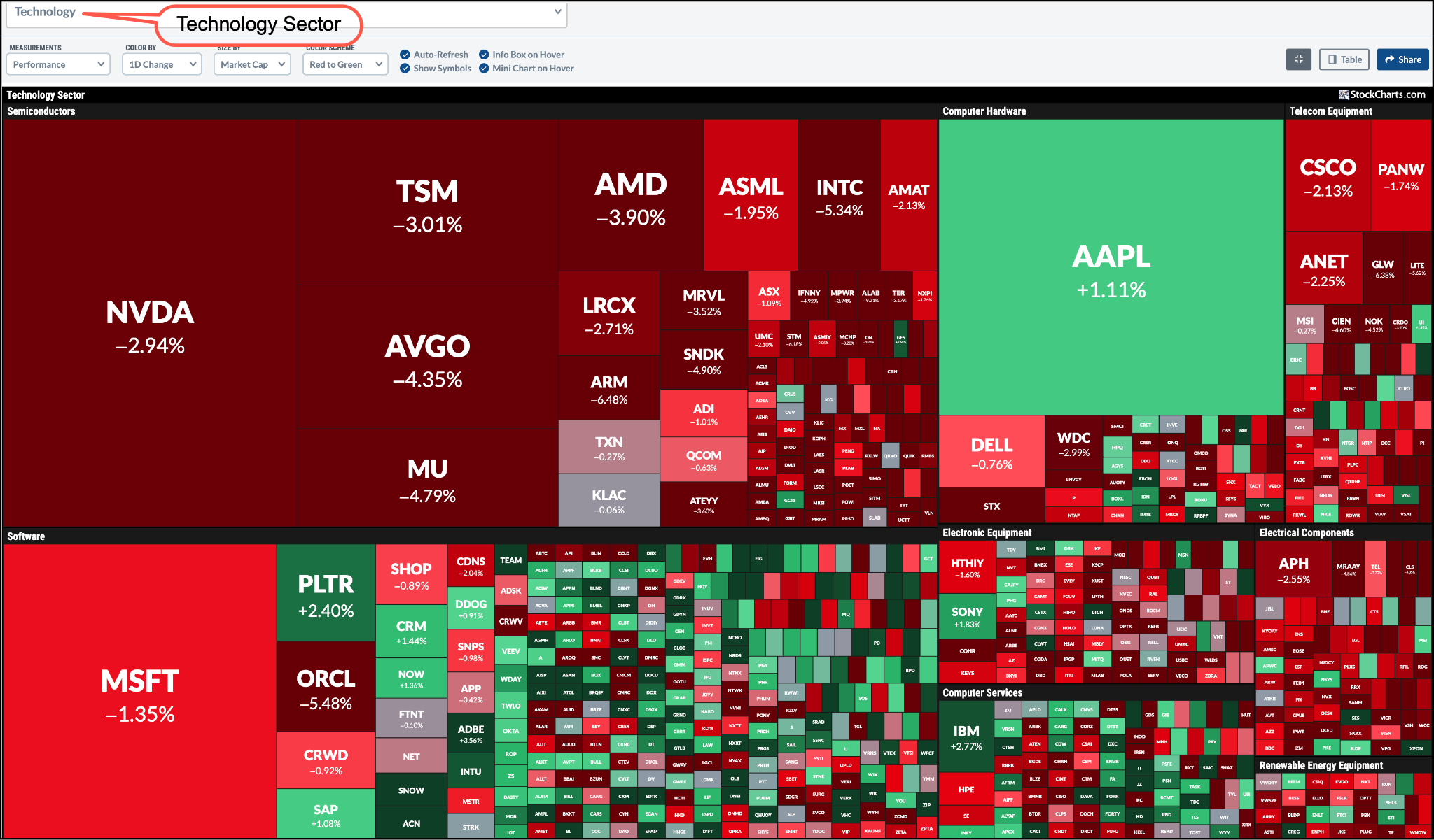
Thursday’s Technology selloff was triggered by the news that OpenAI’s revenue was $20 billion below what it previously indicated. This, of course, made investors worry about the AI trade and sent them rushing out of AI-related stocks. Semiconductors took a pretty hard hit.
You can see this clearly in the MarketCarpet for the Technology sector. Almost every semiconductor stock is shaded dark red, which tells you how widespread the selling was.
Then, another headline, that the Trump administration was suspending Microsoft from sponsoring foreign workers for green cards, weighed on technology stocks.
Together, these developments gave investors reason to take profits in tech and park their cash elsewhere. Thursday’s sector performance (see US Sectors panel in the Market Summary page) shows that eight of the 11 S&P sectors closed higher, with Energy leading the way.
Energy stocks got a boost from rising oil prices as renewed tensions in the Middle East made headlines. This is another indication that money is finding its way to other areas of the stock market.
What are the Charts Saying?
Let’s look at the big picture. Structurally, mega-cap technology stocks remain in a solid bullish trend. Pull up a chart of the Invesco QQQ Trust (QQQ), which tracks the Nasdaq 100, and you’ll see that it’s trading above its 21-day exponential moving average (EMA), which is sloping upward.
The Relative Strength Index (RSI) in the lower panel is between 50 and 70. This suggests that momentum has cooled somewhat, but it hasn’t deteriorated enough to signal a breakdown in the bullish trend. In other words, Thursday’s selloff didn’t do much technical damage to change the bigger picture. Still, you can’t ignore the macro headwinds.
Monitor Treasury Yields
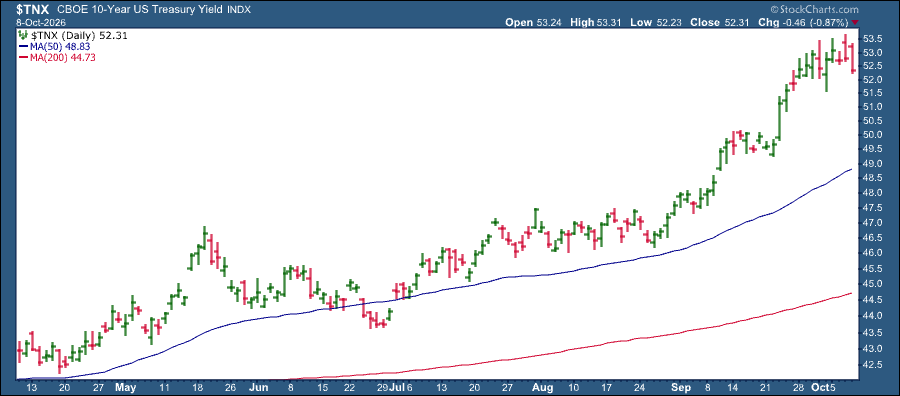
Rising oil prices and elevated U.S. Treasury yields are two areas of concern. Yields pulled back on Thursday, but they are still relatively high. The 10-year US Treasury Yield Index ($TNX) is above 5%, which, relatively speaking, is high.
If higher oil prices push up transportation and production costs, inflationary pressures could persist. This could push Treasury yields higher and create problems for interest-rate-sensitive areas of the market, such as homebuilders, financial stocks, and real estate. Other areas can also be impacted if interest rates rise even higher.
In this market environment, investors should keep an eye on Treasury yields. One way to keep track of yields is to study the price action in the KBW Bank Index ($BKX). The index has been trending lower with a series of lower highs and lower lows; it’s below its 200-day simple moving average (SMA), its 21-day EMA has a negative slope, and its performance relative to the S&P 500 stands at -0.22%%.
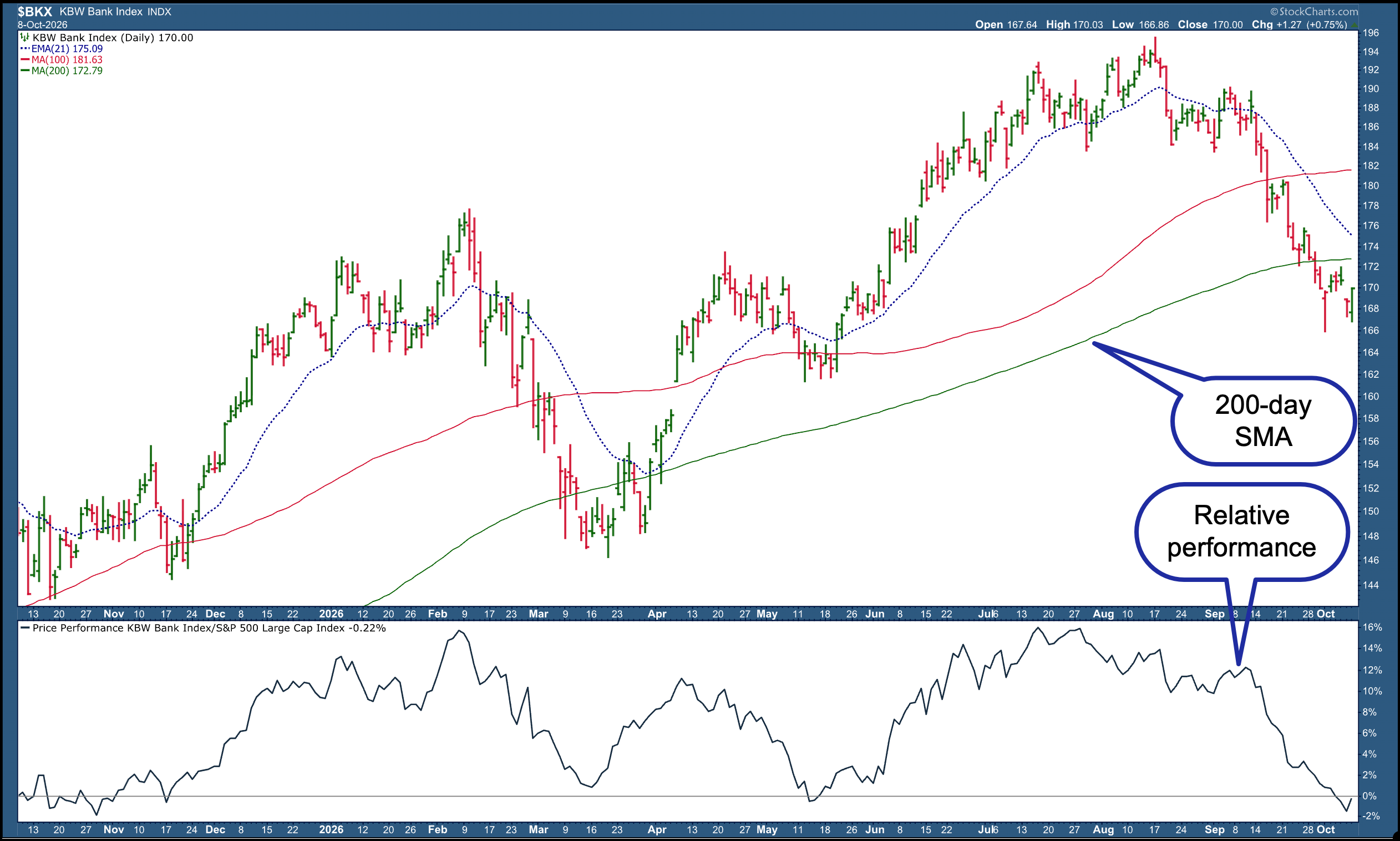
Looking at the above chart, bank stocks look weak. If there’s a change in the banking index’s price action, such as a break in the downward trend and a move back above the 200-day SMA, that would be a signal that yields could head lower. That may take a couple of years, though, and you would want to see a confirmation in the charts before coming to any conclusion.
If you save the $BKX chart in one of your ChartLists and revisit it regularly, you’ll recognize when yields are likely to change direction and what it could mean for the broader market.
The Bottom Line
Thursday’s price action is a reminder that nobody knows what the market will do. Technology stocks may have stumbled, but other areas of the market moved higher.
The StockCharts Market Summary page simplifies market analysis. Check where the major market indexes are trading relative to their moving averages. Look for industries and sectors showing relative strength, and don’t ignore the areas that are lagging. You’ll begin to recognize relationships that aren’t obvious when you just look at the chart of the S&P 500.
This is just scratching the surface of what the Market Summary page can tell you. To take your chart analysis a step further, download the Market Summary ChartPack. The charts will give you another way to explore the relationships between stocks, bonds, sectors, and other market indicators. The more you understand these relationships, the better equipped you’ll be to make investment decisions.
Disclaimer: This blog is for educational purposes only and should not be construed as financial advice. The ideas and strategies should never be used without first assessing your own personal and financial situation, or without consulting a financial professional.