Tech Falls, But Other Sectors/Groups Pick Up the Slack; Biotech and Banks Lead

Key Takeaways
- Health Care, Financials, and Utilities have been picking up the slack in technology stocks.
- Industrials, Banks, and Biotechs are moving higher and hitting new highs.
- Arthur explains how you can build a position within an uptrend in XBI and KRE.
The technology sector is weighing on the S&P 500 ($SPX) as SPY corrects in June. Other sectors, however, are picking up the slack with Industrials and Health Care moving higher. This June rotation is also benefiting the Regional Bank ETF and Biotech SPDR, which hit new highs. Today's report will cover the recent rotations and show how to trade the trend in these two ETFs.
Industrials, Healthcare, Finance, Utilities Pick Up the Slack
The first chart shows performance for SPY, QQQ, XLK, and nine other ETFs in June. Technology (XLK) is leading the pullback with a 3.38% decline. Tech is also weighing on SPY and QQQ, which are down around 3%. Note that tech accounts for 37.5% of SPY and 67% of QQQ. The other nine ETFs are positive, which means money is rotating into these areas.
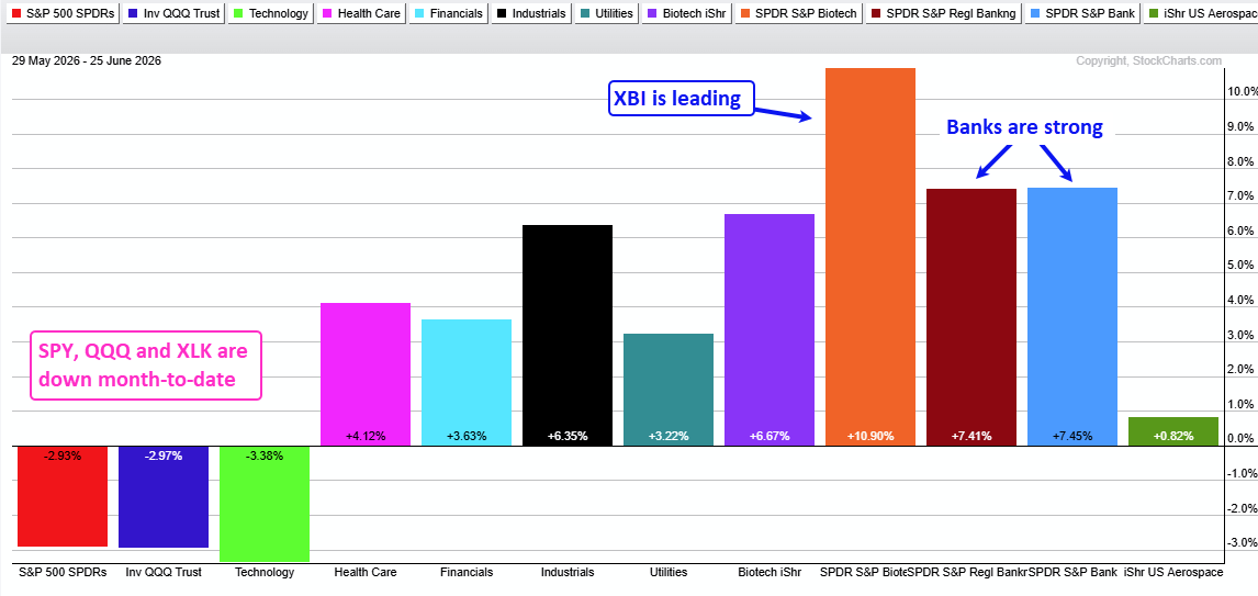
Among the sectors, Health Care (XLV), Finance (XLF), Industrials (XLI), and Utilities (XLU) are leading. Within Health Care, the Biotech ETF (IBB) is up over 6% and the Biotech SPDR (XBI) is the biggest winner with an 11% gain.
Within finance, the Regional Bank ETF (KRE) and the Bank SPDR (KBE) are up over 7% month-to-date. Within industrials, the Aerospace & Defense ETF (ITA) is up 0.82%.
Banks and Biotechs Lead with New Highs
The next image shows CandleGlance charts for leaders with the price-relative in the indicator window. The price-relative is a ratio plot that defines performance relative to SPY (relative performance). This ratio rises when the ETF outperforms SPY and falls when the ETF underperforms.
First, note that all nine are above their rising 200-day SMAs. Second, XLI, IBB, XBI, KRE, and KBE hit new highs this week (blue circles). These are the true leaders.
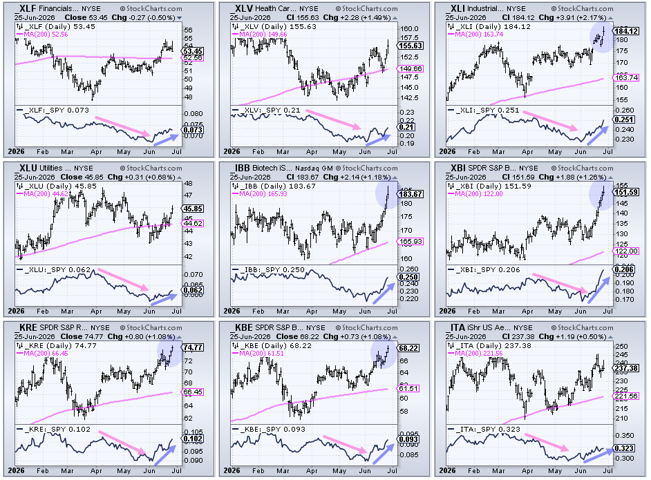
The pink arrow-lines in the indicator windows show the price-relatives falling as these ETFs underperformed into May. The blue arrow-lines show the price-relatives turning up as these ETFs outperformed in June. Industrials, banks and biotechs show the steepest rises this month.
Recent Reports and Videos on TrendInvestorPro
- Tech Under Threat as Banks, Infrastructure and Biotech Lead
- Aerospace & Defense ETF Breaks Out - Plus 3 Defense Stocks
- Copper and Base Metals ETFs Hit Bullish Setup Zones
- ChartList with 297 ETFs Organized in Logical Top-Down Manner
Click here to take a trial and gain full access
Biotech SPDR Breaks Out of Bullish Consolidation
Pullbacks and consolidations offer chances to trade in the direction of the bigger uptrend. The basic strategy at TrendInvestorPro is that, first, we must be in a bull market and, second, the ETF must be in a long-term uptrend; once these prerequisites are in play, traders can look for tradable pullbacks and consolidations.
XBI moved into a long-term uptrend with a break above the 200-day SMA in August. The ETF continued higher into January (five months) and then corrected with a falling channel into April. This is a tradable pullback. XBI then broke out in early April and hit a new high.
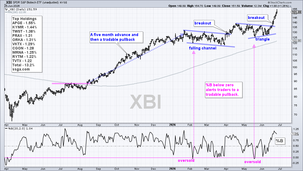
A triangle consolidation formed from mid-April to mid-June and XBI again broke out on June 17th. A consolidation within an uptrend is a bullish continuation pattern. XBI raced to new highs after the breakout. Note that TrendInvestorPro featured the falling channel and triangle as they were taking shape (before the breakouts).
The indicator window shows %B (20,2), which reflects the relationship between the close and the Bollinger Bands. %B is below 0 when the close is below the lower Bollinger Band (20,2). This is a short-term oversold condition that alerts chartists to a tradable pullback.
%B dipped below 0 in early February and again in mid-May. The oversold condition doesn't always mark the low for the pullback, which is why traders must turn to the chart to identify the pattern and the breakout level to watch. An oversold condition is an alert to pay close attention to the chart.
Building a Position Within an Uptrend
The next chart shows the Regional Bank ETF (KRE) with pullbacks, consolidations, oversold readings and breakouts. The uptrend in KRE is not as strong as XBI because KRE dipped below its 200-day SMA in July, October, November, and March. Nevertheless, an uptrend was present with the series of higher highs and higher lows since the June 2026 breakout.
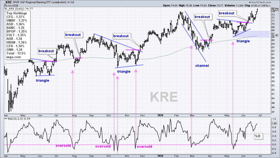
The pink arrow-lines show when %B became oversold. The solid blue lines on the price chart mark the patterns in play, while the short pink lines mark the short-term resistance levels. KRE moved higher from July to June and offered four tradable patterns along the way.
Trading pullbacks and consolidations within an uptrend offers a chance to build a position as the trend extends. The uptrend remains in force until proven otherwise. The time to exit is when the long-term trend turns down and/or a bear market signals.