StockCharts Insider: How to Think Like a Gold Insider
Before We Dive In…
Gold has been all over mainstream financial news since 2020. Prior to that, it was a “barbarous relic.” Yesterday’s money. But then the world changed; inflation came back, debt got heavier, currencies looked shakier, geopolitics got uglier. Suddenly, gold became a “hot asset” again. Strange how this cycle works.
While investors pay attention to the latest hot assets, macro gold insiders tend to think differently. They don’t ask whether gold is cheap or expensive, at least not in the way most people tend to think about it. Instead, they ask what gold can buy. After all, they see gold as “sound money.” Price is one thing. But purchasing power is another.
You may agree or disagree with this view. Either way, I’m going to show you how to see gold from that perspective. And if you decide the shiny metal deserves a place in your asset mix, you’ll at least have a better way to judge whether gold is stretched, cheap, or somewhere in between.
Don’t Think Price; Think Buying Power
If you try to figure out whether gold is cheap or expensive now, you’re making too narrow a relative comparison. You’re comparing it to a single currency; in our case, the U.S. dollar. The problem is, where does that trajectory end?
Gold hovered around or under $20 an ounce from 1808 to 1912. As of May 2026, it's closing in on $4,500. This tells you it can buy more dollars. But has gold outpaced other big ticket items? Not always. And that’s one thing a macro investor pays attention to.
Let’s start with a house.
Housing-to-Gold Ratio
How many ounces of gold do you need to buy a house?
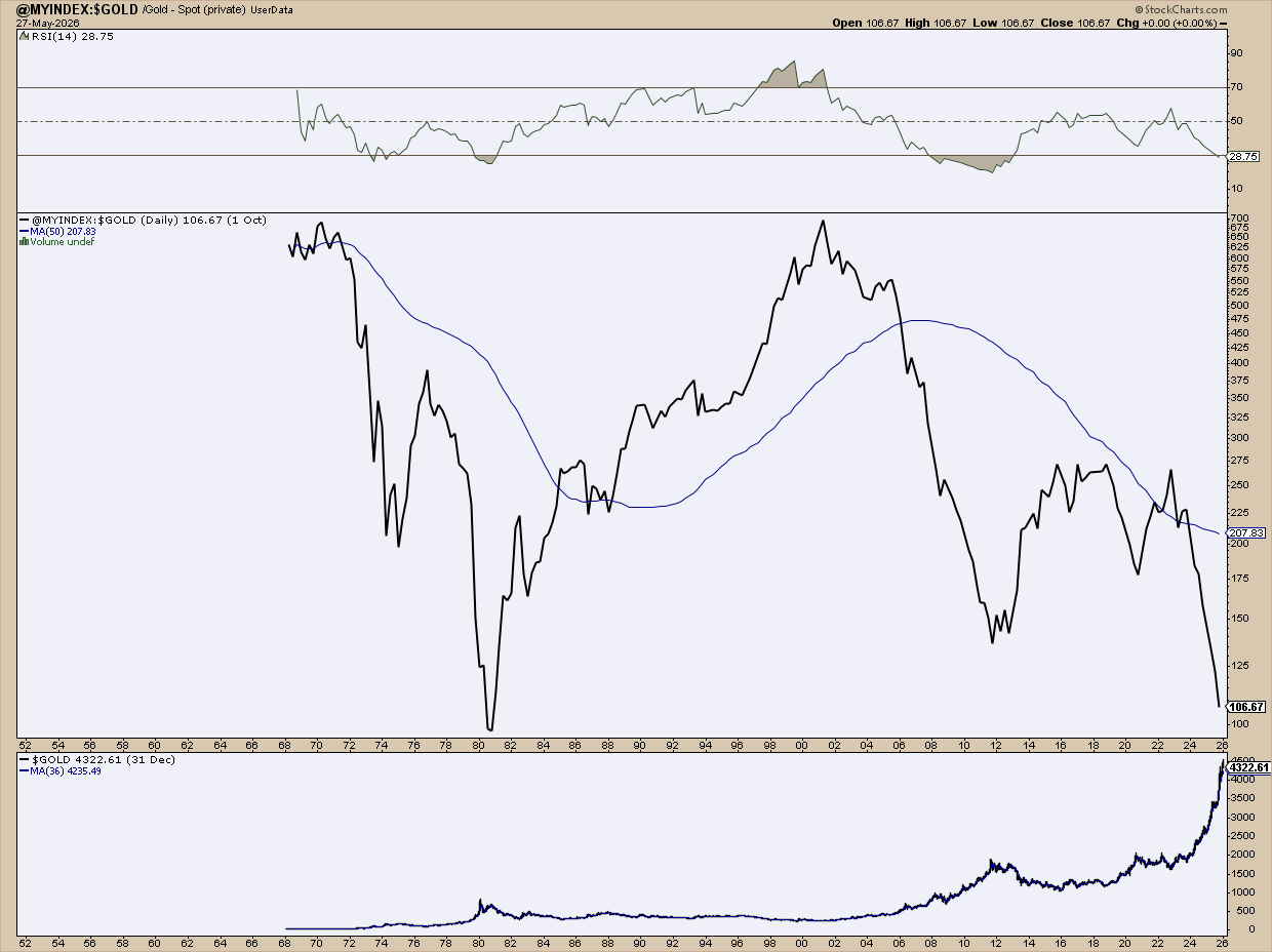
To get this chart, I created my own index drawn from the Federal Reserve Bank of St. Louis (FRED) and input it into StockCharts’ User-Defined Index page.
StockCharts’ spot gold data goes only as far back as 1968. But if you look at the gold prices in the bottom panel, it just shows a steady-to-rapid upward trajectory. It rose in 1980, pulled back and stayed stagnant for a while, and then did something similar in 2012. Overall, though, the net move is upward.
That’s gold’s price. But buying power relative to the median price of a home tells a different story. If the ratio rises, housing is getting more expensive in gold terms. If the ratio falls, gold is gaining purchasing power relative to real estate.
In 1970 and 2001, it took around 700 ounces of gold to buy a median-priced house. That’s a lot of gold. But in 1980 and 2026, only 100 ounces of gold, more or less, was equivalent to one house.
This isn't a pure timing tool. But it's not useless for timing either. When the ratio is historically elevated, gold looks cheap relative to housing. That's a case for heavier exposure. When it's compressed, gold has caught up, or maybe even overshot. That might signal a time to go lighter and buy more gradually. Again, this matters if you’re a gold investor. For macro-investors, 1970 and 2001 were the best times to load up.
Dow-to-Gold Ratio
Most of us are stock investors. While the S&P 500 is the standard benchmark for the U.S. stock market, gold investors have traditionally looked to another index—the Dow Jones Industrial Average—as a proxy for U.S. stocks.
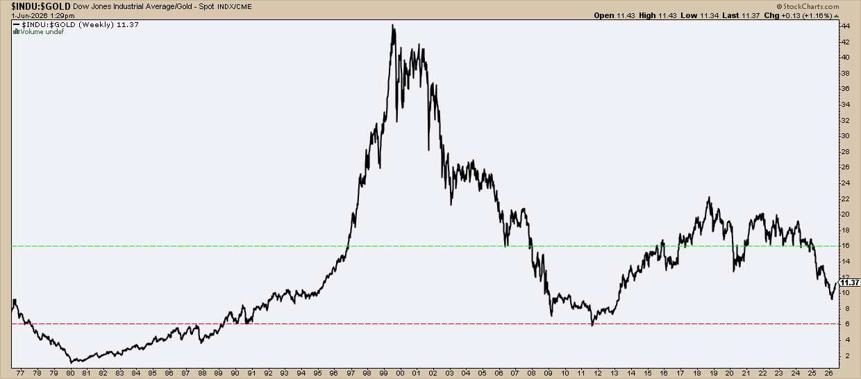
Okay, here’s where we have to be careful, because interpretation is highly subjective. Plus, lots of gold sites are pretty biased.
The common rule is that:
- When the ratio is below 5, which rarely occurs, gold has become much more expensive than stocks, meaning stocks are way undervalued.
- Above 15, however, means gold is at a discount and stocks are getting expensive.
Now, this doesn’t mean you should rotate out of stocks. You’d miss several strong bull markets. But it can suggest how to manage gold accumulations relative to stocks.
As the chart above shows, loading up on gold in 1980 wouldn’t have been the smartest move. But going heavy on gold and light on stocks around 1999 and 2000 would have yielded a windfall. You needed 43 ounces of gold to match the value of the Dow, and now you need only 11. That's a big move. But previous bull markets pushed the ratio even lower. To 6, or even 1. We're not there yet. Will we get there? It’s not certain. But it’s something to be aware of.
Gold-to-Silver Ratio
They’re called goldbugs. But they buy silver too. The so-called “poor man’s gold.” What makes silver interesting is that it’s a hybrid. Industrial and monetary metal. Although central banks typically don't stash silver, that's quietly changing.
Russia has been buying physical silver outright. Hundreds of millions worth for state reserves. India's central bank has quietly reintroduced it into its lending framework. Saudi Arabia is taking a paper approach, gaining exposure through silver-backed ETFs rather than stacking bars in a vault. Three different methods. Same thing, more or less.
Now, the gold-to-silver ratio isn’t so much about gold as it is about silver. It’s a relative value indicator that tells you how many ounces of silver it takes to buy one ounce of gold.
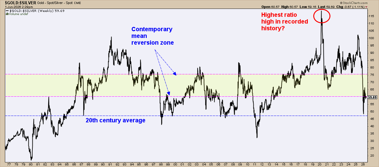
Where’s the average? It’s contested. The classic ratio is 15:1. There’s fifteen times more silver for every unit of gold in the earth’s crust, so the reasoning goes. Some people are still waiting for this to reassert itself. Imagine that.
The 20th century average is 47:1. Recently, the 60 - 75 range has been considered the mean reversion range. Above 80 is hot, meaning gold’s outpacing silver.
Now take a look at the 120:1 spike in 2020. Gold investors got this immediately. Most of the world missed it. It’s been argued that this ratio was never seen before in the recorded history of the two metals.
So, if you happened to see alarmist-sounding headlines at the time of a 5,000-year record high, it was probably right. Was that one of the best windows of opportunity to go overweight silver? Yeah. It was.
And That’s a Wrap
Price tells you what gold costs. But ratios tell you what it's worth. Big difference.
The housing ratio shows you whether gold is keeping pace with real assets. The Dow-to-gold ratio shows relative values across full monetary cycles. The gold-to-silver ratio shows you where fear and opportunity may lie. But really, it’s a silver timing indicator.
Again, none of these are buy triggers. Together, though, they give you something the average stock investor doesn’t typically have. And that’s real context. Not headline context. Not price chart context. Purchasing power context. That's how gold insiders think. And that's your Insider lesson for the day.