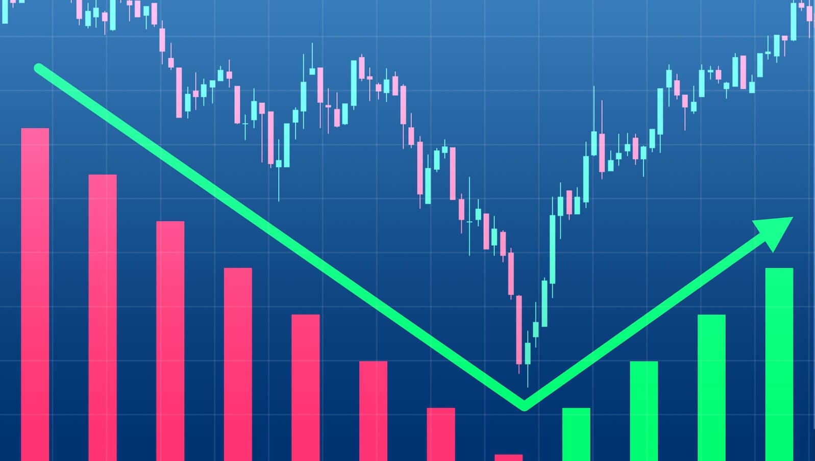
V-Bottom Strikes Again: Stocks Soar as Quality Lags
Key Takeaways
- Semiconductor strength and broad participation point to a clear shift toward risk-on leadership.
- Quality is losing relative ground as momentum and cyclicals begin to take the lead.
- Improving breadth and sector rotation suggest equities are building toward new highs.
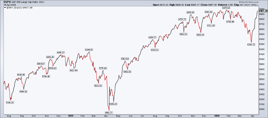
Chalk up another V-bottom on the big board.
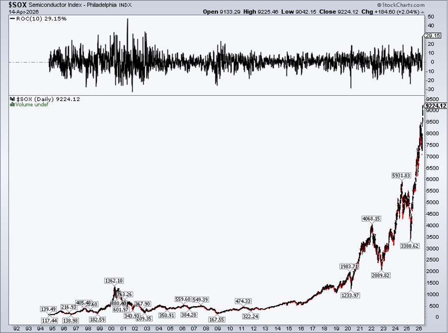
The S&P 500 ($SPX) rallied 9.9% over 10 trading sessions to come within earshot of its January 28 all-time high. The Nasdaq Composite ($COMPQ) soared 13.7% from the close on Monday, March 30, through this past Tuesday, one of its best rallies since 2009. The Philadelphia Semiconductor Index ($SOX) lifted an incredible 29% over that stretch. You have to go back to 2002 to find a steeper SOX surge.
Semis Steal the Show
April gains in the chip space are simply stunning: NVIDIA (NVDA) +12%, Taiwan Semiconductor (TSM) +14%, Broadcom (AVGO) +27%, Micron (MU) +35%, AMD (AMD) +25%, Intel (INTC) +45%.
For traders, the VanEck Semiconductor ETF (SMH) is higher for 10 sessions running, and it’s the first of the major U.S. or international sub-index products to reach a new record level.
A Textbook Risk-On Tape
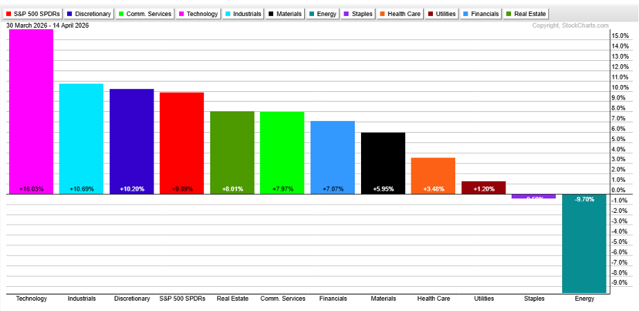
Zoom out and you'll see the sector performance view is a bull’s dream. Information Technology (XLK) has been leading since the penultimate trading day of March, up 16%. Industrials (XLI) and Consumer Discretionary (XLY) are the other two sectors outperforming the S&P 500 ETF (SPY). Lagging are Energy (XLE), Consumer Staples (XLP), Utilities (XLU), and Health Care (XLV).
The upshot? Tech, AI, and the consumer are driving equities higher. Defensives are out of favor, while lower energy stocks suggest $90–$100 oil is transitory.
But there’s another factor pointing to a return of the risk-on trend of larger degree.
When Quality Stops Leading
Quality has rolled over. Last time, I called out boisterous strength in momentum, but quality’s drag has been quieter.
Quality was a popular factor wager for years as mega-cap tech climbed and unprofitable small caps struggled against the S&P 500. The sell-side and pundits on financial TV could rest easy by encouraging investors to lean into quality, as it offered competitive returns with a somewhat low beta.
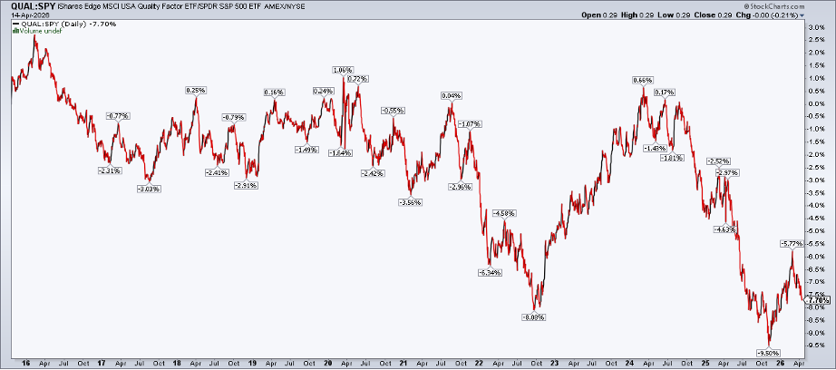
That changed in early 2024, and we see it on the chart. The cleanest view is to compare the iShares Edge MSCI USA Quality Factor ETF (QUAL) to SPY. A 10-year lookback reveals a peak that petered out, eventually bottoming last November. The turn-of-the-year QUAL:SPY rally has the hallmarks of a bearish corrective advance, with the broader trend kicking in since early March. Interestingly, QUAL lagged at the war’s onset and since the March 30 low.
Reading the Rotation
For another way to view this, let’s hop over to the RRG charts. Julius de Kempenaer constructed a factor edition of the Relative Rotation Graph. You can learn all about how to interpret RRG charts here, but the gist of it is that you generally want to play what’s in the upper-right box from the long side.
When a security drifts into the bottom-right “Weakening” box, that’s a yellow flag. Absolute and relative strength may deteriorate further into the red “Lagging” box. Among the seven factor ETFs, QUAL is closest to ringing bearish alarm bells.
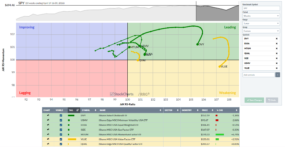
Once again, that’s music to the bulls’ ears. It’s important to point out that, unlike basic market breadth (assessing how many stocks advance or decline on an absolute basis), factor analysis is all relative. So, we can have tremendous breadth, with areas like quality lagging badly (and momentum spiking).
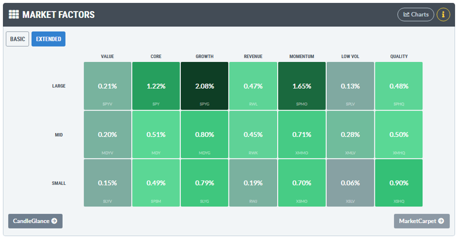
I encourage traders to read the tape at the close each day using StockCharts’ Market Factors style box on the Market Summary page. I prefer the Extended version. Along with the standard large-mid-small and value-blend-growth boxes, it includes revenue, momentum, volatility, and quality. Unlike RRG, this is a nominal analysis, which means bulls want to see green across the board.
By assessing the RRG factor chart and the Extended style box, you can get a holistic market view.
Technicals Confirm the Trend
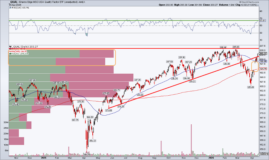
Still, there’s no purer method to spot technical trends than with SharpCharts. While QUAL lags SPY, its price chart is anything but bearish. Notice in the chart below that shares are about 1% from the February record high. The quality factor ETF’s relative strength from last November through mid-Q1 led to a later high-water mark than the S&P 500’s January peak.
Like the SPX, QUAL dipped below its long-term 200-day moving average in March but then snapped back above it during the first full trading week of April. I have joked that nothing good happens below the 200-DMA… except market bottoms!
Posting a bullish engulfing marubozu candle this past Monday, with confirmation on Tuesday, all systems may be a go for new highs.
Resistance, Gaps, and What Could Go Wrong
That QUAL assertion is backed up by the best RSI momentum oscillator reading in three months. The bears can point to the major gap lingering between $193 and $194, as well as a formidable top at $205.
I’d caution traders not to fall in love with the misconception that “all gaps get filled.” The reality is some do, but others don’t (see April–May 2025 as a case in point). What’s more, the volume-by-price profile on the left indicates potential selling pressure until the ETF closes above $205.65.
The Bottom Line
Quality looks good on its own, but it’s losing ground to risk-on areas. That’s an ideal setup for the market as a whole. Factor analysis meshes with recent sector performance, too, with many broad indicators underscoring that new S&P 500 highs may be a matter of when, not if. Still, traders must manage risk, and the tools I laid out today can help you spot cracks in the market’s foundation.
Disclaimer: This blog is for educational purposes only and should not be construed as financial advice. The ideas and strategies should never be used without first assessing your own personal and financial situation, or without consulting a financial professional.