How a Strong Uptrend is REALLY Formed

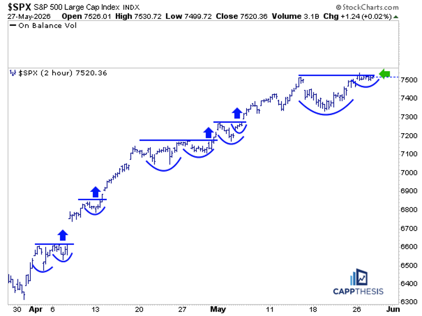
The S&P 500’s 17% gain in eight weeks ranks among the best eight-week advances in stock market history. Recently, we referenced that a few of the pauses along the way can be classified as mini trading boxes. Yet, at first glance, the SPX’s strong rebound from the March lows still looks like one continuous, unabated advance.
Zooming in to the 2-hour time frame provides some helpful and necessary context. As we can see here, there have been multiple bullish pattern breakouts along the way, starting with the price action right off the March low. Overall, there have now been four separate bullish formation breakouts, with each push higher leading to the next digestive phase that has also resolved to the upside.
Now, another small bullish setup has been built, which would be the largest of the bunch so far.
If you measure the price action from the May 14 high to yesterday's high, it looks like a clear multi-day bullish cup-with-handle pattern. And if this particular breakout were to occur, it would give an upside target near 7,750. That isn’t a huge price target, but it sits above the live bull flag target. And when we have more than one live bullish pattern at the same time, it adds conviction to the idea that the target can eventually be acquired.
More importantly, this helps explain why the market continues to move higher, even if the advance has not been as explosive as it was in the early stages. And it's exactly the type of trading circumstances that could extend the uptrend even further.
XOP Oil & Gas Exploration – Volatile Price Action Continues
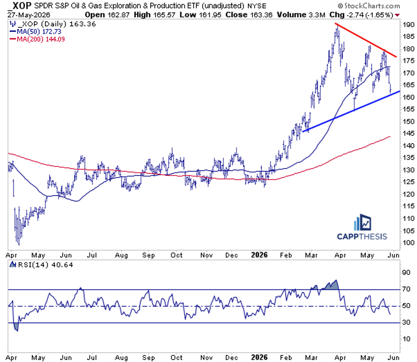
The SPDR S&P Oil & Gas Exploration & Production ETF (XOP) dropped nearly 2% on Wednesday, falling back to the uptrend line that extends from its February low. As is clear, a large symmetrical triangle pattern has developed over the last few weeks following the ETF’s recent top.
We know much of the action here remains headline-driven, but the volatile, directionless price action has made it difficult for either bulls or bears to gain much conviction behind the larger moves. So it may be worth taking a step back and remaining patient until one side makes a more decisive move.
Indeed, trading the intermittent short-term snapbacks and fades may continue to work, but it still appears likely that more time is needed before a clearer trend emerges.
GLD – Staring at Key Support
If the XOP pattern looks familiar, it should. It's starting to resemble the same type of back-and-forth movement we've seen in gold and silver following their own major tops over the last several months.
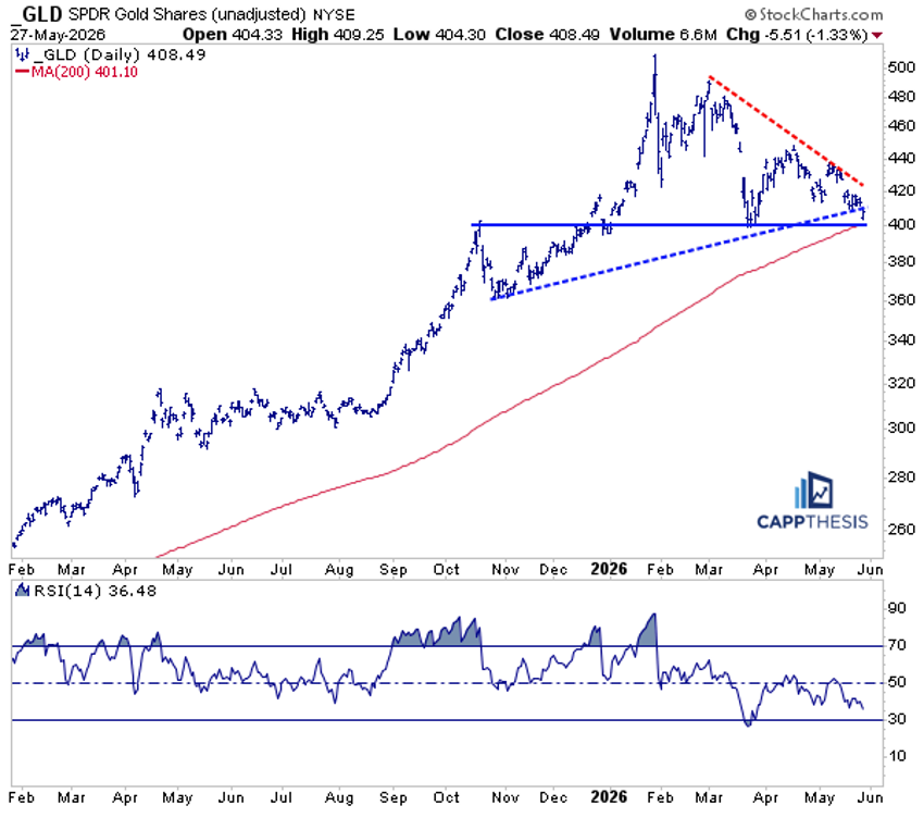
To start, the SPDR Gold Shares (GLD) has also been forming a large triangle pattern, and yesterday it broke marginally below the lower line of that pattern. That area near 400 also coincides with support from March, December, and early October. That zone marked a major breakout area as 2025 concluded and 2026 began. The 200-day moving average sits right at 401, making this as clear a confluence of support as we could ask for.
From a longer-term point of view, GLD remains in a well-established uptrend, and this pullback has brought it back to a meaningful cluster of support. For dip buyers, even those who may have been burned over the last several months, this area could be worth revisiting. That said, a decisive break below 400 would raise the risk profile considerably, and we'd use just below that level as a stop for short-term traders.
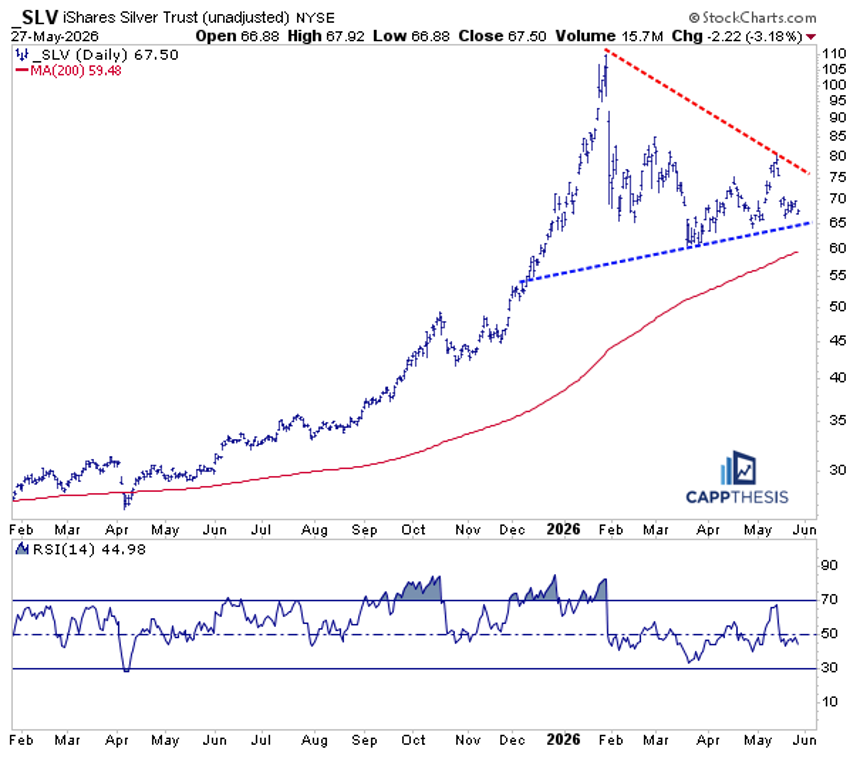
SLV Silver – A Similar Scenario
The iShares Silver Trust (SLV) finds itself in a similar scenario as GLD. The key difference on the chart is that it remains a bit further above its 200-day moving average, which sits just below 60. Regardless, SLV has had trouble following through on its various bounce attempts over the last several weeks, with each one failing to reclaim the 80 zone.
At the same time, buyers have stepped in at slightly higher levels, preventing a bigger rollover and keeping a topping pattern from fully developing. SLV is also still above the same uptrend line that GLD closed below yesterday, so both ETFs remain in proximity to key support zones, with the same scenario now in play for each.
It's getting to a point where prospective buyers could step in once more, with a tight stop just under the 60 zone as the logical risk management level.
Bitcoin - Teetering
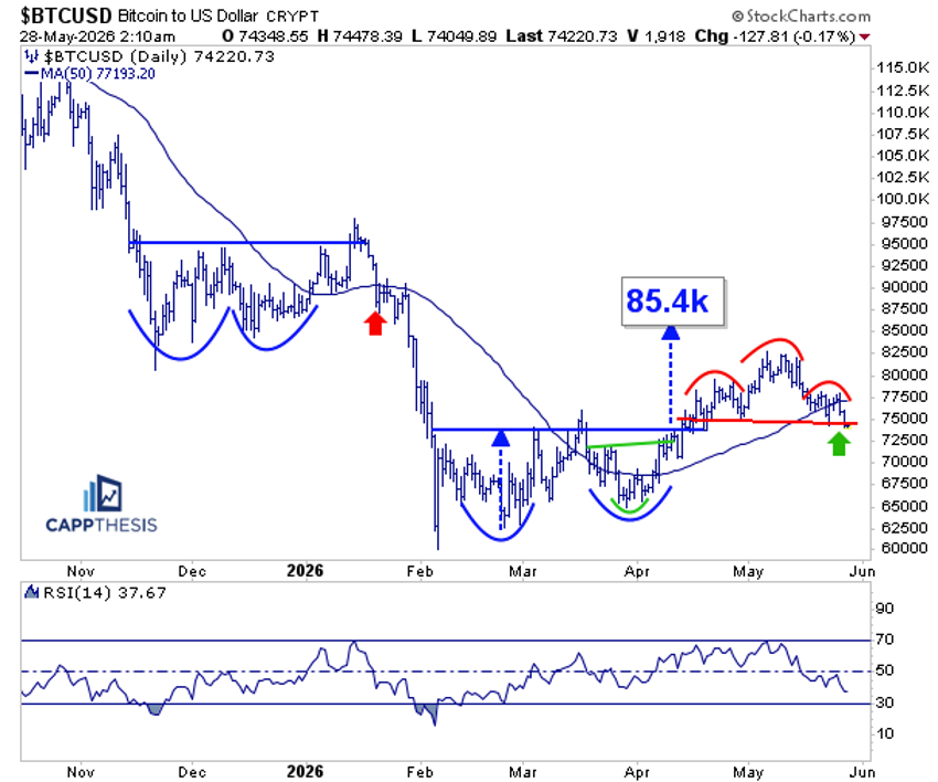
With Bitcoin failing to extend its rally much beyond the beginning of May, the resulting pullback has forced BTC below its 50-day moving average, leaving it teetering near the key 72,000–75,000 zone. As is crystal clear on the chart, what happens next carries some meaningful implications.
First, that area marked the key breakout zone from the cup-with-handle pattern in early April. That breakout produced an upside target of 85,400 and, while Bitcoin initially followed through, the advance proved slower than what crypto investors have grown accustomed to. It eventually topped out near 82,500 before rolling over.
Second, a potential bearish head-and-shoulders pattern has since formed, with Bitcoin now testing the neckline just as it revisits the prior cup-and-handle breakout zone. Needless to say, a decisive break lower would raise the risk of a larger trend reversal.
Third, the 14-day RSI has fallen to roughly 37 — its lowest reading since late February. Momentum has clearly cooled, though it has not yet reached oversold territory, meaning the next move from this support zone could prove especially telling.