Why Rising Treasury Yields Could Be the Biggest Risk to Stocks Right Now
Key Takeaways
- Interest rates are perking up again, fueled by geopolitical flare-ups and a bounce back in oil prices.
- Higher bond yields could limit further stock market gains as debt issuance continues across AI companies.
- Watch the 10-year Treasury rate: A move above 4.56% could put pressure on equities.
Is this March all over again?
WTI and Brent crude oil prices surged mid-week amid fresh strikes on Iran, but that wasn’t the only ominous development across asset classes. Treasury yields jumped, with the benchmark 10-year rate climbing toward 4.60% and the long bond yielding nearly 5.10%. Both of those rates are not far from cycle highs, once again prompting investors to rethink their allocations with a nod to geopolitics.
But the interest rate increase is nothing new. Yes, there was a wobble lower in May as tensions in the Middle East eased and following the June FOMC announcement and press conference, but it has generally been higher highs and higher lows across the rates spectrum since February.
Today, I’m widening the aperture on Treasuries. There’s a battle being waged between a growing number of forecasters calling for a prolonged Fed pause while yields press higher.
The Trend is Hard to Ignore
Let’s start at the StockCharts Market Summary page. Venture to the Bonds section and, on the right, you’ll find a snapshot of the Treasury curve, along with the Fed Funds rate plotted. At the bottom, the 10-year minus 2-year yield spread gives traders and macro onlookers a sense of this year’s curve flattening.
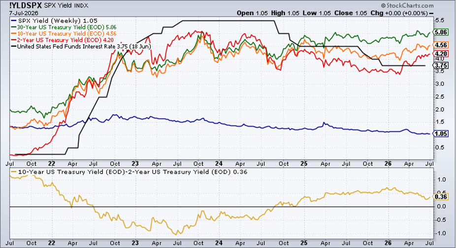
Often, a simple glance at a SharpChart will dispel or reinforce a narrative. In this case, the steady but prominent rate rise took me somewhat by surprise.
Consider that Treasury bulls cropped up after Warsh’s stern words, but that yield retreat hardly registers on a multi-year view. "When in doubt, zoom out," as we like to say in the technical analysis business. Well, bonds have been under price pressure for nearly four months now, and the path of least resistance might be upward.
Last week, I dissected the other useful chart in this Market Summary section. Yes, corporate credit bears watching, but the last few years have taught traders that when Treasuries wake up, all asset classes pay attention.
Volatility Is Somewhat Calm, But Yields Aren’t
To be clear, Treasury volatility has not jumped to the extent that rates have. The ICE MOVE Index ($MOVE), which can be thought of as the VIX of the Treasury market, is little changed from February and down sharply from its March multi-year high. It suggests daily swings of a few basis points a day across the curve. Technically, there really aren’t any imminent indications that MOVE will break out from its now-three-month consolidation.
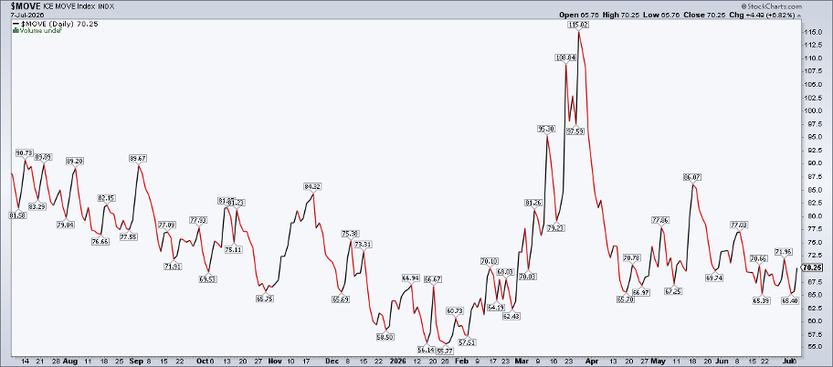
Modest Treasury volatility doesn’t mean yields can’t creep higher and upend 2026’s strong YTD gains, though. A slow bleed upward, perhaps triggered by a rebound in oil prices, would likely cap the S&P 500's potential upside. Keep in mind that the equity risk premium (the S&P 500’s earnings yield minus the 10-year TIPS yield) is already compressed versus its 20-year average. The higher rates go, the less appealing equities become, according to that cross-asset valuation metric. Of course, that’s a long-term valuation technique.
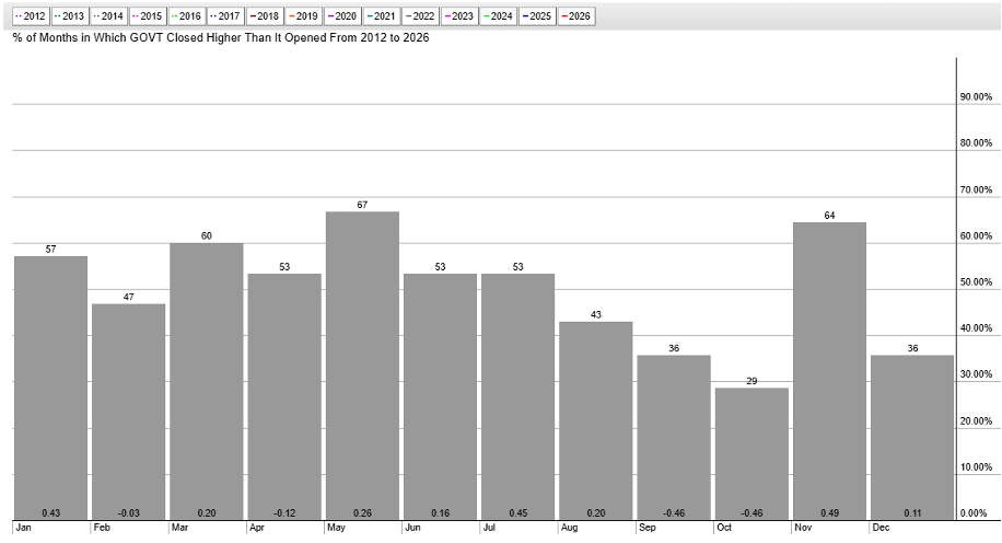
In the very short run, government bonds tend to perform well. Since its 2012 inception, the iShares Core US Treasury Bond ETF (GOVT) has posted positive price gains in July and August on average. It has been the best two-month period for GOVT. Technicians know, however, that price action supersedes seasonality, so I caution readers not to fall in love with the calendar.
A Key Level to Watch
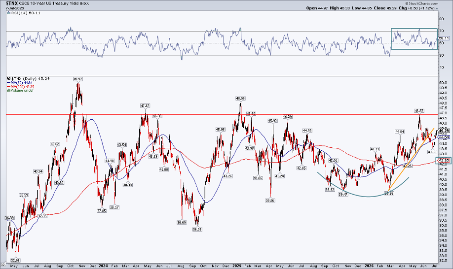
Let's focus in on the most important Treasury chart, the 10-year yield. It’s not the cleanest technical look, but the bond bears have some control here.
Notice in the chart below that the 200-day moving average is on the rise, despite the slope’s occasional ebbs since 2024. The RSI momentum oscillator at the top of the chart has ranged in a positive zone between 40 and 80. Furthermore, while the benchmark yield retraced a chunk of the February-to-May increase (even violating a short-term uptrend line), it’s now nearly back above its June peak.
For now, watch the 4.56% level, which was the June 10 high. Above that, the 2026 peak of 4.687% would certainly be the Street's focus upon a further Treasury selloff.
Will Stocks Feel the Heat?
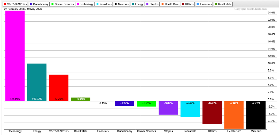
From an equity market standpoint, we have not seen quite as much downside this go-around in supposedly yield-sensitive areas. Utilities, Materials, Consumer Staples, and Health Care were among the hardest-hit S&P 500 sector ETFs from February 27 to May 19.
Maybe, as the AI trade has come under pressure, more traditional "risk-off" sector price action will unfold if Q3 is controlled by bond bears. We might be returning to a world where higher borrowing costs weigh on the growth style more than value, too.
The Bottom Line
Treasury yields have perked back up again. Optimism around the reopening of the Strait of Hormuz helped send the 10-year rate from near 4.70% in mid-May to below 4.40% in late June. But geopolitics is back on the front page, and yields are once again jumping.
You can monitor and analyze Treasury moves using some of the StockCharts resources provided in this article. Also, keep your eye on that 4.56% level on the 10-year... a summer bull/bear battle may be brewing.
Disclaimer: This blog is for educational purposes only and should not be construed as financial advice. The ideas and strategies should never be used without first assessing your own personal and financial situation, or without consulting a financial professional.