StockCharts Insider: SharpCharts Goes High Definition
Before We Dive In…
Imagine giving a presentation on your blog or in a webinar where your SharpCharts pixelate the more you zoom in. You’ve put a lot of work into building a good chart. But on the big screen it looks like a blurry mix of jagged mush. This can make any expert look sloppy. Well, StockCharts just fixed that. SharpCharts is going “HD.”
Is The Chart Blurry, Or Is It My Eyesight?
You zoom in to show the RSI range and it looks like this.
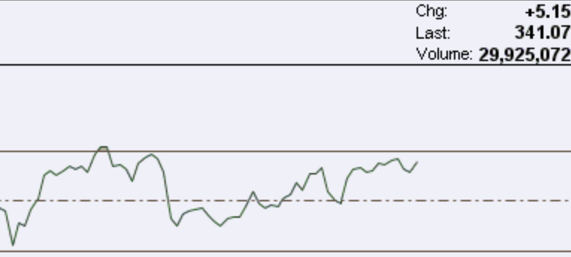
Close up of a pixelated RSI.
The direction of the RSI itself is clear. But the pixelation makes it and the text slightly blurry. A few viewers are rubbing their eyes to see whether it's the chart or their own vision that’s causing the blur.
Now let’s switch over to the High Def feature.
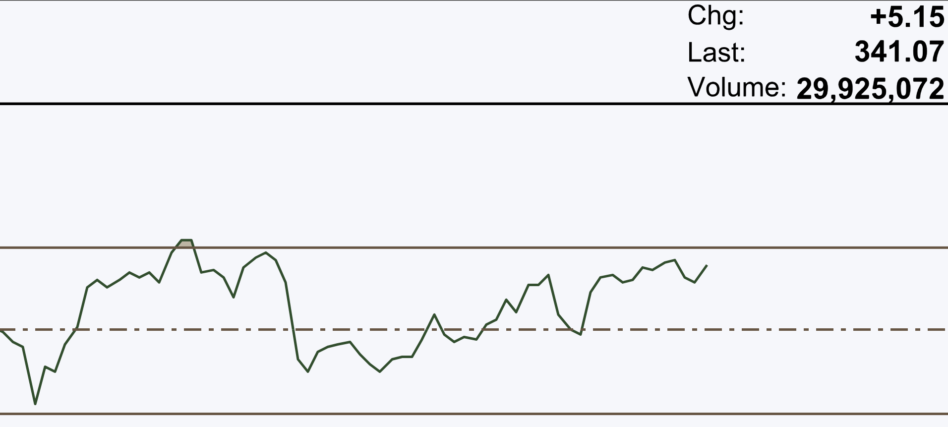
Close up of RSI in HD.
See the difference? Your viewers are relieved. “So it wasn’t my eyes after all.” You earn a little credibility just by making the chart easier to read.
But what if you didn’t make the switch? You continue your presentation, say, on the Ichimoku Cloud and you’re featuring a busy zoom-in.
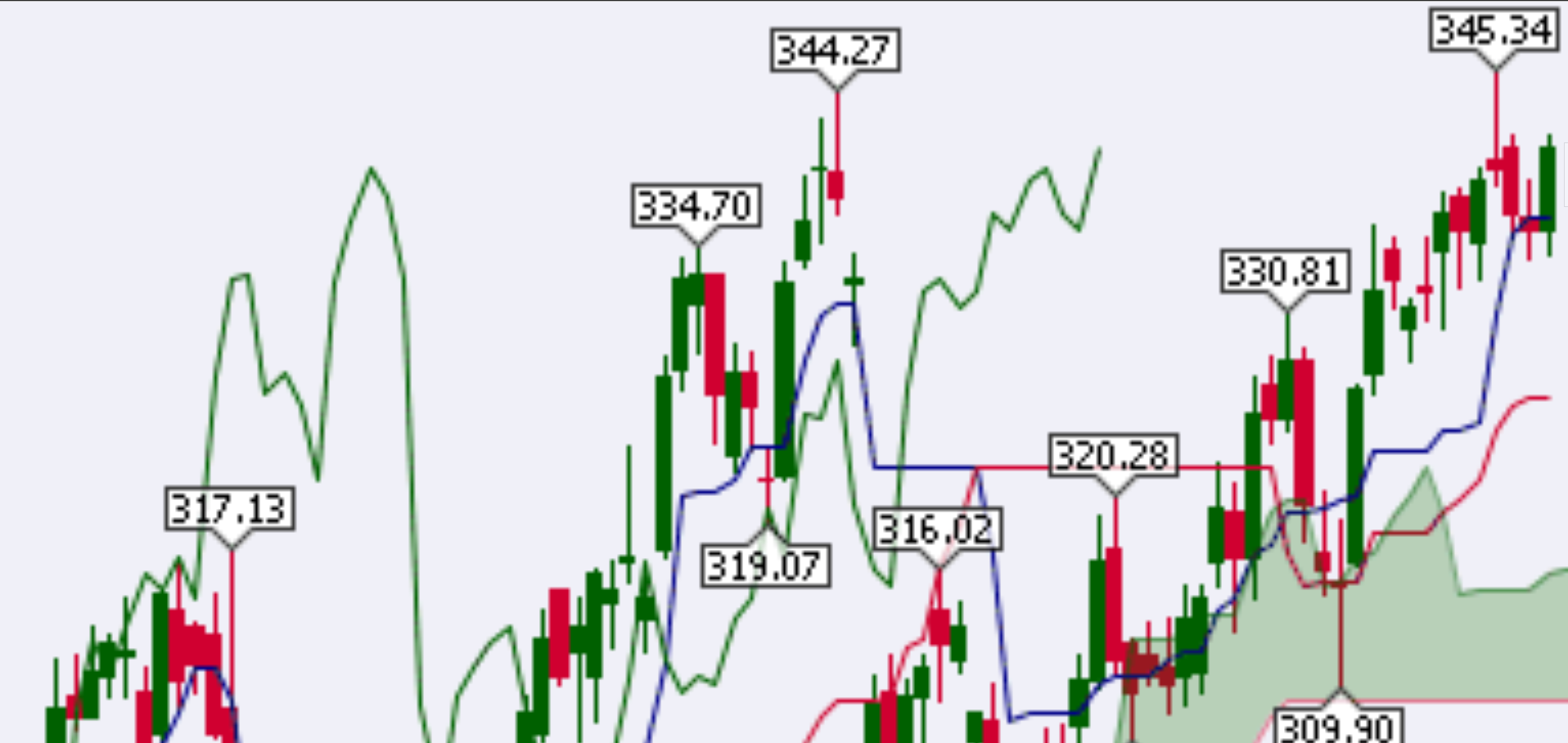
Close up of a pixelated Ichimoku Cloud example.
You can see the numbers. You can see the candles and a few of the indicator components. But its starting to blur.
Switch to HD.
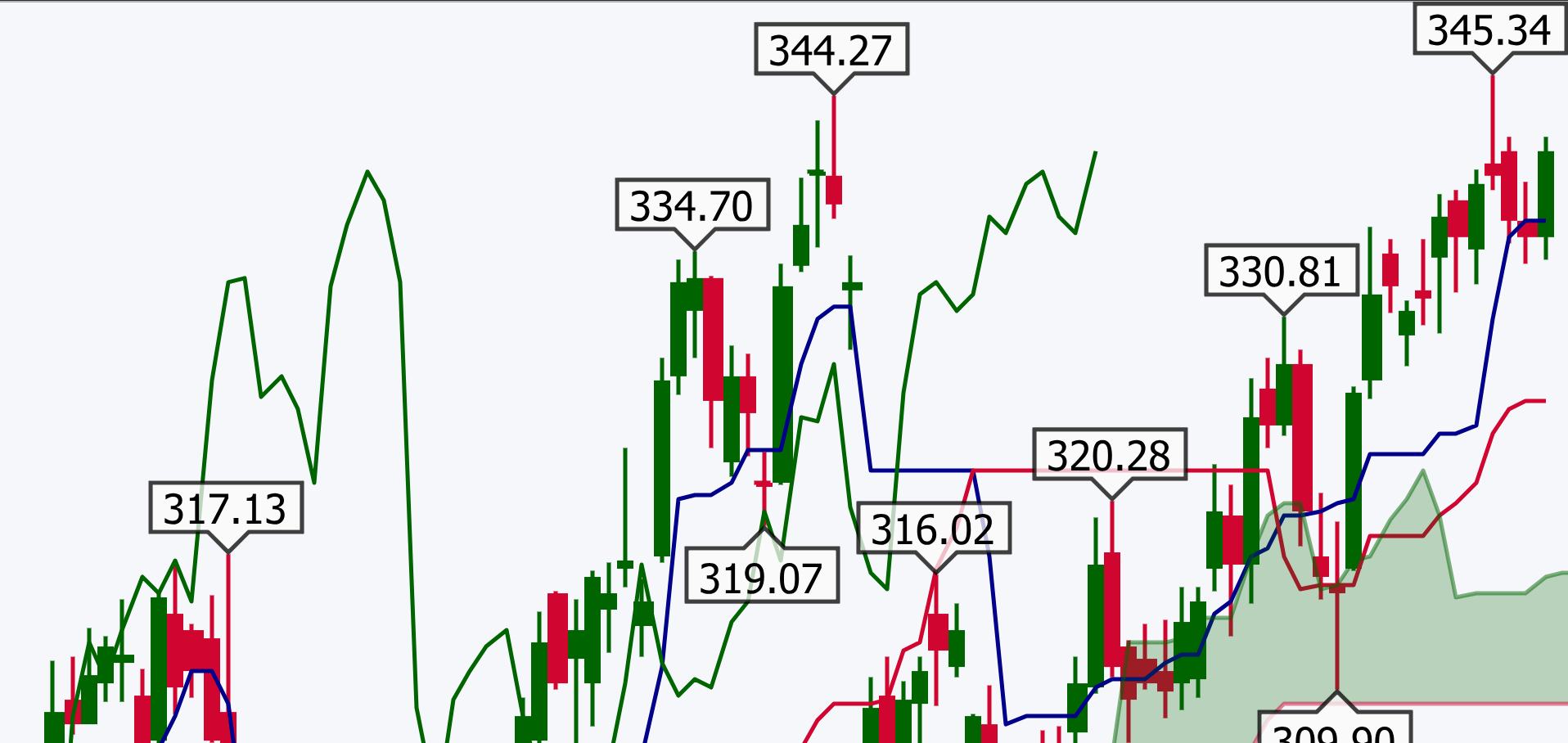
Close up of an Ichimoku example in high definition.
Now, nothing's getting in the way of what you're trying to see.
High Definition Charts are still in beta, but you can try them now. Click the gear icon (Workbench Preferences) in the upper-right corner of any SharpCharts chart.

Image of top icons on top of SharpCharts.
Toggle on High Definition Charts and then click Save Preferences.
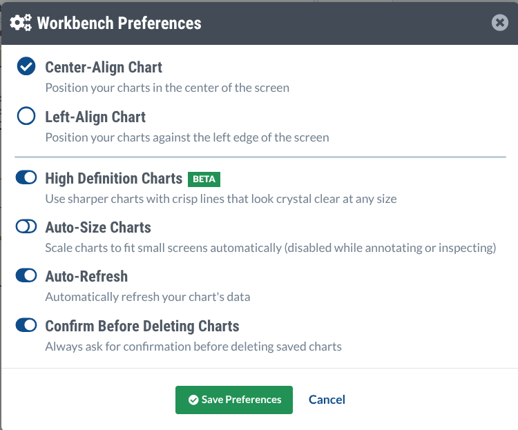
Workbench Preferences.
And that’s pretty much all you need to do. Since this is in beta, feel free to send some feedback. You can send it to the StockCharts support team at support@stockcharts.com. Remember that beta feedback helps shape the final version.
So What’s With the New Look? Meet SVG
The chart you’ve been using is a bitmap image. It’s like a mosaic made up of thousands of little squares (aka pixels). As long as you don’t look too closely, they look smooth. But once you zoom in, each square gets bigger, and what looked like smooth lines start looking jagged.
High Definition Charts use a format called SVG, which is short for Scalable Vector Graphics. Instead of storing pixels, it stores a set of drawing instructions, like “draw a continuous line from here to there,” and so forth. Every time you zoom in, SVG redraws the chart from the same instructions to accommodate the new size.
And that’s why the charts look so crisp, no matter the size of the close-up.
Insider History: SVG's Long Road to Your Charts
Though a new feature for SharpCharts, SVG has been around for a while. In 1998, around the time of the internet boom, the web had no standard way to draw vector graphics. Microsoft and Macromedia had one idea, while IBM and Adobe had another. The World Wide Web Consortium (W3C), which set web standards, didn’t side with either. Instead, it took ideas from both camps and built its own format. In 2001, SVG became an official web standard.
After that, nothing much happened. At the time, the most widely used web browser was Internet Explorer. IE didn’t support SVG. Users needed a plugin to see it. So, pixelated graphics prevailed in common use.
By 2011, things took a turn. Most major browsers supported SVG. That same year, a team of Stanford researchers released D3.js, which was a toolkit for building charts in SVG. It caught on, and in certain fields, it became the standard tool for interactive web-based charts.
Insider Tip: Turn Your ChartList Into an HD Slideshow with Presentation Mode
If you need to present a series of charts, turn them into a slideshow. Open your ChartList, switch to ChartBook view, and be sure to click the Presentation button to the right. If your High Definition Charts toggle is activated, the Presentation button will transform the chart from pixelated to HD.

The Presentation mode button is on the right.
Then, just click through each chart like a PowerPoint deck.
And That’s a Wrap
SVG might have taken the long road to financial charting, but it’s made its way to SharpCharts. Try it yourself. Turn on High Definition Charts, load up a chart with plenty of indicators and overlays, and zoom in. If you present charts on a blog, in a webinar, or at a conference, go “HD” and your audience’s eyeballs will thank you for it.