What Should YOU Do With All-Time Highs Heading Into September?

Key Takeaways
- Seasonal risk is rising, but the technical picture remains bullish.
- Momentum is strengthening across monthly, weekly, and daily time frames.
- Stay alert for a Q3/Q4 pullback, but current evidence still favors higher prices.
The title of this article is a really good question to ask yourself. Why? Because September is the only calendar month that has resulted in more down months for the S&P 500 ($SPX) than up months since 1950.
Here's an interesting stat. Since 1950, there have been 12 corrections where the S&P 500 has declined more than 10% from an all-time high, but didn't reach the 20% requirement for a bear market. Five of the 12 corrections have started in July, August, or September. I mention these three months because historically, according to my analysis, the absolute worst time to be invested in the S&P 500 is from the close on July 17th through the close on September 26th. So it makes sense to at least consider the possibility of a top forming as we move into September.
Does it look like it's a probability based upon technical conditions? No. I see a lot of good things in U.S. stocks right now. The overwhelming weight of the evidence, in my opinion, points to higher prices, not lower prices. But nothing is a guarantee, so let's look at the current technical picture under different time frames, starting with the long-term monthly chart.
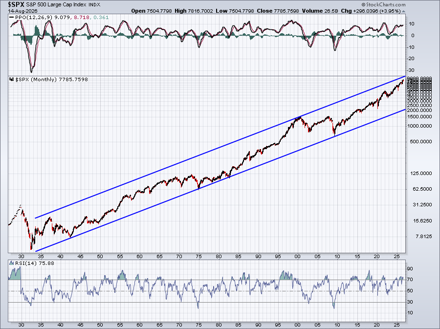
This long-term chart continues to trend higher. As you can see, it really doesn't pay to bet against U.S. stocks over time. Yes, we're somewhat overbought on a monthly chart, but we tend to stay mostly overbought during secular bull market advances.
If we move down to a 10-year weekly chart, we can see that there have been a few negative divergences that alert us to the possibility of slowing momentum. In each of the past three cases, the S&P 500 has done exactly what I expect: trade down to 50-period SMAs and/or PPO centerlines (pink arrows).
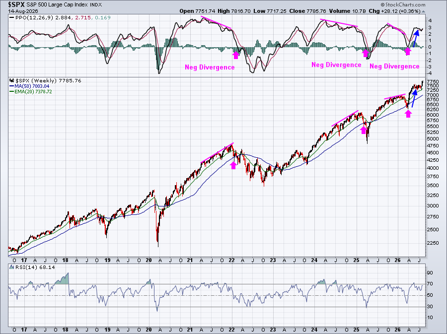
Currently, however, the PPO is moving up off of a recent centerline test as price action has cleared all-time highs. This is a sign of strengthening momentum, not weakening. We occasionally move into overbought territory, but with a weekly Relative Strength Index (RSI) of 68, we're still a bit shy of overbought from a weekly perspective.
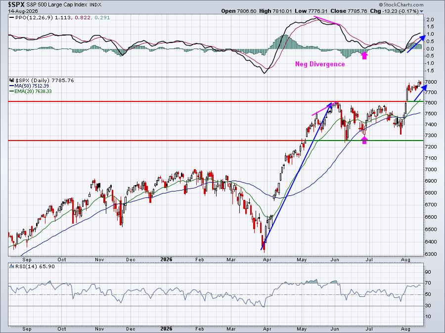
Again, we see a prior negative divergence that's already been resolved with both a 50-period SMA test and a PPO centerline test (pink arrows).
The daily price action shows strengthening momentum to match the strong weekly momentum. Breaking out to new highs with strong momentum is a recipe for further gains, not corrections or bear markets.
So, where are we heading?
Event: Saturday, August 22, 2026
I'll be hosting a very interesting and timely webinar titled, "Four Critical Market Signals, One Verdict" on Saturday, August 22, 2026, at 10:00am ET. It's 100% free with only name and email necessary for registration. I'll break down the four areas that keep me up at night and explain how those factor into my portfolio construction and what I might do to hedge against a possible Q3/Q4 correction. For more details about the event and to register, CLICK HERE.
Happy trading!
Tom