StockCharts Insider: The Hidden Library of 100+ Pro Chart Templates - Ready to Use, Ready to Customize
Before We Dive In…
You know the pain of always having to build charts from scratch. Most of us deal with this on a regular basis. You’ve got charts for different timeframes, charts for trends, a chart for momentum, charts for different styles and setups, etc. It’s a real time-waster.
But why “reinvent the chart” when over 100 pro-charts are already built for you to use or modify? These are charts for various strategies, scenarios, and data needs. So where are they? You can find them the Sample Chart Gallery, available in StockCharts' Member Tools.
Many people have easily skipped over them (it’s in there among a bunch of other Member Tools) but, once you actually see the potential these charts offer, you’re probably going to end up using them often. So let’s take a quick tour.
What Exactly Is the Sample Chart Gallery?
The Sample Chart Gallery is a collection of over 100 charts designed by professional technicians for analyzing different market conditions.

All of these charts are ready to use. But the added plus is that you can customize an already well-built chart based on a particular theme or thesis.
How to Use and Modify Any Template in Under 30 Seconds
I like using Moving Average Ribbons to monitor shorter-term trends and pullbacks. Instead of painstakingly building one myself, I just go to the Popular ChartStyles page, click on Moving Average Ribbon, and change the symbol to the stock I want to focus on, which in this case is Walmart, Inc. (WMT).
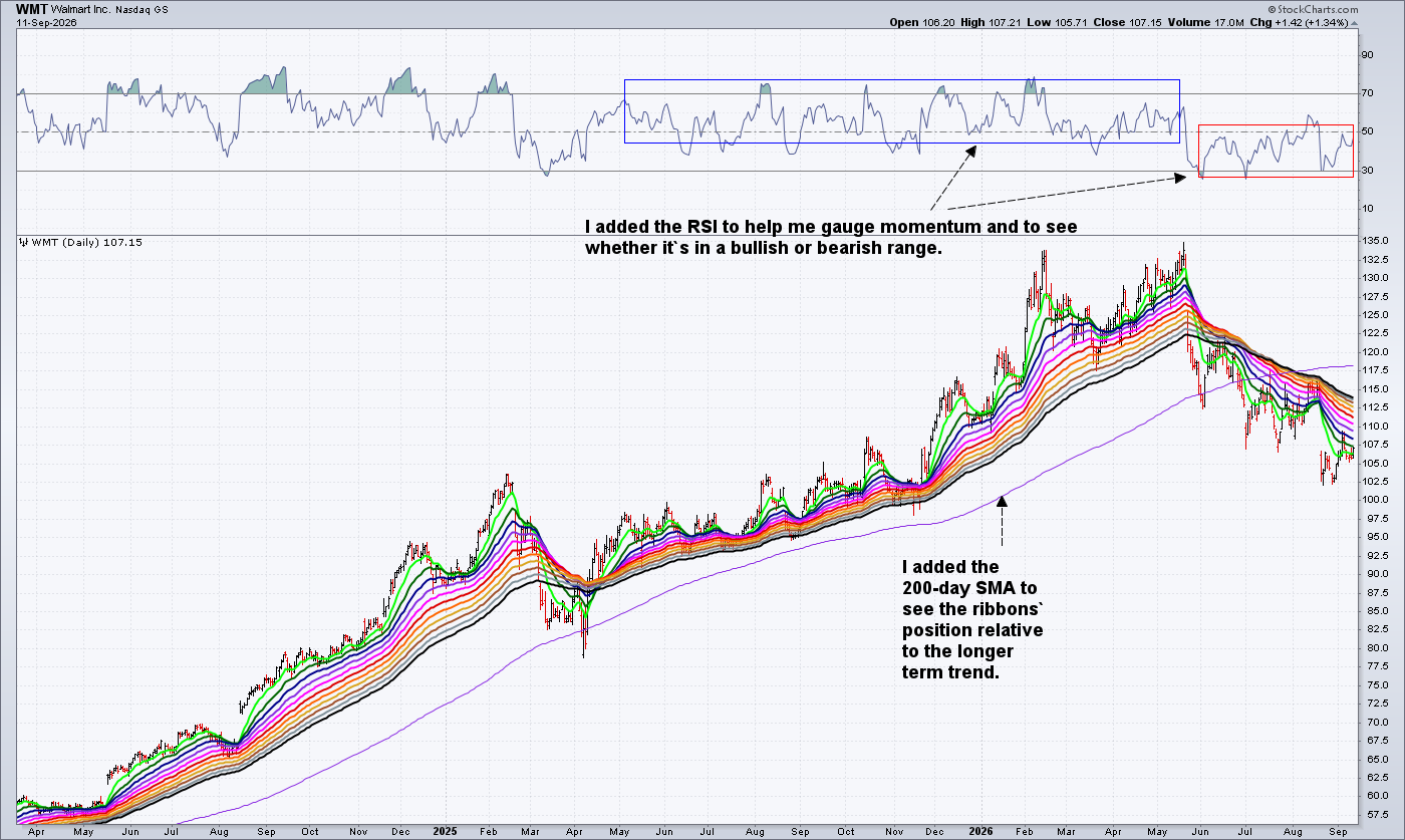
But I also need to see the longer-term trend, so I add the 200-day simple moving average (SMA). In addition to this, I want to gauge momentum, so I also add the Relative Strength Index (RSI) to see whether it's giving me a bullish or bearish range reading.
And that’s all there is to it.
Are there Any Standout Templates Worth Trying First?
I can’t walk through all 109. But you should, and take your time doing so. For our purposes, let me see if I can chunk them out by group.
Popular ChartStyles: If you can imagine a “Greatest Hits” in a charting context, this is pretty much it. Almost all of the standard chart types (e.g., candlesticks, OHLC, etc.) and indicators (MA variations, RSI, ROC, etc.) are all here.
Strategies: To me, these represent a more macro view of what’s going on technically in the markets. Trend, momentum, volume, money flow, and relative strength analysis. This is stuff you need to know before zooming into your specific approaches.
Timeframes: Here’s another one that’s similar. Ever seen a strong move on an intraday or daily chart that you couldn’t figure out simply because you were looking at the trees and not the forest? Well, this section gives you near-to-far vision: intraday, daily, weekly, and monthly. I mean… don’t get T-boned by something you could’ve seen had you just zoomed out.
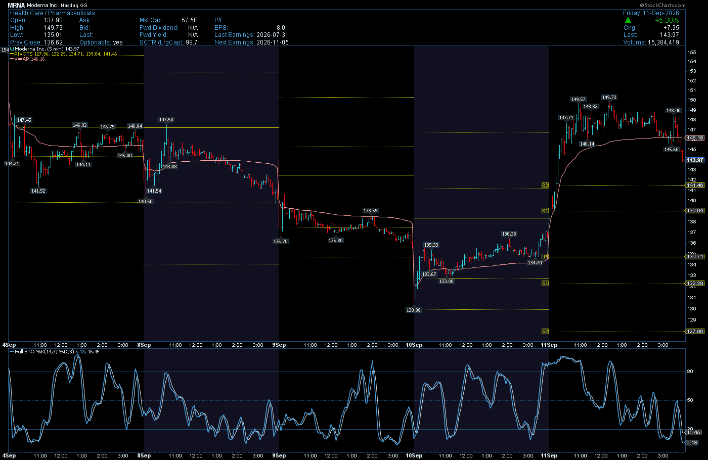
Trading Styles: Different styles often require different tools. If you’re a swing trader who’s fine-tuning a trade entry on, say, a 5-minute chart, you’re probably focused on the immediate price action while keeping an eye on the context established by the previous sessions.
For example, the default Swing Trading chart below provides one example. The pivot points add a layer of nuance that seems appropriate to the situation.
But if you’re a trend trader, you’re going to use different tools to hunt for opportunities. Here’s the same stock using the Trend Trading Chart.
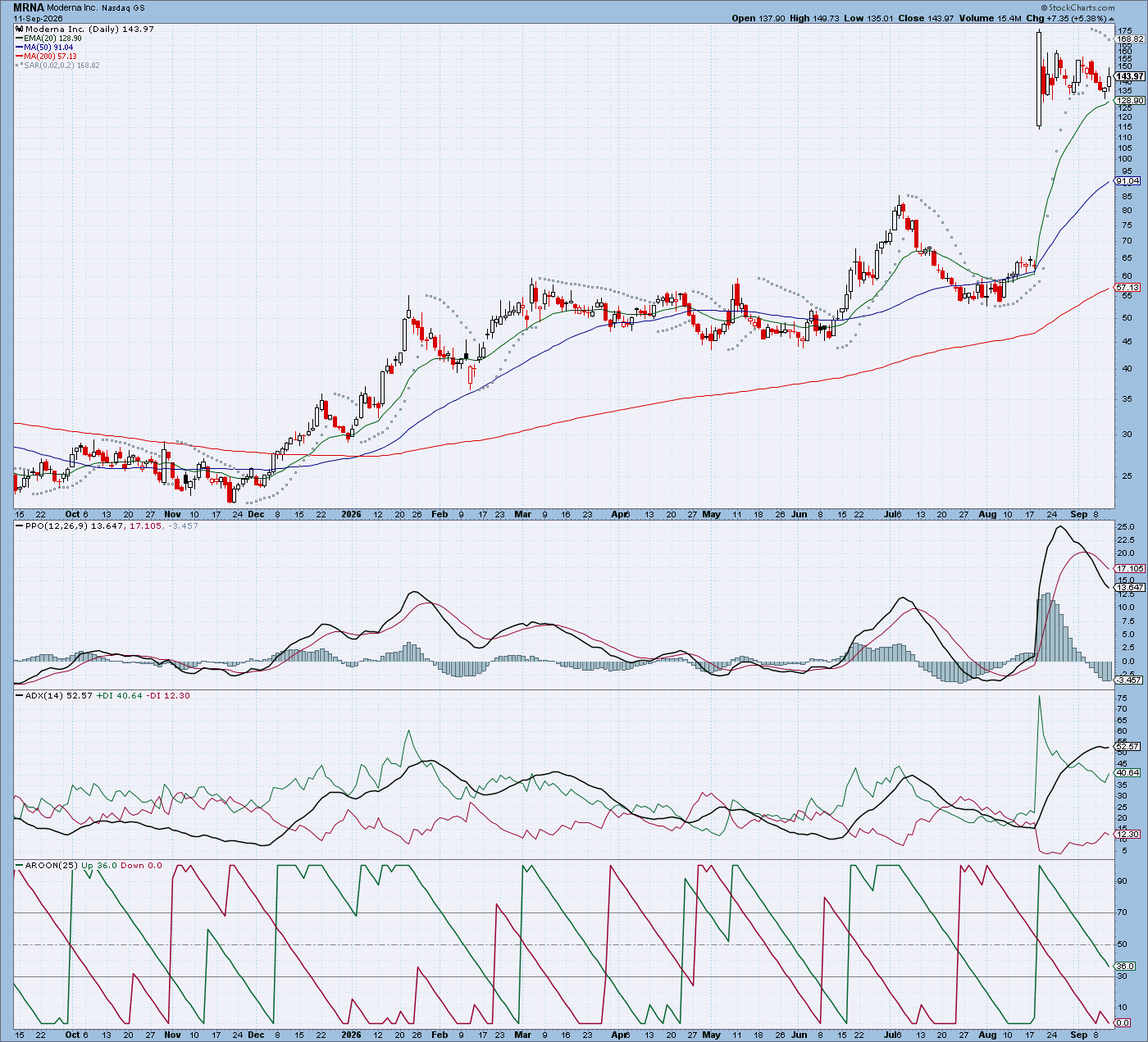
Oh, it looks like you missed the big move. Best you wait for a better entry point.
Experts: All of the templates in the gallery are professionally designed. But these charts give you a window into how certain experts think. That’s because they’re the exact setup (at least one of them) that they use to read the markets themselves.
Market Analysis: Okay, this is one that genuinely surprised me when I first saw it. It’s not all what you’d expect for your more “standard” market analysis stuff. For instance, the Hindenburg Omen is something you’ve likely heard about plenty of times but rarely seen plotted out. Others, like the 5 vs. 200, I’d honestly never come across before, even after years of charting myself. Take a look.
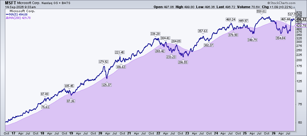
Do you see that clean trend signal going even further beyond 2017? Imagine getting that signal and hanging on until 2022, then getting back in around 2023 for another year and a half.
So, this section is more of “see what’s out there” than a “pick your standard favorite” one.
Keller Market Trend Model: This one’s worth checking out, as Dave Keller spent years as StockCharts’ own Chief Market Strategist. It covers everything from the S&P 500 to the US Dollar. Keller built it using his own custom PPO settings to get a quick read on long, intermediate, and short-term trends at once. Lots of insightful stuff. Just check it out.
Breadth: These charts are all about the underlying health of the market. Think participation: the number of stocks advancing, hitting new highs, or trading above key moving averages really matters. This will tell you whether the market is being carried by a few big names or whether it’s an all-out advance or decline.
Sentiment: These charts give you insight into the market’s underlying mood. Indicators like the VIX, Put/Call Ratios, and more can hint at what’s coming next well before price does.
Mutual Funds: This is a funny one. It’s just one entry. But the Basic Mutual Fund chart plots the Vanguard Total Stock Market Index with dividends below and two moving averages running through a 5-year view. Compare it against your broader index funds. Are they keeping pace in terms of price? What about in terms of dividends?
Bonds: The bonds gallery gives you the full picture on rates, from 2-year to 30-year Treasury, Fed Funds, credit spreads, TIPS, and various other government and corporate rates.
At the time of writing (9.14.2026), everyone’s focused on the 10-year Treasury yield.
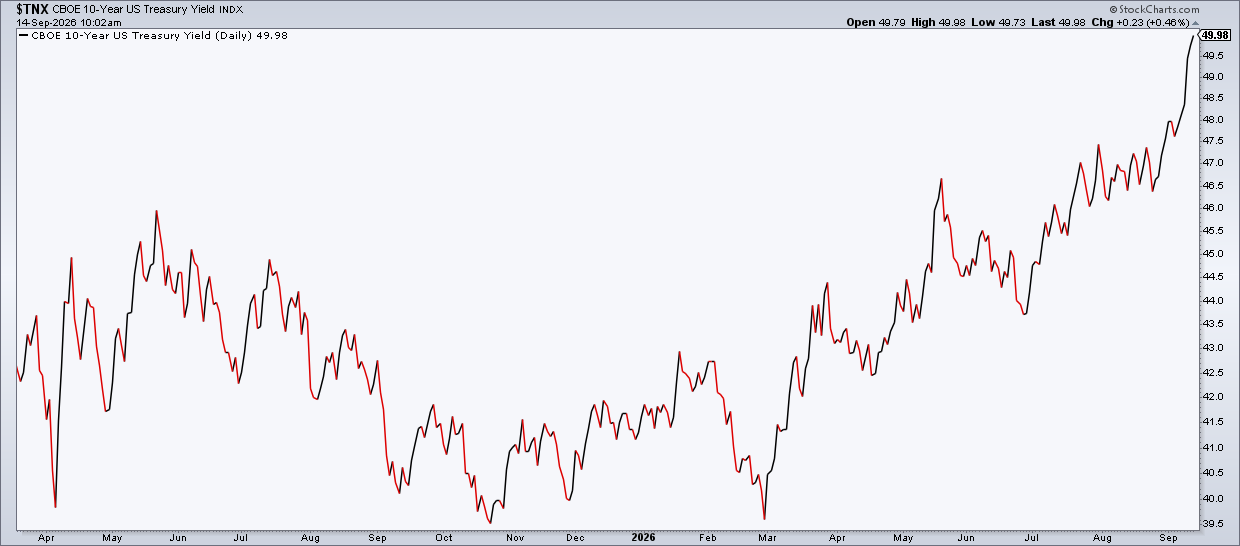
That’s because a yield rising to 5% traditionally signals bad news for the economy and Wall Street. So, where are we at the time of writing? 4.9%. Hmm.
Economic Indicators: Look, I know you’re probably more technician than fundamentalist, but I find this section to be very important, particularly the inflation indicators CPI, PPI, and PCE. These charts tell me something about my grocery bill. They, along with the other economic indicators, also give me a strategic angle to complement my technical views. I hope you find them useful as well.
Fundamentals: This segment zooms in on the S&P 500 itself, namely earnings, earnings growth, and valuation relative to classic P/E metrics. That last one, for me, is kind of a standout. Plotting the S&P 500 against overvalue, fair value, and undervalue P/E bands can help you when pundits on financial news are arguing whether stocks look expensive or not. Take a look.
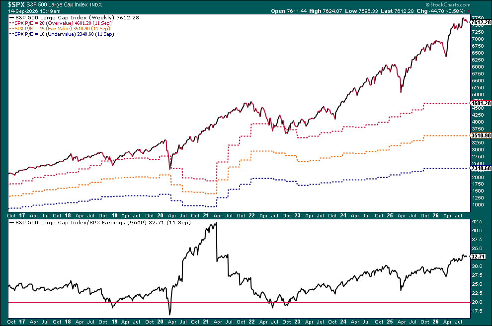
Guess what this is saying about the broader market. You’re probably reading this weeks or months after this was written. If so, that’s even better. Check the chart and see what actually happened. Was it a good indicator?
And That’s a Wrap
The Gallery gives you 109 templates, around 13 categories, and a bunch of useful stuff you probably haven’t seen. This is a great resource. Find what works for your charting and trading style and personalize it if you need to. The important thing is to know it’s there, just a click away. This way, you can spend more time analyzing than building.