Beyond IBM: How to Spot the Market’s Next Major Technical Breakdown

Key Takeaways
- IBM and HCA's earnings warnings show weakness may be emerging beneath the market's surface in certain pockets.
- StockCharts tools help to identify equities, sectors, and ETFs with deteriorating momentum.
- A quantitative approach can help traders avoid, or even profit from, the market's biggest losers.
Earnings season is broadening following the onslaught of big bank Q2 reports last Tuesday. Numbers from the likes of JPMorgan Chase (JPM), Bank of America (BAC), Citigroup (C), Wells Fargo (WFC), and Goldman Sachs (GS) were collectively strong, buoyed by active capital markets over the April-through-June period and impressive sales and trading gains.
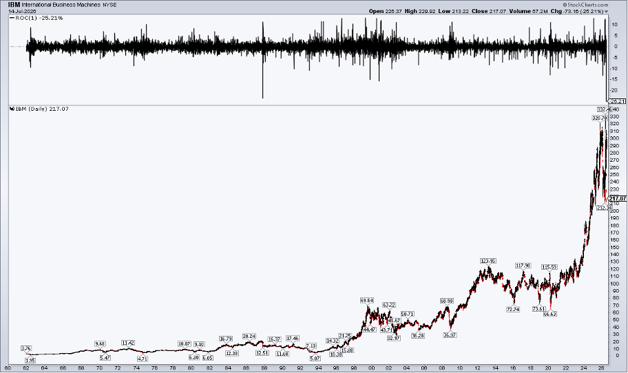
But shortly after their revenue and profit numbers crossed the wires, a pair of unexpected bearish pre-announcements made headlines. Preliminary earnings can be more of a tell than regularly scheduled quarterly reports; IBM (IBM) and HCA Healthcare (HCA) tape bombs rattled the software and health insurance industries, respectively.
To be clear, these were just preliminary updates... more like guidance than official figures. IBM’s full Q2 report is slated for Wednesday, July 22, AMC. HCA numbers arrive the following Friday morning. You can find all the key upcoming releases on the StockCharts Earnings Calendar.
Guidance Matters More Than You Think
Bigger picture, FactSet notes that through last Friday morning, 49 S&P 500 companies had issued negative earnings guidance, compared to 62 positive updates leading into the reporting season. Both amounts were larger than historical averages, perhaps suggesting that, while the Kevin Warsh-led Fed is hush-hush on its outlook, companies are willing to set expectations for investors regarding their bottom-line trends.
But here’s the thing: Stock prices often sniff out profit trends before even CEOs and CFOs relay them to the Street. What’s more, the market usually doesn’t care much about the past. Indeed, information from April through June is far less impactful today than fundamentals looking out to the rest of the year. As technicians, we know that price leads fundamentals, commonly by at least a couple of quarters.
Sticking with the bearish theme, let’s depart from the usual optimistic script. Instead of focusing on what’s working in markets, let’s put the spotlight on the losers. After all, we are closing in on one of the weakest seasonal periods... the August-through-October stretch of the Presidential Election Cycle.
Step 1: Sector Rankings
Beginning with the US market, here’s how I would go about this. We’ll start with the 11 sectors.
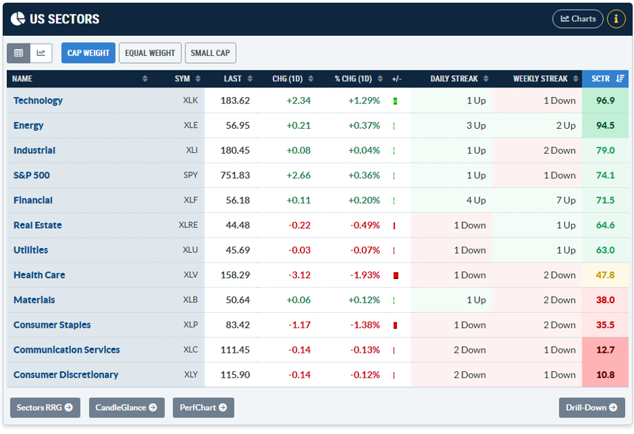
On the Market Summary page, go to US Sectors. There’s Cap Weight, Equal Weight, and Small Cap. Next, rank the list by SCTR Score. Consumer Discretionary and Communication Services are at the bottom of the pack for both Cap Weight and Equal Weight. Curiously, the Small Cap sector SCTR scores are quite strong, sans Materials.
Step 2: Confirm With RRG Charts
It’s not enough to simply find the weakest momentum areas and then have a field day shorting those, however. As a check, let’s use another tool: RRG charts. I normally defer to Julius de Kempenaer, the RRG expert, but you and I can be our own technicians here.
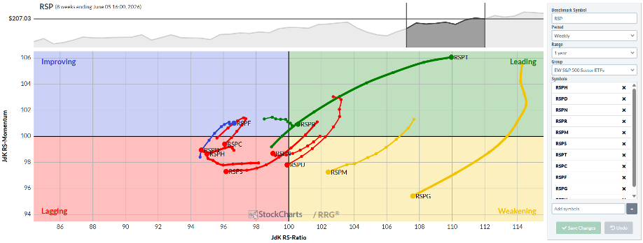
Information Technology was the lone relative sector winner in Q2, so I toggled the Tail Length to eight weeks to find nearer-term laggards. Surprisingly, Health Care has drifted to the lower-right Weakening section, with Utilities and Tech lagging. As for the SCTR stragglers (Consumer Discretionary and Communication Services), they are in the upper-left Improving corner.
Switching to the S&P 500 Equal Weight ETFs, the same tail length reveals several Lagging members, including Consumer Discretionary and Communication Services. Energy and Materials have fallen into the Weakening bucket.
Step 3: Build a Bearish Scan
Another method to find the worst stocks in the market is to create a custom scan. The Scan Workbench allows traders to filter any number of categories to drill down to what’s not working; perhaps equities with sub-30 RSI readings, bearish gaps, or those notching new relative lows.
If you’re unsure which indicators to harness, definitely take a look at the Sample Scans, including the Popular Bearish Scans and the By the Experts curated list of Scan Components. The Sample Scan Library is also a Treasure Trove for short-idea generation.
Don't Forget International Markets
Traders aren’t confined within US borders, of course. Spotting bear markets among overseas stocks can offset your long-US portfolio.
Venturing back to the Market Summary page, the Country Funds tab under Equities lists all the common ETFs globally (view all charts here). A simple way to view the weakest country ETFs is to rank them by distance from the 200-day moving average. Indonesia (EIDO) and China (MCHI) are furthest below their 200-day moving averages, but they are also on the rebound, with two- and three-week winning streaks respectively.
The better bearish bet could be on India, down two days running and over the last two weeks, while still 5% below its 200-day moving average and 17% removed from its all-time high.
Treasuries Still Look Weak
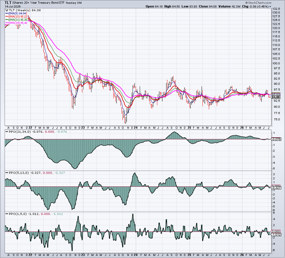
Wrapping up with fixed income, the Keller Market Models view paints a clear bearish picture of the Treasury space. David Keller, CMT, designed this model using Percentage Price Oscillators (PPO).
Long-term Treasuries (TLT) are categorically in downtrends across short-, intermediate-, and long-term timeframes. That augurs for a fixed-income underweight heading into the dog days of summer.
The Bottom Line
IBM and HCA's negative earnings pre-announcements came after solid Q2 reports from the major US banks. It’s a reminder that not everything is coming up roses from a revenue and earnings perspective. The SaaSpocalypse may not be over, and woes in consumer healthcare and insurance may last yet another year.
For traders, taking a more quantitative approach to spotting losers helps de-risk a portfolio that might otherwise be long-only. Several StockCharts tools and indicators can be used to find single names and ETFs with high negative momentum.
Find the setups. Skip the noise. The Scan Engine gets you straight to the charts that matter.
Disclaimer: This blog is for educational purposes only and should not be construed as financial advice. The ideas and strategies should never be used without first assessing your own personal and financial situation, or without consulting a financial professional.